
You rewrote the homepage, argued over the hero line, and shipped it. Three weeks later the demo requests are flat and nobody on the team can agree on why. User testing is the fastest way to stop guessing, and you do not need a lab or a budget to run it. Five people, watched once, will tell you more about why your page fails than a month of staring at the analytics.
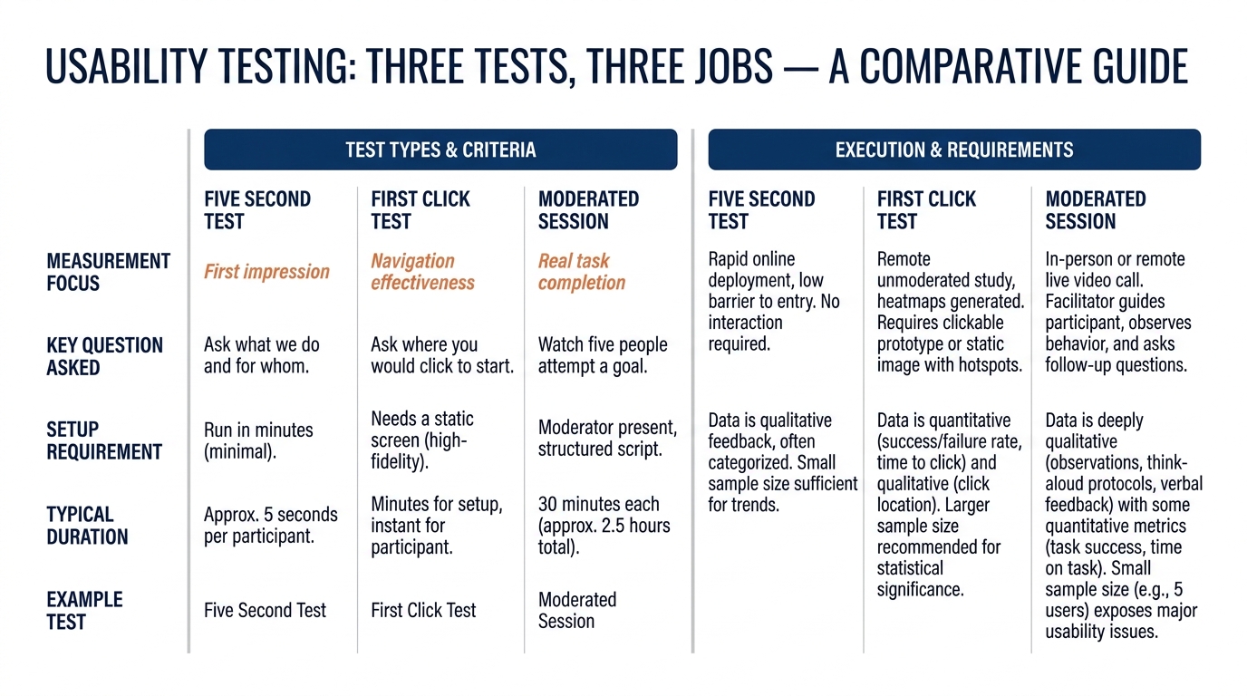
This guide covers three methods you can run this week: the five second test, first click testing, and a short moderated session with five people. I will explain what each one measures, show it on a real B2B page, and end every section with what to change. The Behavly homepage index of 118 B2B service firms (November 2026) gives us a few numbers to argue with along the way.
1. What the research actually says about five people
The number five is not folklore. Jakob Nielsen of Nielsen Norman Group published the math in 2000: five users will surface roughly 85% of the usability problems on an interface, because the same obvious failures repeat across people. His usability research is the reason small moderated tests are worth running at all. You are not measuring preference across a population. You are finding the broken parts, and the broken parts are loud.
Testing is not the same as a survey. A survey asks people what they think. User testing watches what they do when they try to use your page for a real task, which is a different and more honest signal. For B2B sites, where the buyer is cautious and the purchase carries career risk, watching someone hesitate tells you where the perceived risk is highest.
Two caveats keep you honest. Five people find usability bugs well, but they do not prove that one version converts better than another. For that you need traffic and a proper experiment, which Ron Kohavi, Diane Tang and Ya Xu cover in their book on trustworthy online controlled experiments. Use small tests to find the problems, and A/B tests to confirm a fix at scale.
2. The five second test, and when it fits
In a five second test you show someone your page for five seconds, take it away, and ask what the company does, who it is for, and what they would do next. It measures first impression and comprehension, nothing more. If a prospect cannot say what you sell after five seconds on your homepage, the rest of the page rarely gets a fair read.
This is where the index gets uncomfortable. Across 118 B2B service firms, 49% lead the first screen with AI wording, and most of those lines describe the vendor's technology rather than the buyer's problem. A five second test on that kind of hero usually comes back with "something about AI, not sure for who." That is a failed test, and you can see the full pattern in the November 2026 homepage trends.
What to change: if your testers cannot name your audience and your category in five seconds, the hero line is carrying too much cleverness and not enough plain meaning. Rewrite it around what the buyer does, then read our note on writing a B2B value proposition before you touch it again.
3. First click testing for pages that hide the next step
First click testing shows a static screen and asks one question: where would you click to do X. The method draws on research from Bob Bailey and Cari Wolfson, later popularized through usability practice, showing that users who get the first click right are far more likely to finish the task. On a B2B page the task is usually "book a demo," "see pricing," or "understand if this is for me."
The index shows why this matters. Of those 118 firms, 33% ask the visitor for nothing at all on the first screen, no clear action, no obvious next click. When you run a first click test on a page like that, people click the logo, the nav, or a case study, anywhere except a path to buy. Your call to action copy is doing the heavy lifting here, and vague copy produces scattered clicks.
What to change: pick the one action you want from the page, then test whether a cold reader finds it on the first click. If clicks scatter, the primary button is either absent, buried, or competing with three other buttons of equal weight. Reduce the choices until one path is obvious.
4. Moderated sessions with five people
A moderated session is you, one tester, and a real task, watched live for about thirty minutes. You give them a scenario ("you run marketing at a 200-person distributor and need a vendor to fix your reporting"), hand them the site, and stay quiet. You are not there to explain the page. You are there to watch where they stall and listen to what they say out loud.
Remote user testing makes this cheap. A screen share and a recording tool are enough, and you can recruit testers who resemble your buyer rather than whoever walks past your desk. Nielsen Norman Group's research on thinking-aloud testing is the standard reference for running these sessions without leading the witness.
What to ask, and what not to
Ask them to narrate: "tell me what you are looking at and what you expect." Ask what they would need to see before contacting a vendor like this. Do not ask "do you like the page," because people are polite and liking is not buying. Watch for the moment they look for proof. Most B2B buyers hunt for evidence that someone like them bought and survived, which is why 80% of the firms in the index show case studies, and why social proof placement changes how fast they relax.
What to change: write down every point where a tester paused, backtracked, or asked a question the page should have answered. Those pauses are your priority list. Fix the three that showed up across more than one person first.
5. A worked example on one pricing page (illustrative)
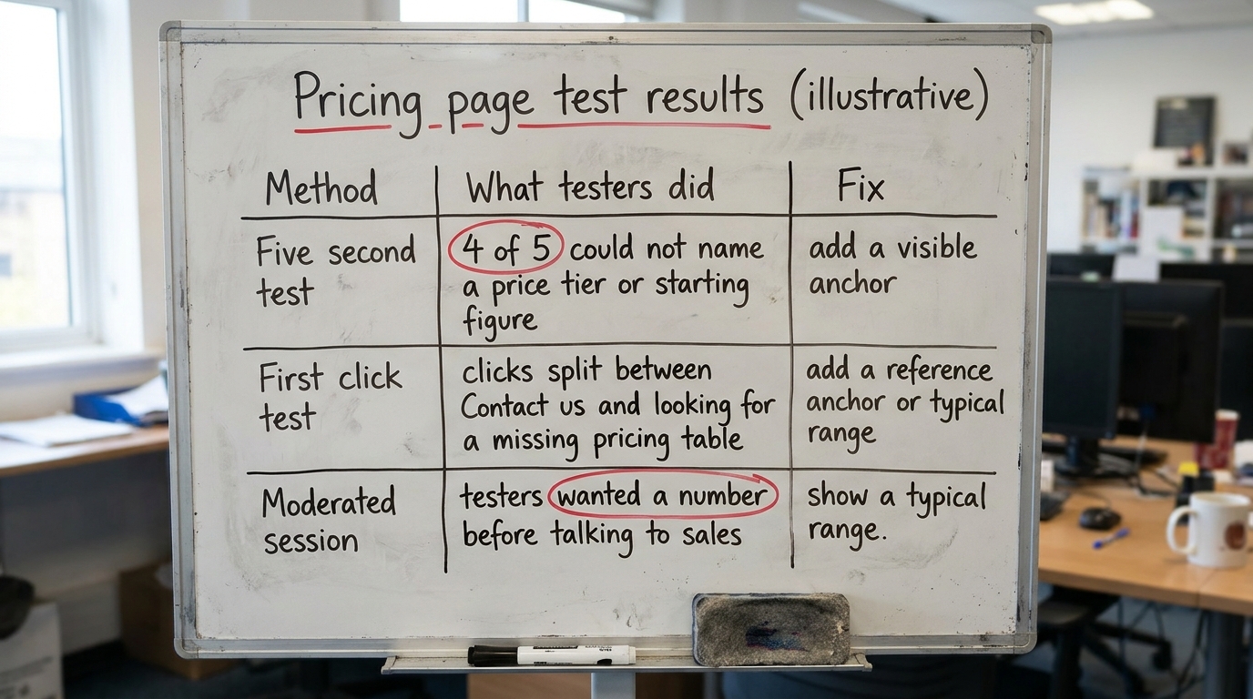
Here is a composite example, built to show the method rather than a real client. Treat the numbers as illustrative. Say you test a pricing page where only a "Contact us" form appears and no price is shown. That is common: just 3% of the firms in the index show a price on the first screen, so most pricing pages ask the buyer to request a quote blind.
You run a five second test first. Four of five testers say they cannot tell what a plan costs or even what tier they would be in. Then a first click test: most click "Contact us" reluctantly, two look for a pricing table that is not there. Finally, moderated sessions reveal the real friction. Testers want a reference point before they talk to sales, and a form with no anchor reads as expensive and risky.
If the business cannot publish a price list, it can still give the buyer an anchor: a starting figure, a typical range, or a named example tier, so the buyer has something to reason against. That is the mechanism behind price anchoring on B2B pricing pages, and it is why a single visible number changes how the whole page feels.
6. Where each test shows up on your B2B site
The three methods map onto the places a deal actually stalls. Use this table to decide which test to run on which page, what you are watching the buyer do, and the change it points to. It applies to a homepage, a pricing page, a proposal, a demo form, or an outbound email landing page equally.
| Where it shows up | What the buyer does | What to change |
|---|---|---|
| Homepage hero (five second test) | Reads the first screen, tries to name what you sell and for whom | If AI or jargon wording wins and the audience is unclear, rewrite around the buyer's problem |
| Navigation and primary CTA (first click test) | Looks for where to start: demo, pricing, or proof | Reduce competing buttons until one path is obvious; sharpen the button copy |
| Pricing page (all three) | Hunts for a number or tier before contacting sales | Add a starting figure or range as an anchor, even without a full price list |
| Case studies and proof (moderated session) | Checks whether a company like theirs bought and succeeded | Lead with the buyer's own segment; watch for survivorship bias in which stories you show |
| Demo form (first click + moderated) | Weighs how much to give up before any value is returned | Cut fields to what sales truly needs; say what happens after submit |
| Proposal or outbound landing page (moderated) | Scans for the one memorable reason to proceed | Give them a single clear story, the kind the availability heuristic makes them repeat internally |
7. Common mistakes that waste a test
The first mistake is leading. If you ask "would you click the big blue demo button," you have told them the answer. Give a task and go silent. The second is testing with colleagues who already know the product; they cannot see what a cold buyer sees. Recruit people who resemble your actual buyer, even roughly. The third is confusing a usability test with a conversion test. Five people tell you what is broken. They do not tell you that version B lifts signups by 8%. For that claim you need enough traffic and a disciplined setup, and Evan Miller's note on how not to run an A/B test is worth reading before you declare a winner off twelve conversions. The fourth is testing the thing you are proud of instead of the thing that is failing. If demo requests are flat, test the path that leads to the demo. Baymard Institute's UX research is a good reminder that most buyers abandon over small, fixable friction, not grand strategy.
8. What to change on your page this week
You do not need a research plan to start. Run these five steps in order, each one small enough to finish in a day.
- Run a five second test on your homepage hero with five people outside your company. Write down whether they named your audience and category.
- Run a first click test on the page that should drive your main action. Note where the clicks scatter.
- Book three short moderated sessions, give each tester a realistic buying scenario, and stay quiet while they work.
- List every pause, backtrack, and unanswered question. Fix the ones that appeared across more than one person first.
- If the page shows no price and no anchor, add a starting figure or range, then plan a proper A/B test to confirm the lift before you trust it.
One structural note: much of this is comprehension before it is design. A buyer who cannot explain your offer will not advocate for it internally, which is also why the halo effect from a clean, confident first screen carries so much weight in B2B. If you want the wider pattern across the market, the lessons from 118 B2B service firms show how consistent these failures are.
If you want a fast read before you recruit a single tester, run Behavly's free homepage check on your own page and see what a cold visitor meets in the first five seconds.