
A third of B2B service homepages ask the visitor to do nothing. In Behavly's November 2026 index of 118 firms, 33% had no clear next step on the first screen, and only 3% showed a price. That gap matters because a call to action is the single moment where a page turns reading into a decision, and if the ask is missing, vague, or too heavy for a first-time visitor, the traffic you paid for leaves without committing to anything.
This guide explains what a call to action is doing in behavioral terms, then shows how to match the ask to the visitor's stage across the pages you actually run: homepage, pricing, proposal, demo form, and outbound email. Each section ends with what to change.
1. What the research says about the ask
Every call to action requests a commitment, and the size of that commitment changes how many people say yes. Nielsen Norman Group's usability research has documented this for years: users scan, they resist friction, and they abandon forms that ask for more than the moment warrants. You can read the body of work on their research articles page.
Behavioral science gives the mechanism a name. Daniel Kahneman, who won the 2002 Nobel Prize in Economic Sciences, described how people weigh a potential loss more heavily than an equivalent gain. A visitor who has read two paragraphs about your firm is considering the cost of a sales call they are not sure they want yet. The ask that works is the one whose perceived cost matches where the person is.
So the practical question is not "what is our main conversion goal." It is "what is this specific visitor ready to do right now, and does the button on the screen match that."
2. The four commitment levels an ask can carry
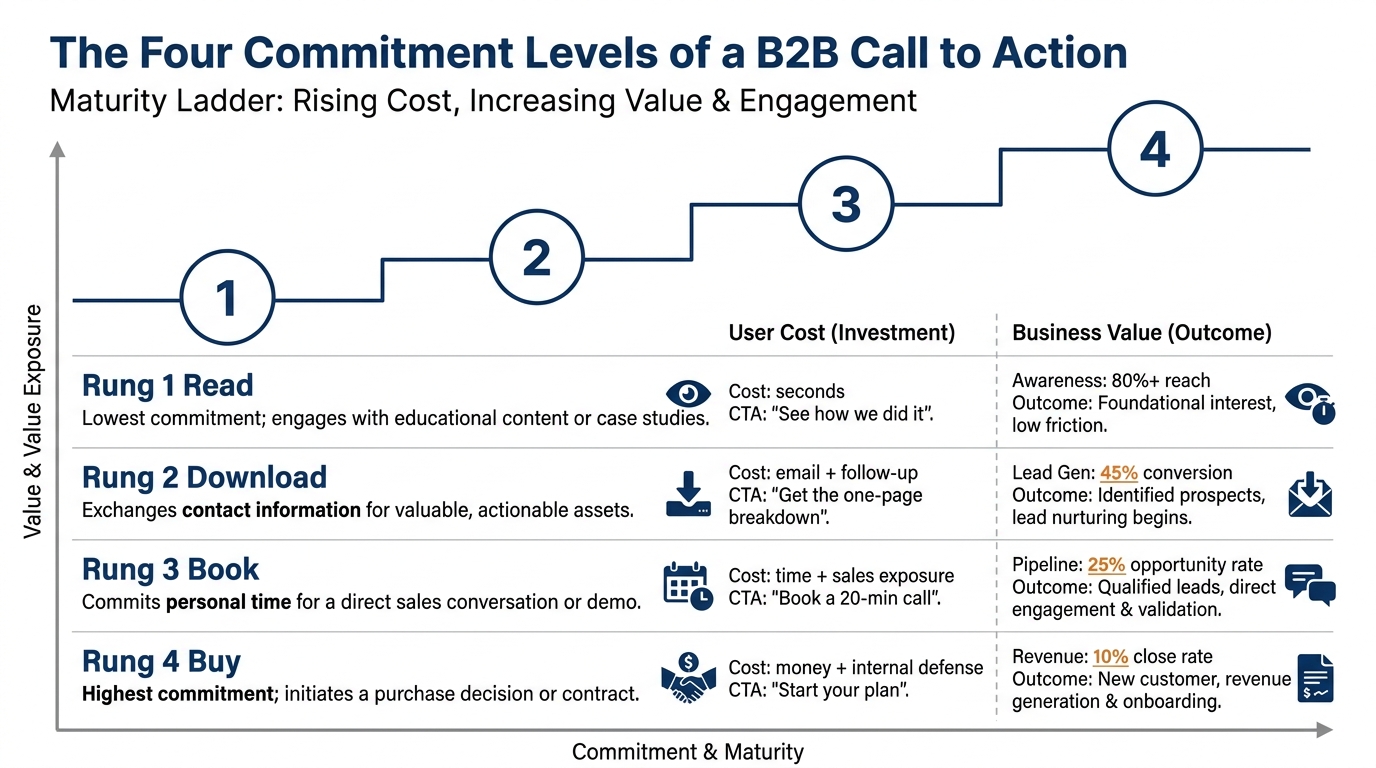
Every call to action sits at one of four commitment levels, and each one costs the visitor something different.
- Read keeps attention on the page. The cost is seconds. "See how we cut onboarding time for logistics firms" asks for a click, nothing more.
- Download trades a resource for an email. The cost is an inbox and a follow-up they expect.
- Book asks for time and exposure to a salesperson. This is where loss aversion bites hardest, because the visitor pictures a call they cannot easily end.
- Buy asks for money and a decision they have to defend internally.
A first-time homepage visitor is usually at read or download. A pricing-page visitor has moved up. Putting a "Book a strategy call" button as your only primary CTA on the homepage skips two levels, and most people will not jump them.
3. Where the call to action shows up across a B2B sale
The same logic repeats everywhere a buyer touches you. The buyer's readiness is different at each point, so the ask has to be different too. The table below maps the common places a B2B call to action appears, what the buyer is actually doing there, and the change that fits.
| Where it shows up | What the buyer does | What to change |
|---|---|---|
| Homepage first screen | Decides in seconds whether you solve their problem | Give one primary CTA and one lighter secondary. |
| Pricing page | Checks fit and cost before involving anyone else | Let them see enough to self-qualify, then ask them to book. This is the right page for the heavier ask. |
| Case study or results page | Looks for someone like them who already bought | End with a book ask tied to the result just shown, not a generic "Contact us." |
| Demo or contact form | Weighs the cost of the form against the value | Cut fields to the minimum. Each extra field raises the perceived cost of the ask. |
| Proposal | Decides whether to sign or escalate internally | Make the next step one clear action with a date, not three options that stall them. |
| Outbound email | Judges whether replying is worth the risk of a sales thread | Ask for a reply or a resource, not a 30-minute call in the first message. |
Notice the pattern. The further the buyer has traveled toward you, the heavier an ask they tolerate. A cold email that asks for a booked call fails for the same reason a homepage that asks for a purchase fails: the request outruns the readiness.
4. Why so many homepages ask for nothing
The 33% of homepages that ask for nothing usually got there by accident. One pattern is a page that ends on a logo wall or a paragraph of company history with no button at all. Another is a page where every element is a soft link and nothing is visibly the primary CTA, so the eye has no destination. A third is a page crowded with five equal buttons, which creates the same problem because the visitor cannot tell which one you want them to press.
This connects to a point about trust. If you have never made your value proposition sharp, the ask has nothing to stand on, and no button phrasing rescues a page that has not told the visitor why to bother. We covered the upstream work in how to write a B2B value proposition. Fix that first, then the call to action has something to convert.
Behavly's wider read on the same 118 firms is in homepage design lessons from 118 B2B service firms, and the month-over-month movement is tracked in the November 2026 homepage trends.
5. A worked example on one pricing page (illustrative)
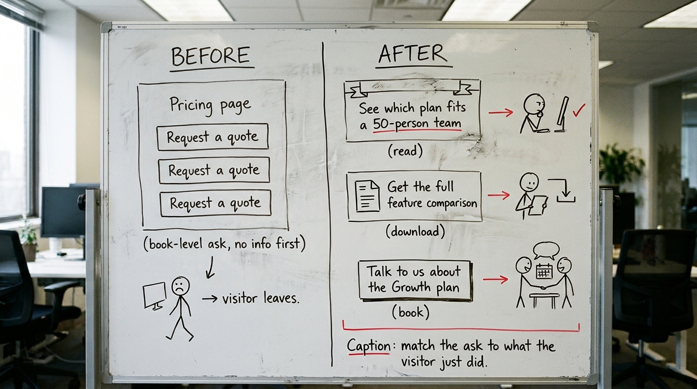
The following is illustrative, built to show the mechanism rather than report a real client. Picture a managed-services firm whose pricing page has one button, "Request a quote," repeated three times down the page.
The visitor on that page is doing something specific: checking whether the firm fits their size and budget before they involve a colleague. "Request a quote" forces them to a book-level ask before they have the information to self-qualify. Most leave, because the ask jumped ahead of what they were ready to do.
The fix puts three asks at three different points. Near the top, a visitor can see which plan fits a 50-person team. In the middle, after the plan details, the page offers a feature comparison download. At the bottom, once the visitor has reviewed the plans and the comparison, the page offers a call to discuss the Growth plan. The call-to-action appears after the visitor has the information that makes the request reasonable.
Behavly's index found only 3% of these firms show a price at all, which means most pricing pages ask a visitor to book a call just to learn what everyone else would call baseline information. That is the ask-readiness mismatch at scale.
6. Writing the CTA copy so it names the value, not the action
Weak call to action phrases describe the mechanical step: "Submit," "Learn more," "Get started." They tell the visitor what their hand does. Stronger CTA copy names the thing on the other side of the click. "See the logistics onboarding breakdown" beats "Learn more" because it answers what the visitor gets for the click.
Two things worth checking in your copy. First, confirm the words match the commitment level. A button that says "Get the guide" but drops you into a sales call breaks trust, and the visitor who feels misled will not come back. Second, be aware that people read your page already leaning toward what they expected to find, a pattern we covered in confirmation bias in B2B buying. Your primary CTA should confirm the specific outcome they came looking for, stated in their words.
Richard Thaler, who won the 2017 Nobel Prize in Economic Sciences, showed that small design choices in how a decision is presented move behavior without changing the underlying offer. The wording and placement of a call to action is exactly that kind of choice.
7. Cutting friction on the form the CTA leads to
A good ask routes to a bad form and the whole thing stalls. Baymard Institute's UX research on checkout and form design has shown repeatedly that every unnecessary field costs completions. On a B2B demo form, each field the visitor did not expect raises the felt cost of the request they already agreed to.
The rule is simple to apply. Ask only for what you need to take the next step, and nothing you could capture later in the conversation. A booked-call form rarely needs company size, budget range, and a free-text description of their problem before the call has even happened. Collect that on the call. The form's job is to honor the commitment the visitor just made, not to pre-qualify them into leaving.
8. What to change on your page this week
You do not need a redesign to fix an ask-readiness mismatch. Work through this in order.
- Find the primary CTA. Look at your first screen for three seconds and name the one action it wants. If you cannot, you are likely in the 33% with no clear ask, and that is the first fix.
- Check the commitment level. Is a first-time visitor being asked to book or buy when they are ready to read or download? Lower the first ask by one level.
- Rewrite the CTA copy to name the value. Replace any "Learn more" or "Submit" with the specific thing the visitor gets.
- Count the form fields. Remove anything you could ask on the call. Each removal lowers the perceived cost of the ask.
- Align the pricing page. If you force a quote request to see anything, add a read-level and download-level ask ahead of it.
When you are ready to see where your own ask sits against the 118 firms in the index, run Behavly's free homepage check on your page.