
A visitor who lands on your homepage decides in a few seconds whether you understand their problem. If the first screen talks about your technology stack instead of their outcome, you have spent that attention on yourself. Homepage design for a B2B service firm is mostly about three decisions: what the first screen says, what it asks the visitor to do, and what proof it puts in front of them before they scroll.
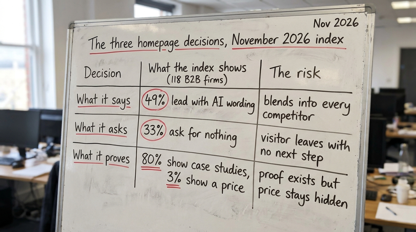
We index these three things across B2B service sites. In November 2026, across 118 firms, 49% led the first screen with AI wording, 33% asked the visitor to do nothing at all, 3% showed a price, and 80% showed case studies somewhere on the page. Those numbers describe the field you are competing in, and they explain why so many homepages feel interchangeable.
1. What the research says about the first few seconds
The Nielsen Norman Group's usability research has reported for years that people scan pages rather than read them, and that they leave quickly when a page does not signal relevance. Their eye-tracking work describes an F-shaped scanning pattern on text-heavy pages, where the first line and the left edge get the most attention and the rest is skimmed. You can read their usability research articles for the detail.
The practical reading for a homepage is simple. The top-left of your first screen does most of the work, so the words there have to name a buyer and a result. A headline that says "AI-powered solutions for modern enterprises" fails that test, because it names neither.
Baymard Institute's UX research makes a related point from a different angle: when a page does not make the next action obvious, people hesitate, and hesitation on a B2B page usually ends in a closed tab rather than a form fill. That connects directly to the 33% of firms in our index that ask for nothing on the first screen.
2. What the first screen should say
The job of the first screen is to make a specific buyer think "this is for me and my problem." For a B2B service firm, that means naming the audience and the outcome in plain words.
Compare two first-screen headlines for the same firm, a RevOps consultancy selling to private-equity-backed portfolio companies. The first reads "AI-driven revenue operations." The second reads "We connect your CRM, ERP and martech so your leadership can see the numbers in days." The second one is longer and it will outperform the first because it describes the visitor's situation, which is usually that the business runs on disconnected spreadsheets.
This is where the 49% AI-wording figure matters. When half your market opens with the same phrase, that phrase stops carrying information. It becomes background. The homepage best practices worth following here are boring on purpose: say who you help, say what changes for them, and save the method for the section below the fold.
Translate the capability into the buyer's result
A useful test for your b2b homepage headline: if you could paste it onto a direct competitor's site without anyone noticing, rewrite it. Specificity is the only thing that survives comparison, and buyers compare on the first screen whether you want them to or not.
3. What the first screen should ask
A third of the firms we index ask for nothing above the fold. No primary action, no form, sometimes not even a visible button until you scroll. That is a choice to let interested visitors drift, and it is the easiest thing on this list to fix.
You do not need an aggressive ask. A single primary action, stated plainly, is enough. For a service firm, that is usually one of three: book a short call, see a specific piece of proof, or run a low-risk check. The important part is that there is exactly one obvious next step and it matches where the visitor is in their thinking.
Most homepage visitors are not ready to talk to sales, so a demo-request form as the only option filters out everyone who is still deciding whether you are relevant. A lower-commitment action, such as viewing a worked example or running a free assessment, keeps those people moving. Robert Cialdini's work on influence and commitment describes why small first steps convert better than large ones: a person who takes a small action is more likely to take the next.
4. What the first screen should prove
Proof is the one area where B2B service firms mostly do something: 80% in our index show case studies. The problem is placement and specificity. A logo wall with no outcome attached shows you have clients, but it does not show what changed for them.
Cialdini's research on social proof explains the mechanism: people look to the behavior and judgments of similar others to decide what to do, and the closer the match, the stronger the effect. For a B2B buyer, "similar others" means a firm in their industry, at their size, with their problem. A named result from a comparable company does far more than ten unexplained logos.
Then there is price. Only 3% of indexed firms show a price on the homepage. That is a defensible choice for custom service work, but it has a cost: buyers who cannot find any pricing signal often assume the worst and self-select out, or they ask for a quote mainly to discover the number. You do not have to publish a rate card. A range, a starting point, or a plain statement of how you scope and charge removes a quiet source of friction.
5. A worked example on one page (illustrative)
The following is illustrative, built to show the pattern, not a real client or a reported result. Picture the homepage of a mid-sized firm that does data and web work for private-equity portfolio companies.
The current first screen reads "Enterprise-grade AI and data solutions," with a stock image and a "Learn more" link that scrolls down. It names no buyer, asks for almost nothing, and shows no proof until three screens down. It sits squarely inside the 49% and the 33% at once.
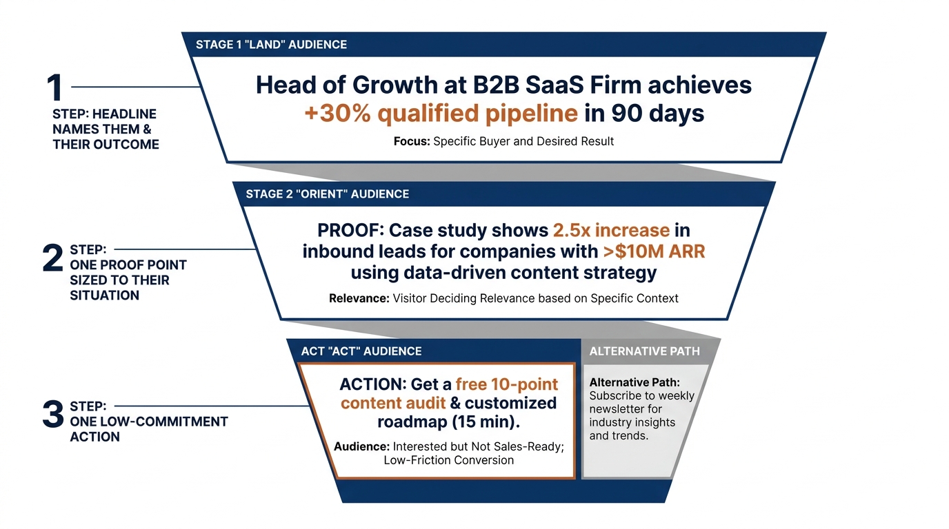
The revised first screen reads "For PE-backed companies still running on Excel: a unified view of revenue, in days not quarters." Directly beneath it sits one line of proof sized to the reader, for example a short, specific description of connecting three systems for a portfolio company and surfacing the first dashboards within a week, clearly labeled as a representative engagement rather than a metric. The primary action is "Run a free homepage check on your own page," a low-commitment step. A secondary line states how the firm scopes and prices initial work, which answers the price question without publishing a rate card.
Nothing in that revision is clever. It names a buyer, offers one proof point, asks for one small thing, and removes the price mystery. That is most of what homepage design has to accomplish on the first screen.
6. The homepage first-screen table
Use this to audit your own page. Read each row as a place the buyer forms a judgment, then decide what you would change.
| Where this shows up | What the buyer does | What to change |
|---|---|---|
| Homepage headline (first screen) | Decides in seconds whether you understand their problem | Name the buyer and the outcome; cut generic AI wording if a competitor could reuse the line |
| Subhead and supporting line | Confirms relevance to their industry and size | Describe their situation (for example, "running on disconnected spreadsheets"), not your method |
| Primary action above the fold | Looks for one obvious next step | Give exactly one low-commitment action; replace a demo-only ask with a check, example, or short call |
| Proof near the top | Looks for a firm like theirs that got a result | Attach a specific outcome to at least one named or clearly comparable case; drop bare logo walls |
| Pricing signal | Tries to gauge cost and whether to engage | State a range, a starting point, or how you scope; do not leave zero pricing signal |
| Proposal and demo form | Weighs effort against interest | Ask only for fields you will use; match the ask to how ready the visitor actually is |
7. Why these patterns persist across the index
The reason half of B2B homepages open the same way is that AI wording feels current and safe, and safe copy is easy to approve internally. The reason a third ask for nothing is that a confident single action requires a decision about what the page is for, and that decision is often deferred. You can see the field-level version of all three patterns in our homepage trends from November 2026.
Daniel Kahneman's work on fast, intuitive judgment, recognized with the 2002 Nobel Prize in Economic Sciences, is a useful backdrop here: most of the first-screen judgment is quick and low-effort, so the page has to do the relevance work for the visitor rather than asking them to reason their way to it. That is the whole case for a specific headline, one clear action, and proof sized to the reader.
For the broader argument that distinctiveness and clear mental availability drive B2B buying, the Ehrenberg-Bass Institute is worth reading, because a homepage that looks like every competitor's is working against its own brand, not just its conversion rate. GrowthShuttle writes about aligning this kind of positioning with how the business actually sells; their main site covers the strategy side that sits behind the page.
8. What to change on your page this week
You do not need a redesign to fix most of this. Work through the list in order and stop when you run out of time; the first item moves the most.
- Rewrite the headline to name a buyer and an outcome. A headline that any competitor could use unchanged is not specific enough to do its job. The 49% AI-wording problem appears most often in headlines.
- Add one primary action to the first screen. If you are in the 33% that ask for nothing, pick a single low-commitment step and make it the one obvious button.
- Attach a result to one piece of proof near the top. Replace a bare logo row with one specific, comparable case, labeled honestly.
- Add a pricing signal. A range or a plain statement of how you scope work removes a quiet reason buyers leave.
- Trim your demo or proposal form. Remove every field you will not actually use before the first conversation.
Each of these is an hour of work, not a quarter. Done together, they change what the first screen says, asks, and proves, which is the part of homepage design that decides whether a qualified visitor stays.
If you want an outside read before you change anything, run Behavly's free homepage check on your own page and see how your first screen scores on these three decisions.