
By the time a B2B buyer lands on your homepage, they usually already have a working answer. They have talked to a peer, read a comparison, or shortlisted three vendors, and they arrive looking for reasons to keep you in or drop you out. Confirmation bias is the habit of reading new information as support for what you already believe, and it governs those first ten seconds on your page more than any feature list you wrote. If your page does not quickly confirm the buyer's hunch that you fit their situation, they leave, and most of them never tell you why.
This guide explains the behavior, shows where it shapes decisions across a homepage, a case study page and a sales deck, and gives you a usable table and a short list of changes to make this week.
1. What the research says
The term goes back to Peter Wason's 1960 experiments, where people testing a rule sought out cases that fit their guess and avoided cases that would break it. Daniel Kahneman, who won the Nobel Prize in Economic Sciences in 2002, later folded this into a broader account of how fast, intuitive judgment runs ahead of slow, deliberate checking. The short version for your page: people form a quick impression, then spend most of their attention looking for evidence that the impression was right.
There is a close cousin worth naming. Selective exposure is the tendency to choose which information to look at in the first place, so a buyer who suspects you are too expensive may skim past your value section entirely. The Decision Lab keeps a plain-language reference on both, which is a good place to send a skeptical colleague (The Decision Lab).
None of this means one bias explains a whole purchase. A six-figure platform decision involves budget, politics and risk. Confirmation bias explains a narrower thing: how a buyer reads your page once they have half decided, and how little it takes to be confirmed out of the running.
2. How confirmation bias shows up in marketing before anyone contacts you
The uncomfortable part of confirmation bias in marketing is that most of it happens off your site. A buyer builds a belief from a referral, an analyst note, or a competitor's comparison page, then visits you to check it. Nielsen Norman Group's usability research describes this scanning behavior well: users do not read, they hunt for the words that match the question in their head (Nielsen Norman Group).
So the buyer who was told "they only do enterprise" scans for a logo wall and a mention of team size. The one who heard "they are a RevOps shop, not a web shop" scans for the word RevOps. If the confirming evidence is not where they look, the prior belief wins by default, because the absence of a counter-signal reads as agreement.
This is why generic positioning fails against a buyer with a prior. In Behavly's November 2026 index of 118 B2B service firms, 49% led the first screen with AI wording. If every third homepage says the same thing, AI phrasing confirms nothing and corrects nothing. You can see the full breakdown in our homepage trends, November 2026.
3. Where it shows up on a B2B website and in a sales process
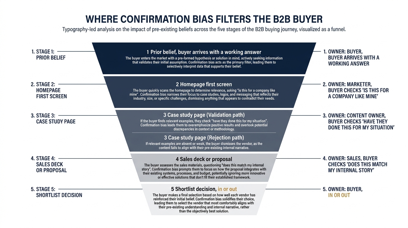
Three surfaces carry most of the weight. On the homepage, the buyer checks "is this for a company like mine" in the first screen. On the case study page, they check "have they done this before, for my situation, with a result I can defend internally." In the sales deck or proposal, they check whether what you present matches the story they have already started telling their boss.
Each surface has a failure pattern. When a homepage names no specific buyer segment, it confirms nobody. A case study library that is 80% logos and 20% specifics (the index shows 80% of firms show case studies at all, but most are thin) confirms a vague impression of busyness and little else. A deck built as a tour of your capabilities invites the buyer to scan for doubt rather than fit.
4. The three-column map you can act from
Before the worked example, here is the core table. Use it as a working document: find your surface in the left column, name what your buyer is actually doing, then make the change in the right column instead of guessing.
| Where it shows up | What the buyer does | What to change |
|---|---|---|
| Homepage first screen | Scans for proof you serve a company like theirs, then confirms or dismisses in seconds | Name the buyer's segment and situation in the headline, not your category or "AI-powered" wording |
| Case study page | Hunts for a story that matches their industry, size and problem so they can defend the shortlist internally | Lead each study with the client's situation and a defensible number, not the logo and the service name |
| Pricing page | Arrives with a budget belief and looks for a reason it is right or wrong; 3% of firms show any price | Give a band or a starting point so the buyer can confirm fit rather than assume you are out of range |
| Demo or contact form | Reads the ask as a signal of how heavy you are to work with; 33% ask for nothing at all | Match the form length to the buyer's stage, and say what happens after they submit |
| Sales deck or proposal | Looks for the slide that matches, or contradicts, the story they have already told their boss | Open with their situation in their words, then your fit, before any capability tour |
| Outbound email | Decides in the first line whether this is "for us" and deletes if it reads generic | Reference a specific, verifiable detail about their business in sentence one |
5. A worked example on one page (illustrative)
The following is illustrative, not a real client result, and the numbers are invented to show the mechanics. Picture a vendor selling data and reporting work to private equity portfolio companies. A deal team member lands on the homepage with a prior: "these web agencies do not understand our reporting problem."
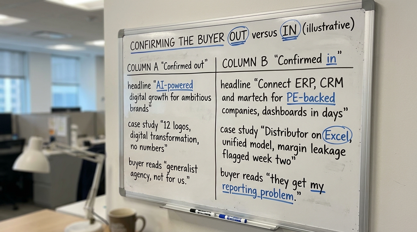
The current first screen reads "AI-powered digital growth for ambitious brands." The buyer scans for "reporting," "portfolio," or "EBITDA," finds none, and confirms the prior. The case study page shows twelve logos and three paragraphs each about "digital transformation." Nothing names a portfolio company or a financial outcome, so the vague impression of a generalist agency holds.
Now rewrite for the same buyer. The first screen reads "We connect ERP, CRM and martech for PE-backed companies and ship the first dashboards in days." The case study opens "A distributor acquired six months earlier ran the business on Excel. We built a unified model and flagged margin leakage in week two." The buyer looking for confirmation that you get the reporting problem now finds it, and the prior flips. Same company, same work, different evidence placement.
6. Writing for a buyer who has half decided
Two mistakes are common. The first is trying to argue the buyer out of their belief with volume. More claims do not beat a prior, because the buyer reads extra copy as noise and keeps their answer. The second is hiding the one detail that would confirm fit below a wall of capability text, where selective exposure means they never reach it.
The better move is to surface the confirming detail early and make the disconfirming question easy to ask. If a buyer suspects you are too expensive, a price band confirms or corrects that in one line, which is why the 3% of firms in our index that show any price get a cleaner conversation. If a buyer suspects you do not serve their industry, naming the industry in the first screen does the work that ten testimonials cannot.
You are not manipulating anyone. You are placing the true, relevant evidence where the buyer is already looking, so a good-fit buyer confirms correctly and a bad-fit buyer self-selects out before you both waste a call.
7. Confirmation bias examples you can check on your own pages
Walk your own site as the skeptic who was warned about you. A few concrete confirmation bias examples to look for:
- Your homepage headline names your category ("digital agency") rather than the buyer's situation, so a buyer with a niche need confirms you are too general.
- Your case studies lead with the service delivered rather than the client's starting problem, so a buyer cannot find the story that matches theirs.
- Your pricing page is a contact form, so a budget-anxious buyer confirms "probably out of our range" and never asks.
- Your demo form asks for twelve fields, so a buyer confirms "heavy process, not for a quick evaluation."
- Your outbound opens with your company history, so the recipient confirms "generic blast, delete."
For the case study pattern specifically, Baymard Institute's UX research on how users evaluate content is a useful reference on why scannable, situation-first copy beats dense prose (Baymard Institute).
8. What to change on your page this week
Pick the surface where you lose the most shortlisted buyers and fix the confirming evidence there first. A realistic week looks like this:
- Rewrite the homepage first screen to name one buyer segment and one concrete situation, and cut the AI wording if it is doing no work.
- Re-order your two strongest case studies so each opens with the client's starting problem and one defensible number, not the logo.
- Add a price band or a starting point somewhere a budget-anxious buyer will look, even if it is a range.
- Trim your demo form to the fields you genuinely need at that stage, and add one line saying what happens next.
- Rewrite the first sentence of your outbound template to lead with a specific detail about the recipient's business.
Do not try all five at once. Change one, watch how shortlisted buyers behave over two or three weeks, then move to the next. Confirmation bias cuts both ways, so once a good-fit buyer finds the evidence they were hunting for, the rest of your page gets read in a more generous light.
If you want an outside read on what your first screen confirms or contradicts for a buyer who already has a working answer, run Behavly's free homepage check on your own page and see which belief it confirms in the first ten seconds.