
Most B2B deals do not die because a buyer picked a competitor. They die because the buyer decided the safest move was to keep doing nothing. Risk aversion is the reason a committee that liked your demo still goes quiet, and it sits behind more lost pipeline than any feature gap you can name. The buyer is not weighing your upside against a rival's upside. They are weighing the career cost of a bad call against the comfort of the status quo, and the status quo usually wins by default.
Your website is where that calculation starts. If the page raises more questions than it answers, the buyer does the rational thing for their own career and waits. This guide maps the kinds of risk a B2B buyer carries, shows where each one surfaces on a real page or in a sales process, and gives you a table you can act on this week.
1. What the research says about risk aversion
The sharpest description of this behavior comes from Daniel Kahneman and Amos Tversky's work on loss aversion, which earned Kahneman the Nobel Prize in Economic Sciences in 2002 (Kahneman's Nobel Prize page covers the work). Their finding was that people feel the pain of a loss roughly twice as strongly as the pleasure of an equivalent gain. A buyer does not treat a potential win and a potential mistake as equals. The mistake looms larger, so they protect against it.
In a B2B purchase, that instinct multiplies because the decision is not just financial. The person signing off also carries reputational exposure inside their own company. If the project fails, the budget loss is the company's problem, but the explaining is theirs personally. That is why a rational buyer with budget approved will still stall: the downside is concentrated on them, and the upside is shared across the organization.
2. Where risk aversion shows up on a B2B website
You can see it in the questions a visitor is silently asking as they scroll. The homepage question is whether you understand their business well enough to be worth a call. The pricing page question is whether talking to you commits them to anything. The demo form question is how much of their time and contact information they are handing over before they know if this is real.
Our November 2026 homepage index of 118 B2B service firms shows how often pages leave those questions open. Only 3% show a price anywhere on the first screen, and 33% ask the visitor for nothing at all, meaning the next step is unclear. Meanwhile 49% lead with AI wording that tells the buyer nothing about risk. You can see the full breakdown in our homepage trends from November 2026. A page that hides price and leaves the next step vague is asking a risk-averse buyer to commit without information, and they will not.
Perceived risk also compounds other biases. A buyer looking for reasons to stay safe will read your page to confirm what they already fear, which is the pattern we cover in confirmation bias in B2B buying and what it means for your website. And once a buyer has committed time to an incumbent vendor, the pull to keep going is its own problem, which we unpack in the sunk cost fallacy in B2B vendor decisions.
3. The four kinds of risk a buyer is weighing
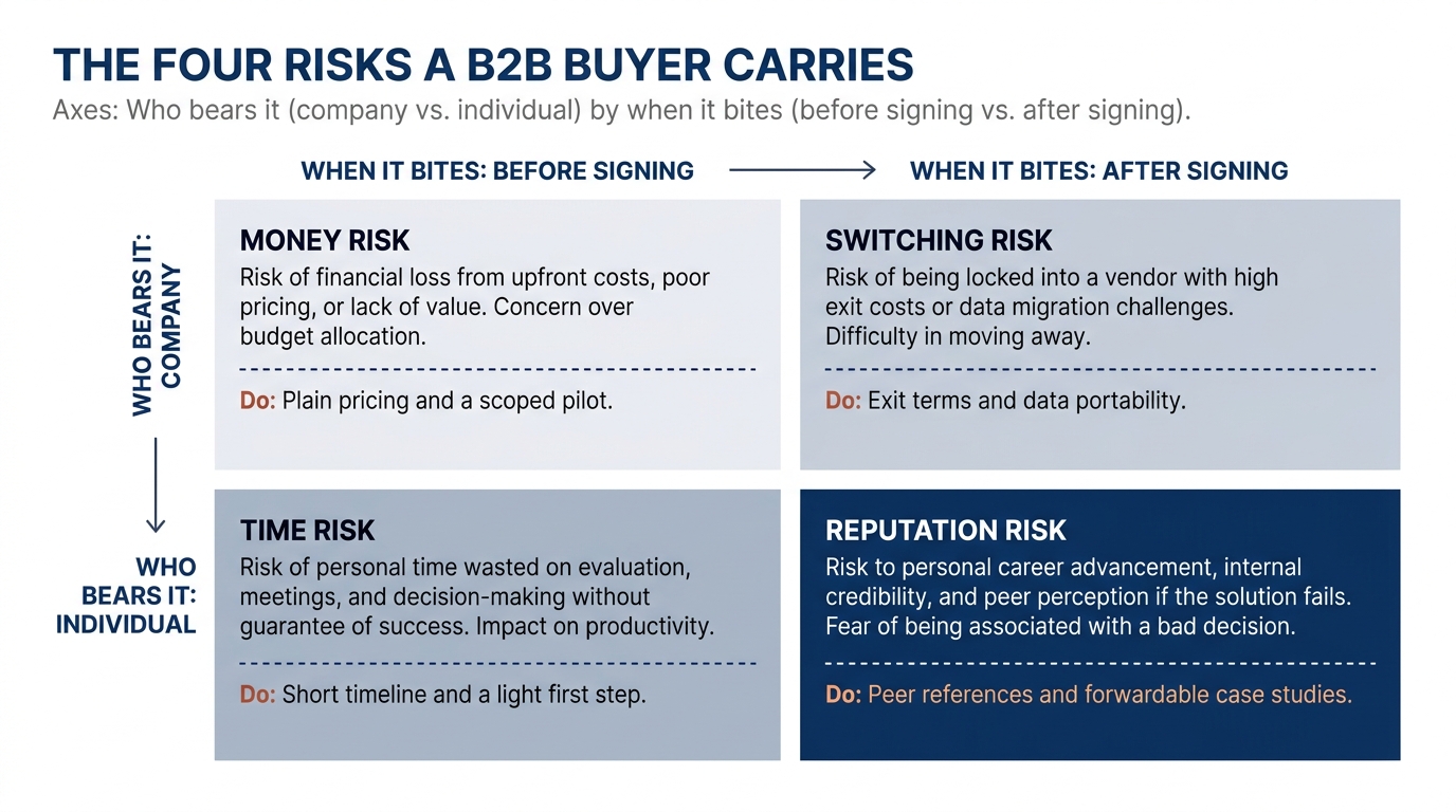
Risk aversion has four components: money, time, reputation and switching. Each requires a different page element. A testimonial addresses reputation risk (whether this vendor is credible) but does not address switching risk (whether the old system can be replaced safely). A guarantee addresses money risk (whether the cost is recoverable if it fails) but does not address time risk (whether the engagement will drag on).
- Money risk. Will this spend be wasted? Lowered by plain pricing, scoped pilot projects, and a clear statement of what the first payment buys.
- Time risk. How long until I know if this works, and how much of my week does it cost? Lowered by short timelines, named deliverables, and a light first step.
- Reputation risk. If this fails, how exposed am I internally? Lowered by references from peers in the same role, named case studies, and proof the buyer can forward to their boss.
- Switching risk. What happens if we start and want out? Lowered by exit terms, data portability, and the absence of a long lock-in.
Nielsen Norman Group's usability research has long found that unanswered questions on a page translate directly into hesitation and abandonment (their research articles document this across B2B and B2C). Answer the specific worry before the buyer has to ask.
4. How risk reversal actually works
Risk reversal means moving some of the downside off the buyer and onto you. The term shows up constantly in marketing writing, but most pages apply it as a slogan rather than a structure. A line that says "100% satisfaction guaranteed" lowers almost nothing, because the buyer cannot picture what triggers it or what they get back.
Useful risk reversal names the condition, the remedy and the limit. "If the pilot does not hit the agreed metric in 30 days, you pay nothing and keep the work" addresses money risk and time risk together because it bounds both the cost and the calendar. Robert Cialdini's work on influence, summarized at Influence at Work, is often cited in conversion discussions, though reciprocity and commitment operate through different mechanisms than loss shifting. A guarantee reduces risk by moving the downside from the buyer to the vendor.
The strongest form of risk reversal in B2B services is the pilot. A small, scoped, time-boxed engagement lets the buyer test you with a loss they can absorb and explain. It converts a large irreversible bet into a small reversible one, which is exactly the trade a risk-averse buyer is looking for.
5. A worked example on a pricing page (illustrative)
Consider a mid-market data firm whose pricing page says "Custom pricing. Contact us for a quote." A buyer landing there encounters all four risks at the same time with no mitigation. Money risk remains open because no number appears. Time risk remains open because "contact us" implies a sales process of unknown duration. Reputation risk remains open because the buyer has nothing to forward to a colleague or manager. Switching risk is unaddressed because the page says nothing about reversibility, data ownership or exit terms. (This is an illustration of the mechanism, not a client engagement.)
Rewrite the same page to address the risks in sequence. Add a starting figure, even a "pilots from $X" range, to partially close the money question. Add a line stating the pilot runs two weeks and requires four hours from the buyer's team, bounding time. Add two named references from the same industry and role, giving reputation cover. Add a sentence on data ownership and a 30-day exit clause, addressing switching. The price has not changed. The amount the buyer must risk to discover the price has, and that reduction removes the stopping point.
The Decision Lab's reference on loss aversion (The Decision Lab) is a good plain-language check if you want to confirm the mechanism before you rewrite. The point for your page is narrow: every open question is a place the buyer supplies the worst-case answer themselves.
6. The table to work from
This is the work product. Each row is a place on your site or in your sale where risk aversion surfaces, what the buyer does when the worry is unanswered, and the specific change that lowers it. Map your own page against it.
| Where it shows up | What the buyer does | What to change |
|---|---|---|
| Homepage first screen with no clear next step (33% of firms in our index) | Reads, finds no low-commitment action, leaves to compare | Add a light next step that costs them little: a short assessment, a scoped pilot, or a sample, not just "book a call" |
| Pricing page with "contact us" only (97% hide price) | Assumes it is expensive and a long sales cycle, stalls | Show a starting figure or a pilot range so the money risk is bounded before the call |
| Demo or contact form asking for many fields | Weighs the time and data given against unknown value, abandons | Cut fields to the minimum, state what happens next and how long it takes |
| Case studies that praise you but name no metric (80% show case studies) | Cannot forward anything credible to their boss, delays | Add a named metric and a peer in the same role the buyer can point to internally |
| Proposal with a large fixed scope and one price | Sees an irreversible bet, asks for "time to think" | Lead with a scoped pilot and a clear condition for continuing or stopping |
| Contract terms buried or absent on the site | Fears lock-in, raises it late or walks | State data ownership and exit terms plainly before the buyer has to ask |
| Outbound email promising a big outcome | Discounts the claim, does not reply | Offer a small, specific, reversible first step instead of the full engagement |
7. What to change on your page this week
Start with the page the conversion index flags as the weakest and the single most common objection that page leaves unaddressed. A page that tries to close four objections at once signals defensiveness rather than confidence. If the index shows visitors leaving because the next step is unclear or the price is hidden, address that one point first.
- Add a low-commitment next step to your homepage first screen, worded so the buyer can see exactly what it costs them in time and money.
- Put a starting price or a pilot range on your pricing page, even if the full number stays custom.
- Rewrite one case study so it names a metric and a peer role the buyer can forward internally.
- Add a single plain sentence on exit terms or data ownership wherever you ask for a commitment.
- Replace a "satisfaction guaranteed" line with a specific condition, remedy, and limit.
Baymard Institute's UX research on forms and checkout (Baymard's research library) is a useful reference if the form is where you start, since field count and unclear next steps are among the most measured sources of abandonment. The same logic applies to a demo request as to a cart.
When you have made one change, see how your own page reads to a buyer who is looking for a reason to wait. Run Behavly's free homepage check on your page and start with the question your buyer is silently asking.