
Most of what you read about consumer behavior was measured on one shopper deciding alone, in a few seconds, spending their own money. A B2B purchase rarely looks like that. A committee of five or six people evaluates you over weeks, inside a budget cycle, and at least one of them carries personal career risk if the choice goes wrong. So some of the famous findings still apply to your homepage and your pricing page, and some of them quietly fall apart. This guide sorts them, then shows where each one shows up on a real B2B page and what to change.
I run Behavly's homepage index, where we review the first screen of B2B service firms. In November 2026, across 118 firms, 49% led with AI wording in the first screen, 33% asked the visitor for nothing at all, only 3% showed a price, and 80% showed case studies. Those four numbers already tell you which behaviors firms are leaning on and which they are ignoring.
1. What the research actually says about buyer behavior
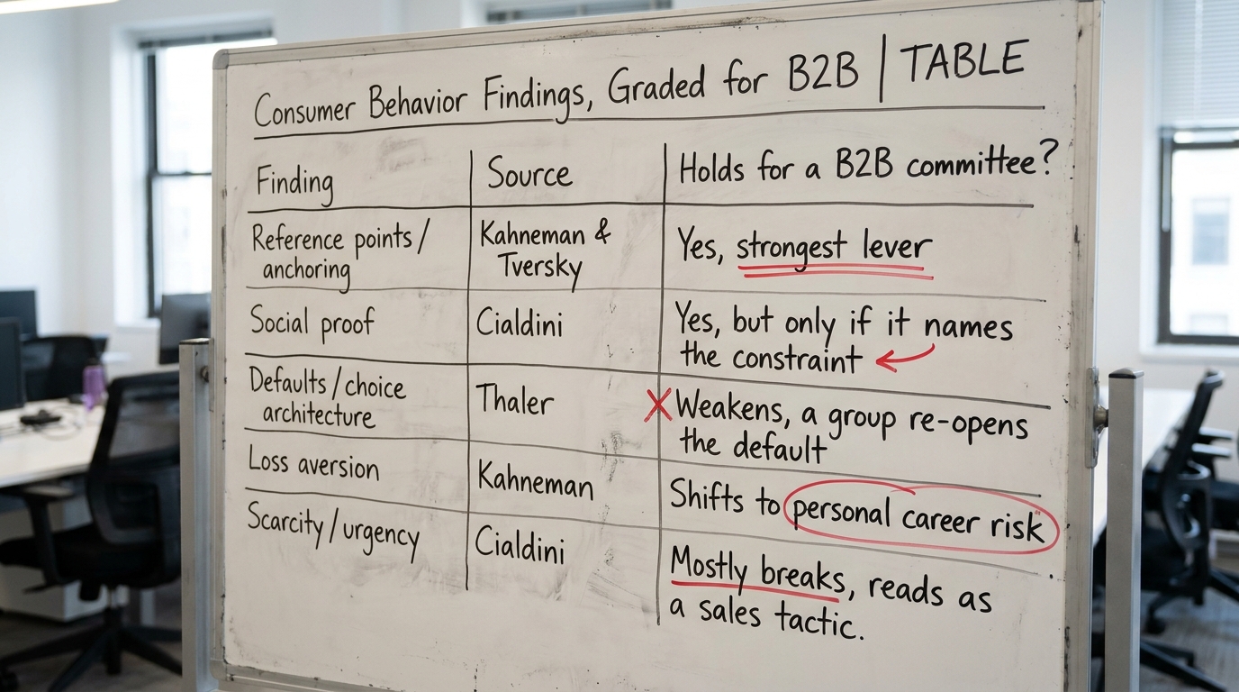
The core findings people quote under "consumer behavior" come from a small set of sources. Reference points and loss aversion trace to Daniel Kahneman and Amos Tversky, work that earned Kahneman the 2002 Nobel in Economic Sciences. Defaults and choice architecture come from Richard Thaler, recognized with the 2017 Nobel. Social proof as a persuasion principle is Robert Cialdini's, laid out through Influence at Work.
The honest summary is that these describe how a person reacts to a single choice presented a single way. B2B buyer behavior layers a group, a budget and a timeline on top of that individual reaction. The individual effect does not disappear, but it has to survive being discussed out loud by people who disagree. That filter is what decides whether a finding holds.
2. Reference points hold, and most B2B pages waste them
A price means nothing until the buyer has something to compare it against. Kahneman and Tversky showed that the same number reads as expensive or cheap depending on the reference point set just before it. In B2B this is the single most useful finding, because your buyer almost never arrives with a reference point for what your service should cost.
On a pricing page, the reference point is whatever you put next to the number: the cost of the problem, the cost of the in-house alternative, or a higher tier the buyer rules out. The 3% of firms in our index that show a price mostly show it naked, with nothing to anchor it against. That is the waste. A buyer who sees "$6,000/month" with no frame compares it to zero, because zero is the only other number on the screen.
If you are rewriting the line that frames the number, our note on how to write a B2B value proposition covers the reference point the price sits against.
3. Social proof holds, but the committee reads it differently
Cialdini's social proof principle is real, and 80% of the firms we reviewed show case studies, so the instinct is right. What breaks is the assumption behind most consumer studies: that the viewer trusts the proof at face value. A committee does not. One member is specifically looking for the reason your case study does not apply to them, and a logo wall of your best outcomes gives them the opening.
The problem is survivorship. You publish the engagements that worked, so the buyer sees a success rate that no vendor actually has. We wrote about this in survivorship bias in case studies and marketing benchmarks, and it matters here because the skeptic on the committee already assumes it. Proof that names the constraint it worked under, the industry, the team size, the starting point, survives that reading. Proof that only shows the win does not.
That same skeptic is running confirmation bias in both directions: the champion reads your page for reasons to proceed, the doubter reads it for reasons to stop. Both are on the committee.
4. Defaults weaken the moment a group is in the room
Thaler's work on defaults is powerful for an individual, because most people accept the pre-selected option rather than change it. The default enrollment effect moves millions of people. In a B2B sale, the default you set, a recommended tier, a pre-ticked plan, gets re-opened the instant it reaches the group, because approving a default is exactly what a committee exists to not do.
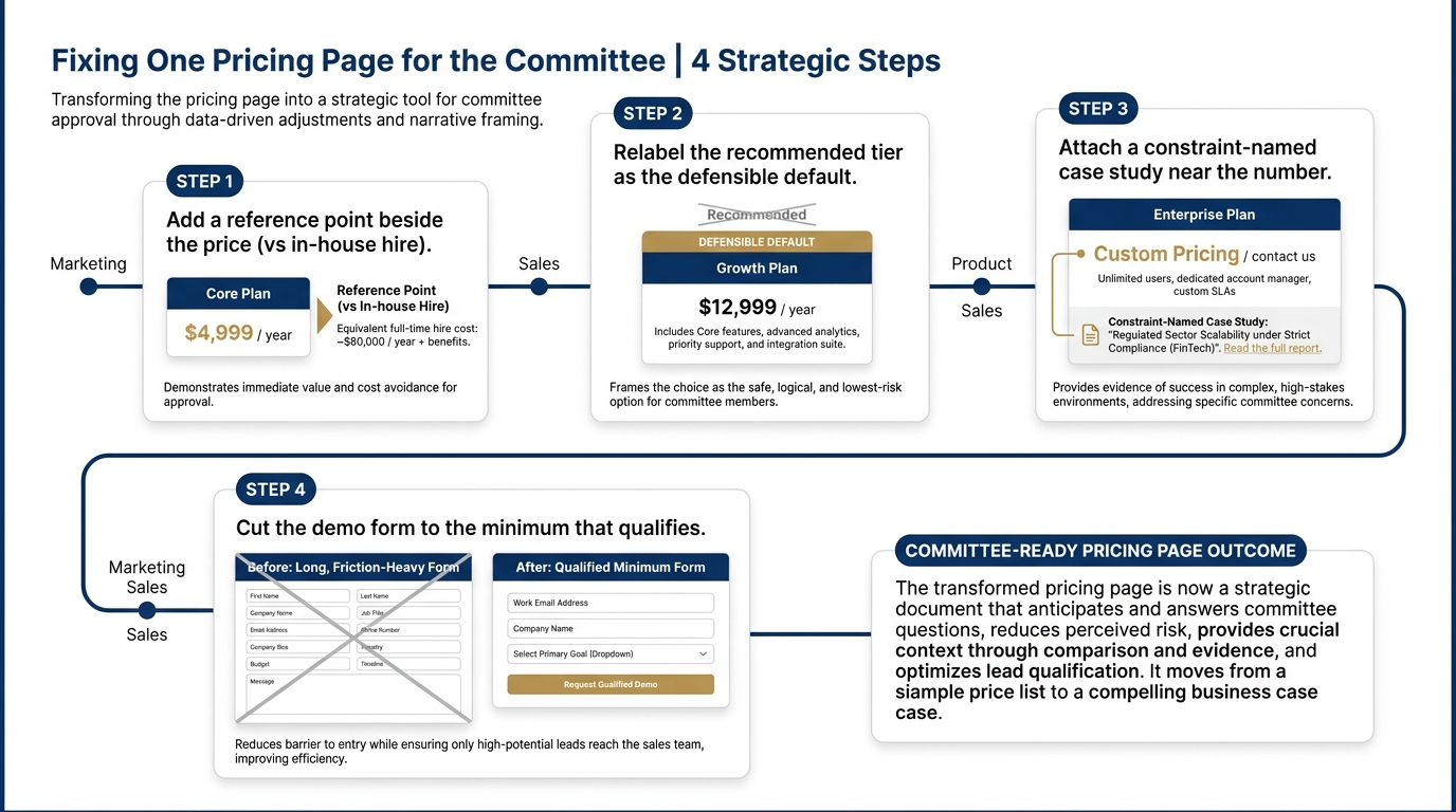
So a default still helps you, but as a starting proposal the room can rally around, not as a decision that sticks by inertia. On a proposal, this means your recommended option should be the one that is easiest to defend to a finance reviewer who was not on the demo call, not simply the one you most want to sell. The group will pressure-test it, so arm the champion with the reason it is the right default.
5. Loss aversion holds, but the loss that matters is personal
Loss aversion, the finding that a loss feels larger than an equivalent gain, is robust. The mistake is aiming it at the company's money. The loss your buyer weighs most heavily is personal: the one who recommends you and is wrong looks bad in front of peers for the next year. That is a sharper loss than a line item.
This is why the sunk cost fallacy shows up so strongly once a buyer has committed internally. Having spent political capital to champion you, they are reluctant to reverse, which helps you after signature and hurts you before it, because they are just as reluctant to champion an unproven choice in the first place. Your page reduces the personal loss when it makes the buyer look careful: references they can call, a small first phase, a way to test before committing the whole budget.
6. Where each finding shows up on your pages, and what to change
Here is the working version. Each row is a place the behavior surfaces in a real B2B page or sales step, what the buyer does there, and the specific change.
| Where it shows up | What the buyer does | What to change |
|---|---|---|
| Pricing page, the number itself | Compares your price to zero, the only other figure on screen | Place a reference point beside it: cost of the problem or the in-house alternative |
| Homepage first screen | Scans for whether you solve their specific problem, not generic AI wording | Lead with the named problem, not the 49%-common AI claim everyone else runs |
| Case studies section | The skeptic hunts for why this win does not apply to them | Name the constraint each case ran under: industry, team size, starting point |
| Proposal, recommended tier | Re-opens the default because approving defaults is not what a committee does | Make the recommended option the easiest to defend to an absent finance reviewer |
| Demo form or contact step | 33% of firms ask for nothing, so a heavy form feels like a cost before value | Ask for the minimum that qualifies, and say what happens next |
| Outbound email | Reads in seconds, deletes anything that sounds like a mass send | Open on their reference point, one specific observation about them |
Nielsen Norman Group's usability research on how people read pages supports the scanning behavior in rows two and six: your first screen and your first email line get read, the rest gets skimmed. For the email specifically, see our pieces on cold email copy based on how B2B buyers read and how to write a follow-up email after a sales call.
7. A worked example on one pricing page (illustrative)
This example is illustrative, not a client result. Take a managed-service firm whose pricing page shows three tiers and a "from $6,000/month" line. A committee lands there from a demo. The champion wants to proceed, a finance reviewer who missed the demo is comparing it to doing nothing, and a technical lead is deciding whether the case studies apply.
Applying the findings in order: the price gets a reference point, one line stating that an in-house hire for the same scope runs several times the retainer. The recommended tier is relabeled as the one most firms of their size start with, so it reads as a defensible default rather than an upsell. One case study near the price names its constraint plainly, a firm of similar size and sector, so the technical lead cannot dismiss it as survivorship. None of this is a trick. It gives the group the comparisons and the cover they were going to look for anyway.
The change, measured in outcomes, is fewer buyers stalling because they could not build the internal case, which is the actual bottleneck in a complex B2B sale.
8. Which findings to stop leaning on
Two popular levers mostly break in B2B and are worth dropping. Scarcity and false urgency, the countdown timer and the "3 spots left" line, read to a committee as a sales tactic and lower trust rather than raising it. A group that is already slow because of a budget cycle will not be rushed by an artificial clock, and the finance reviewer notices the manipulation.
The second is treating any single bias as the explanation for the whole purchase. Reference points, social proof and defaults each nudge one moment. None of them decides a six-person, multi-week evaluation on its own. The Decision Lab's reference material on behavioral science is useful precisely because it keeps each effect in its own lane rather than selling one as a master key. Build your page to help the group's actual process, then let the individual effects do their small part inside it.
9. What to change on your page this week
Pick the three changes with the shortest path from your desk to live:
- Put one reference point next to your most visible price or the strongest claim that currently stands alone.
- Rewrite your two best case studies to state the constraint each ran under, so the skeptic cannot dismiss them.
- Replace generic AI wording in your first screen with the specific problem you solve, since nearly half your market is running the same undifferentiated line.
If you want the full picture of what the first screen looks like across the market before you change yours, the homepage trends for November 2026 and the longer read on homepage design lessons from 118 B2B service firms give you the comparison set.
When you are ready to see which of these behaviors your own first screen is helping or fighting, run Behavly's free homepage check on your page.