
Most B2B teams run a test on something nobody would have noticed either way: a button color, a word in the footer, a hero image swap. The traffic gets spent, the result lands inside the margin of error, and the team concludes that testing does not work for them. The problem is usually that the idea was too small to show up, or it tested something visitors never read. Good a/b testing examples start from a behavior you can name, applied to a page a buyer actually reads before deciding.
Below are test ideas for the pages where B2B deals move: the homepage first screen, the pricing page, the demo form, the proposal, and outbound email. Each one gives you the behavior it rests on, a hypothesis, the metric to watch, and one change to ship. Every example is illustrative. I am not reporting a result you can copy; I am giving you a hypothesis to run on your own traffic and judge for yourself.
One honest caveat before the list. If you get a few hundred visits a week to a page, you will not resolve a small effect in a reasonable window. Ron Kohavi, Diane Tang and Ya Xu lay out the sample-size math plainly in Trustworthy Online Controlled Experiments, and Evan Miller's How Not To Run an A/B Test explains why stopping the moment a result looks good inflates your false positives. Pick tests where the change is large enough to show up, and let them finish.
1. Replace the AI claim in your first screen with a specific outcome
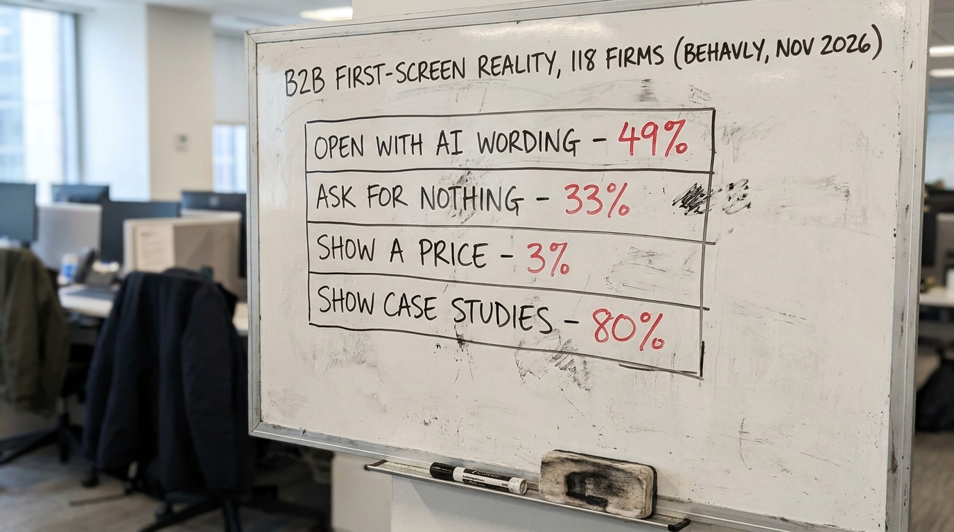
In Behavly's homepage index of 118 B2B service firms from November 2026, 49% open with AI wording in the first screen. When half a category says the same thing in the same place, the words stop carrying information for the reader. Nielsen Norman Group's usability research on homepages has long shown that visitors skim the top and leave fast when the value is generic, which you can read through the NN/g research articles.
Page: homepage first screen.
Hypothesis: Replacing "AI-powered [category] platform" with a concrete outcome for one named buyer type will raise the click rate into the next step, because a specific claim is easier to evaluate than a crowded one.
Metric to watch: click-through from the first screen to pricing or demo. Not scroll depth, not time on page.
Change this week: write a variant headline that names who it is for and what changes for them, with no mention of AI, and send it half your homepage traffic.
2. Ask for something on the 33% of pages that ask for nothing
A third of the firms in the same index (33%) ask the visitor for nothing in the first screen: no form, no clear next step, no single call to action. The visitor who was ready has nowhere to put their intent. You can see the breakdown in the November 2026 homepage trends.
Page: homepage, below the headline.
Hypothesis: Adding one primary action to a first screen that currently has none will raise qualified next-step starts, because people who arrived with intent currently have nowhere to put it.
Metric to watch: starts on the primary action, filtered to ones that reach a real conversation or a completed form. Raw clicks alone will mislead you.
Change this week: add a single clear action and remove the competing links near it. Reducing the number of choices is also a way to lower cognitive load so the one action you want is obvious.
3. Show the price, or show a range, on the pricing page
Only 3% of the firms in the index show a price anywhere in the first screen. For a service business there are real reasons to hold pricing back, but "contact us for pricing" asks the buyer to spend effort before they know if you are in their budget, and many will not. The framing of a number matters as much as the number itself.
Page: pricing page.
Hypothesis: Showing a starting price or a banded range will increase demo requests from in-budget buyers and reduce wasted calls with out-of-budget ones, because the buyer self-qualifies before they reach your calendar.
Metric to watch: demo requests that convert to a second meeting. A range can raise volume while lowering fit, so measure the downstream step that shows whether the initial meeting qualified.
Change this week: add a "starts at" figure or a three-tier range to one variant of the pricing page. Read the framing effect in B2B copy and pricing before you word the tiers.
4. Move your proof above the fold, or cut it in half
Eighty percent of the firms in the index show case studies somewhere, so proof is not a differentiator by its presence. It becomes one by placement and relevance. A wall of twelve logos the visitor does not recognize does less than two named results from companies that look like them. The pull of "others like me chose this" is the bandwagon effect, and it only works when the "others" are legible.
Page: homepage or solution page proof section.
Hypothesis: Replacing a long logo strip with two outcome-led proof points from the visitor's own segment will raise click-through to the case study or demo, because relevant proof is read and a generic one is scrolled past.
Metric to watch: clicks into a case study, and next-step starts from visitors who saw the proof block.
Change this week: cut the logo count in one variant and lead with two specific, named results instead. Label any numbers in your proof as realized outcomes with a real account behind them, never as illustrations.
5. Shorten the demo form and test what you actually need
Long B2B forms are where intent goes to die. Baymard Institute's checkout and form research, collected at the Baymard research library, consistently finds that unnecessary fields cost completions. Every extra field is one more small decision, and the buying committee is already carrying plenty of them, as covered in decision fatigue in B2B buying committees.
Page: demo or contact form.
Hypothesis: Cutting the form from seven fields to three will raise completed submissions without lowering lead quality enough to matter, because the fields you dropped were enriched or confirmed later anyway.
Metric to watch: completed submissions that sales accepts as qualified. Measure accepted leads, not form fills, or you will optimize for junk.
Change this week: remove phone number, company size and "how did you hear about us" from one variant and recover them after the first reply.
6. Reframe the renewal or proposal around what the buyer keeps
A proposal is a page too, and it is where status quo bias does the most damage. A buyer evaluating a switch weighs the loss of their current setup more heavily than the gain of yours, a pattern Daniel Kahneman's work made central to behavioral economics, summarized at his Nobel Prize page. That is why status quo bias keeps B2B buyers with their current vendor even when the alternative is better on paper.
Page: proposal or renewal summary.
Hypothesis: Framing the proposal around what the buyer protects and keeps, rather than only what they gain, will raise acceptance, because the switch feels like less of a loss.
Metric to watch: proposal-to-signed rate within the normal cycle length.
Change this week: rewrite the opening of one proposal variant to lead with continuity and risk removed, and pair it with the loss aversion lens on sales copy. The test is which true framing lands.
7. Test the subject line and the ask in your follow-up email
Outbound and follow-up email is the cheapest surface to test because you send it constantly. The two variables worth testing are the subject line, which decides whether it is opened, and the ask, which decides whether it gets a reply. A single clear next step beats a menu of three, which is the same choice-reduction logic as a clean homepage.
Page: post-call follow-up email.
Hypothesis: A follow-up that proposes one specific time and one specific next step will get more replies than one that asks the buyer to suggest options, because a yes or no is less work than organizing their own calendar.
Metric to watch: reply rate and meetings booked, split by variant over a fixed send window.
Change this week: A/B two versions of your standard follow-up using the structure in how to write a follow-up email after a sales call, and hold everything else constant.
8. Write the hypothesis before you touch the page
Every example above has the same spine: a behavior, a predicted direction, and one metric. Write the hypothesis before you start, because deciding in advance what would count as a win stops you from reading noise as a result after the fact.
Two technical guards keep a well-formed test honest. First, decide your sample size and stop date before you start, so you are not peeking and calling it early. Second, understand the two ways a test lies to you: Type 1 and Type 2 errors are seeing an effect that is not there and missing one that is. When you are ready to write yours, this A/B testing hypothesis template gives you the sentence structure.
What to change on your page this week
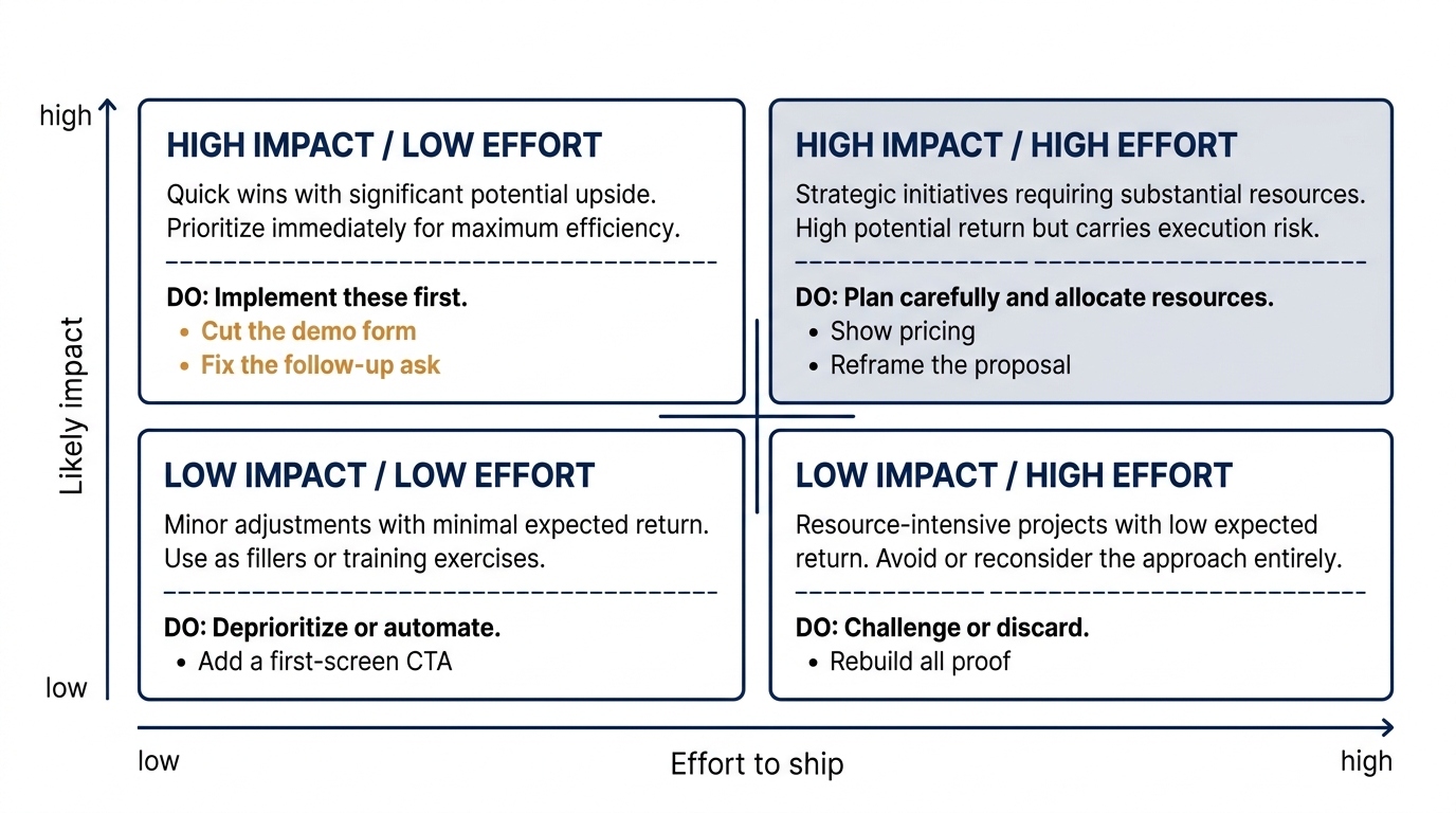
You do not need all eight running at once. Start with the one that is cheap to build and likely to move something, then work toward the heavier bets once you trust your own process. Here is the batch ranked by effort so you can pick a starting point.
- Lowest effort: shorten the demo form (Item 5) and fix the follow-up ask (Item 7). Both ship in an hour and run on traffic or sends you already have.
- Low effort: add one primary action to a first screen that has none (Item 2). A single element, big potential swing.
- Medium effort: rewrite the first-screen headline away from AI wording (Item 1) and swap a logo wall for two relevant results (Item 4). More copy work, same-day build.
- Higher effort: show pricing or a range (Item 3) and reframe a proposal around continuity (Item 6). These touch pricing strategy and sales process, so bring the right people in before you ship.
Rank your own list the same way and run the top row first. The behavioral angles behind several of these, from the endowment effect in free trials to recency bias in buyer evaluations, are worth reading once you have a test in flight, so your next idea rests on a named behavior rather than a guess. For the research behind why these biases hold, The Decision Lab is a reliable reference.
If you want to see which of these a stranger would flag on your own homepage first, run Behavly's free homepage check and start your test list from what it finds.