
By the time a B2B buyer reaches your proposal, they have already made dozens of small decisions. Which vendors to shortlist, who to loop in, what to compare, which internal objection to raise first. Each one spends a little attention. By the fourth week of an evaluation, the person who was sharp on your first call is tired, and a tired evaluator does not pick the best option. They pick the one that asks the least of them, or they stall. That is decision fatigue, and it tends to hit hardest exactly where your revenue sits, on the pricing page and inside the proposal.
This guide explains what the research does and does not support, shows where the problem lands on real B2B pages, works one example you can copy, and ends with changes you can make this week. The point is simple: the more separate choices you force late in a sale, the more deals go quiet.
What the research actually says
The popular version of decision fatigue comes from the idea of ego depletion, proposed by Roy Baumeister and colleagues in the late 1990s. The claim was that self-control and decision-making draw on a shared, limited resource that gets used up, so people make worse choices after a run of hard ones. It is a tidy story and it spread fast.
It is also a story you should hold loosely. The ego depletion effect ran into serious replication problems in the 2010s, and large multi-lab studies failed to reproduce the strong version of it. The American Psychological Association has covered the wider replication debate in psychology, and the honest summary is that the mechanism is contested. What survives is narrower and more useful to you: people avoid effort, they satisfice under load, and more options with more attributes measurably slow them down. Nielsen Norman Group's usability research has documented for years that added choices and added cognitive load lower completion on real interfaces, whatever the underlying theory turns out to be.
So treat decision fatigue as an observation about behavior on your pages, not as a proven law of the brain. You do not need the neuroscience to be settled to see that a pricing table with five plans and eleven rows of fine print converts worse than a clear recommendation.
If you want the broader behavioral-science vocabulary, The Decision Lab keeps a readable reference library, and much of the modern framing traces back to work by Daniel Kahneman, awarded the Nobel in Economic Sciences in 2002 for research on judgment under uncertainty. For the practical mechanics, Nielsen Norman Group's article on decision fatigue and its effects on user experience documents how added choices slow real users on real pages, and Baymard Institute's extensive checkout research shows the cost of extra fields and extra comparisons in conversion loss.
Why long B2B sales make it worse
Consumer examples of choice fatigue, the shopper frozen by a wall of jam, do not map cleanly onto B2B, so ignore them. Your sale is different in three ways that all compound the problem.
First, it is long. A serious evaluation runs weeks or months, and fatigue accumulates across that span rather than within a single session. Second, it runs through a buying committee, so no one person decides. Each member brings their own list of concerns, and your proposal has to clear all of them at once. Third, the person championing you internally has to re-explain and re-defend every choice to colleagues who were not on your calls. Every extra decision you hand the champion is a decision they then have to sell twice.
That is why reducing the number of choices per page and per document does more for a complex sale than for a simple one. You are not just helping one tired brain. You are lowering the cost of agreement across a group.
Where decision fatigue shows up on your pages
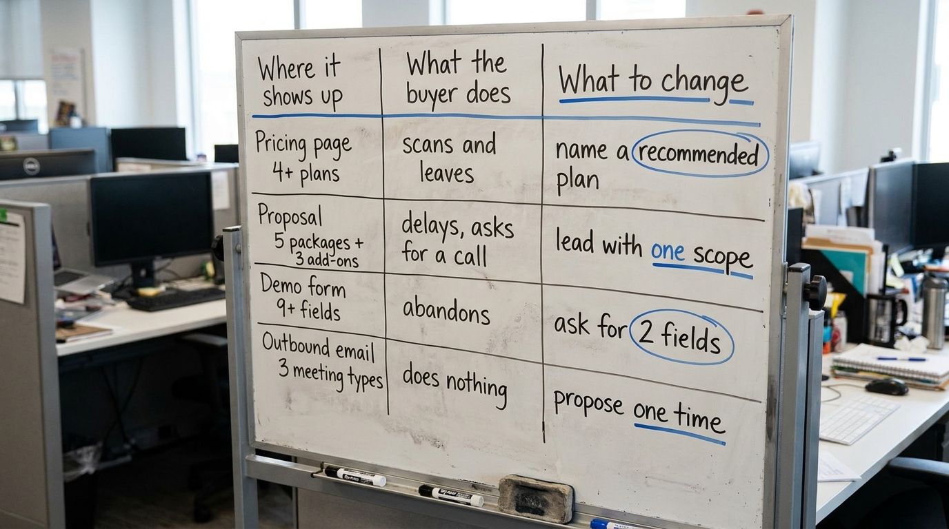
It is easy to spot once you look for the moments where you ask the buyer to choose rather than to understand. Here is the map, built as a working table you can run against your own funnel.
Table: where decision fatigue appears, what the buyer does, and what to change
| Where it shows up | What the buyer does | What to change |
|---|---|---|
| Pricing page with 4+ plans and a long feature matrix | Scans, cannot tell which plan is for them, leaves to "think about it" | Name a recommended plan for the common case; collapse the matrix behind a toggle |
| Homepage first screen crowded with claims and options | Reads nothing fully, bounces or clicks around without intent | One claim, one primary action; move secondary paths lower |
| Proposal listing five packages and three add-on tiers | Delays, asks for a call to "walk through options," loses momentum | Lead with one recommended scope; list alternatives as a short appendix |
| Demo or contact form with 9+ fields | Abandons, or submits with junk data | Ask for the two fields you act on; collect the rest after the reply |
| Outbound email offering three meeting types and two links | Does nothing, because replying requires a decision first | Propose one specific time and one action; drop the menu |
In Behavly's homepage index of 118 B2B service firms from November 2026, 33% of first screens ask the visitor for nothing at all, and only 3% show a price. The first number is a decision deferred, the second is a decision hidden. You can read the full breakdown in our homepage trends from November 2026 and the wider pattern in our review of homepage design lessons from 118 B2B service firms.
Fix the pricing page first
The pricing page is where your buyer is most decision-heavy and least patient. Baymard Institute's checkout and form research shows how quickly added fields and added comparison work raise abandonment, and a dense pricing matrix is the B2B version of that same load.
Do three things in order. Name a default: mark one plan "most common for teams like yours" so the tired buyer has a safe path that needs no analysis. Cut the comparison surface: show the three or four rows that actually differ between plans on the first view, and put the exhaustive matrix behind an expandable "compare all features" control for the one person who wants it. Then state the price. If you are among the 97% of B2B firms hiding it, understand that hiding the price does not reduce the decision load. It adds the separate decision of whether talking to you is worth the effort of finding out what you charge.
Thin the proposal and the form
A proposal that lists every package you could sell reads as thorough to you and as homework to the committee. The champion now has to decide which option, then defend that decision to four colleagues. Lead instead with one recommended scope, priced, with a one-line reason it fits their situation. Keep the alternatives, but move them to a short appendix labeled as such, so choosing them is an active step rather than the default assignment.
Apply the same logic to your demo and contact forms. Every field is a micro-decision and a reason to stop. Ask only for what you act on in the next step, usually a name, a work email, and maybe one context field. You can collect firmographics and use-case detail in the reply, once the person has already said yes to the smaller thing.
A worked example on one pricing page (illustrative)
The following is illustrative, built to show the mechanics, not drawn from a specific client.
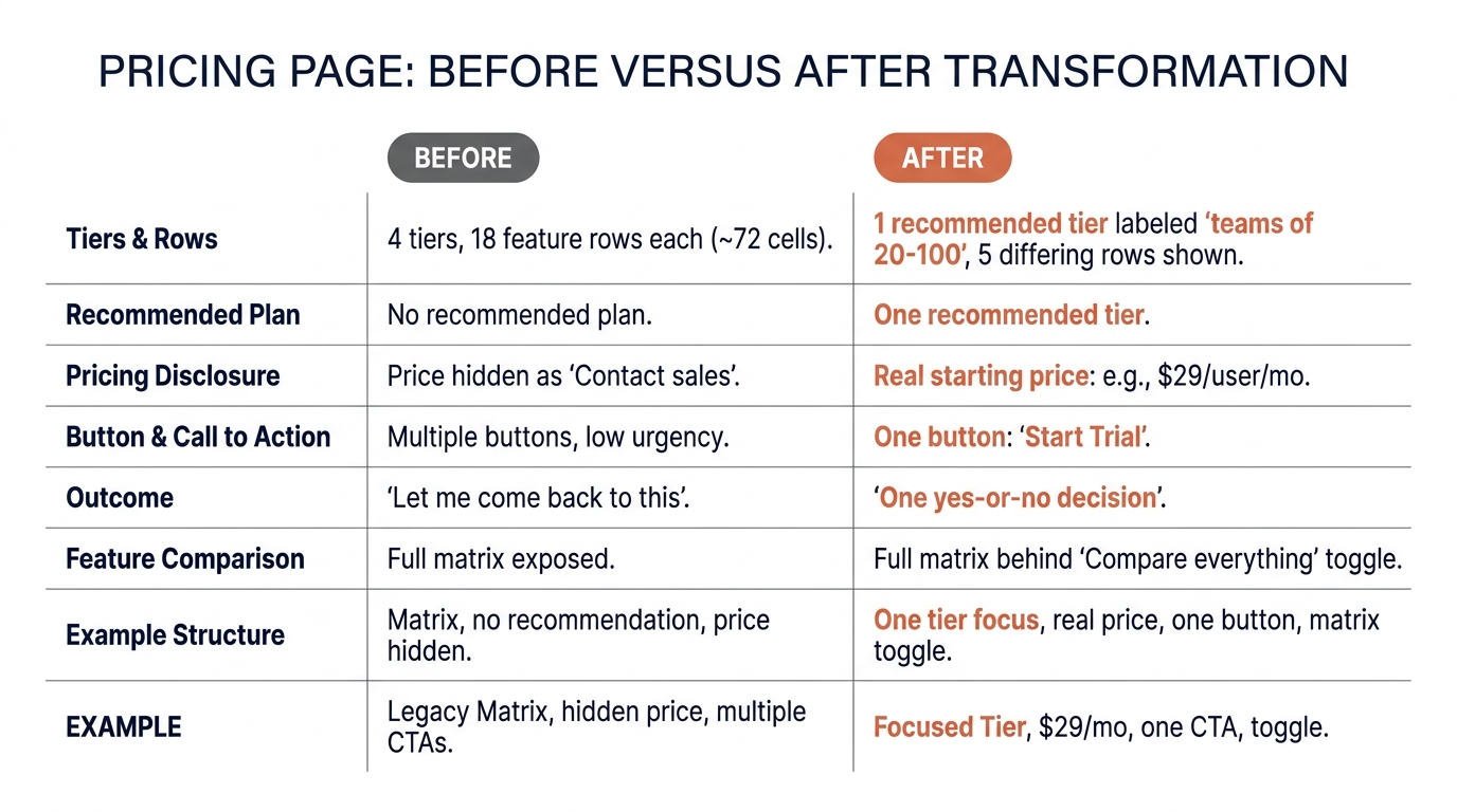
Picture a mid-market analytics firm with a pricing page that lists four tiers, each with eighteen feature rows, no recommended option, and "Contact sales" where the price should be. A buyer arrives in week three of an evaluation, already carrying a shortlist of three vendors and a spreadsheet their CFO asked for. They now face roughly seventy-two cells to read and four undefined prices to chase. The realistic outcome is a stalled deal: they close the tab and tell themselves they will come back to it later.
Now rework it. The firm marks the second tier "recommended for teams of 20 to 100," shows the five rows that actually differ between tiers, puts the full eighteen-row matrix behind a "compare everything" toggle, and prints a real starting price with "typical range" context. The same week-three buyer now has one clear default, a short reason it fits, a number to put in the CFO's spreadsheet, and one button. The decision shrank from seventy-plus comparisons to a single yes-or-no. Nothing was removed from the offer; the choices were just sequenced so the tired buyer is not asked to do the sorting.
How this connects to the other biases you are managing
Decision fatigue rarely acts alone in a real sale. A buyer worn down by too many choices leans harder on whatever they already believe, which is confirmation bias doing the sorting for them, covered in our piece on confirmation bias in B2B buying and what it means for your website. A tired committee also clings to the vendor they have already invested time in rather than restarting the evaluation, the pattern we describe in the sunk cost fallacy in B2B vendor decisions.
You do not fix these one bias at a time with a clever trick on a single page. You fix the underlying condition, which is a buyer who has been asked to do too much thinking across too many weeks. Lower the decision count and the other effects get easier to manage, because the person is not operating past the point where they can evaluate clearly.
What to change on your page this week
You do not need a redesign. Pick the page where real revenue decisions happen, usually pricing or the proposal template, and make these edits in a single sitting:
- Mark one plan or one scope as the recommended default, with a one-line reason it fits the common buyer.
- Cut the first-view feature comparison to the three to five rows that actually differ; hide the rest behind a toggle.
- Put a real price or a real starting range on the page, even if it is a "from" number.
- Reduce your demo or contact form to the two or three fields you act on immediately.
- Rewrite your most-used outbound email to propose one specific time and one action instead of a menu.
- In your proposal template, move alternative packages to a labeled appendix so the recommended scope is the path of least effort.
Each edit removes a decision from a buyer who is already carrying too many. None of them weakens your offer. They change the order in which the buyer meets the choices, so the sorting work falls on your page instead of on a tired person in week four.
If you want an outside read on how many decisions your own first screen is asking for, run Behavly's free homepage check on your page and see where you stand against the 118 B2B firms in our index.