
Most of the time a visitor lands on a B2B software page, they decide within a few seconds whether to keep reading or close the tab. A saas landing page that lists features without setting up a single clear ask loses that person before the fold ever scrolls. The sections matter, but the order matters more, because each one has a job: earn enough attention to justify the section below it, and set up the one small decision you actually want the visitor to make.
This guide walks the sections a B2B software page needs, in sequence, with the ask each one sets up and what to change when a section underperforms. It is written for the person who owns the page.
1. What the research says about scanning and the first screen
People do not read web pages in order. Nielsen Norman Group's eye-tracking work, summarized across their usability research, shows that visitors scan in rough F-shaped and layer-cake patterns, reading headings and the first few words of a line before deciding whether anything below is worth their time. On a landing page that means your headline and subhead carry most of the weight, and a vague one gets skipped rather than parsed.
The second constraint is load. Every extra choice, link, and competing message in the first screen costs attention, a problem we cover in more depth in reducing cognitive load on B2B websites. The practical reading of both findings is simple: say one specific thing at the top, and make the next action obvious.
From Behavly's index of 118 B2B service firms (November 2026), 49% lead the first screen with AI wording and 33% ask the visitor for nothing at all. Those two numbers describe the common failure. The top of the page is spent on a trend word, and no decision is set up.
2. The sections a software landing page needs, in order
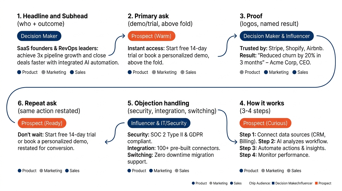
A page that converts moves the visitor through a short sequence. Each block answers the question the previous one raised, and each sets up a smaller commitment than the final ask.
Here is the order that holds up on most B2B software pages:
- Headline and subhead that name the buyer and the outcome.
- Primary ask, visible without scrolling, usually a demo or a trial.
- Proof, meaning logos, a named result, or short case references.
- How it works, in three or four steps, so the buyer can picture the first week.
- Objection handling, the questions a committee raises: security, integration, switching cost.
- Repeat ask, the same action restated once the case has been made.
Proof comes before the mechanics because a buyer decides whether to care before they decide whether it fits. Put your proof and your value proposition near the top.
3. Where each section earns or loses the next click
On a saas homepage the headline is doing diligence work whether you intend it to or not. The visitor is asking a single question at each stage, and the section either answers it or stalls. The table below maps the common sections of a B2B software page to what the buyer is actually doing there and what to change when the section underperforms. Treat it as a working checklist you can walk your own page against.
Section-by-section work table
| Where it shows up on the page or sale | What the buyer does | What to change |
|---|---|---|
| Headline and subhead (first screen) | Decides in a few seconds whether this is for a company like theirs | Name the buyer and the outcome. Replace a trend word with a specific job the software does. |
| Primary call to action (above fold) | Looks for the next step, or leaves if none is offered | Put one ask in the first screen. If 33% of pages ask for nothing, yours should not be one of them. |
| Proof block (logos, results) | Checks whether peers already trust it | Use named, dated results over adjectives. Group logos by segment so the right buyer sees themselves. |
| How it works (steps) | Tries to picture the first week of use | Show three or four steps, not a feature grid. Lead with the first action they take, not the architecture. |
| Objection section (FAQ, security) | Collects reasons to say no on behalf of the committee | Answer the switching, integration and security questions in plain words before the form. |
| Demo or trial form | Weighs the effort of the form against the value promised | Cut fields to what sales truly needs. Restate the outcome next to the submit button. |
| Follow-up email after signup | Decides whether to actually show up or activate | Reference what they came for. See our note on the follow-up email after a sales call. |
4. The headline carries more than you think
If 49% of B2B service firms open with AI wording, as Behavly's homepage trends for November 2026 record, then a headline built on the same word does not separate you from the shortlist. The buyer reading it cannot tell you apart from the three other tabs open on their screen.
A working headline names the reader and the result. "Close your month three days faster" tells a controller what changes. "AI-powered financial operations platform" tells them nothing they can act on. The subhead then adds the qualifier that makes it credible: for whom, at what size, with what first step.
This is also where the framing of a claim decides how it lands. The same capability described as a gain or a loss avoided reads very differently to a buyer, something we unpack in the framing effect in B2B copy and pricing.
5. Proof belongs high, and it has to be specific
Across the 118 firms Behavly tracked, 80% show case studies somewhere, so proof is common. What is rare is proof placed where it still matters, high on the page and tied to a named outcome. A buyer who cannot yet tell whether you are serious will not scroll to find a case study three screens down.
The behavior here is straightforward. B2B buyers weight what peers already chose, a pattern described in our piece on the bandwagon effect in B2B marketing. Logos from companies that look like the reader do more work than a longer list of logos that do not. Segment them so the right buyer recognizes their own world.
Keep the illustrative and the real clearly separated. If you show a sample result to make a layout point, label it as illustrative so no visitor mistakes it for a client claim.
6. A worked example on one pricing-plus-demo page (illustrative)
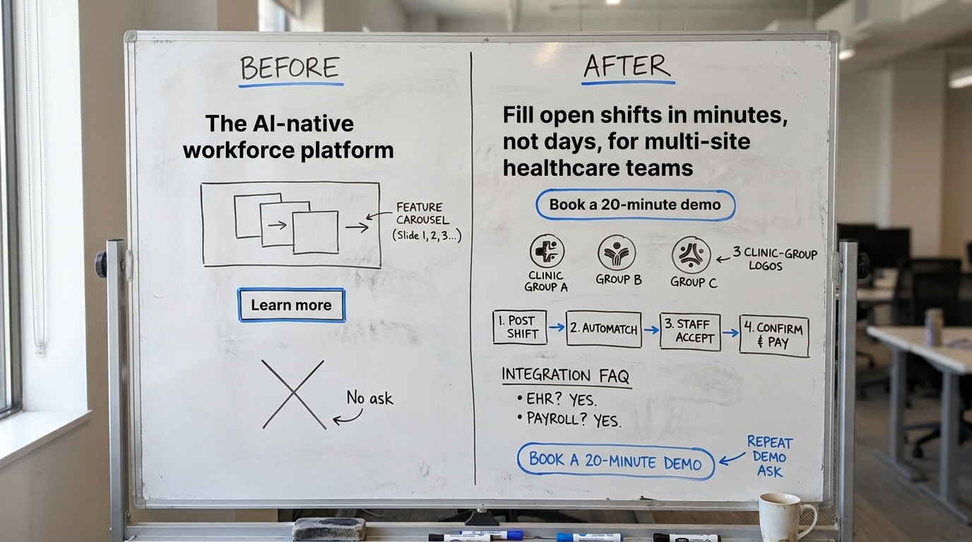
Here is an illustrative rebuild of a single page for a mid-market scheduling tool. The numbers and company are invented to show the moves, not to report a result.
Before. The first screen read "The AI-native workforce platform," followed by a feature carousel and a "Learn more" link. No ask, no named buyer. A visitor from an operations team could not tell whether it fit a 40-person clinic or a 4,000-person logistics firm.
After. The headline became "Fill open shifts in minutes, not days, for multi-site healthcare teams." Directly below it sat one button, "Book a 20-minute demo," with a second quiet link to a self-serve trial. A row of three clinic-group logos followed, then a four-step "how it works," then a short FAQ answering integration with their existing HR system. The same demo ask repeated once at the bottom.
The visual changes mattered less than the structure: every block set up the next one, and the first screen asked for something. For a fuller treatment of page mechanics, our sister guide on B2B landing page best practices walks the same ideas from a lead-generation angle.
7. Handle the committee's objections before the form
A software purchase rarely has one decision-maker. The person on your page is often collecting reasons to bring back, or to reject, on behalf of a group. The more people and steps involved, the more the buying process slows under its own weight, a pattern covered in our piece on decision fatigue in B2B buying committees.
Answer the predictable questions in plain words before you ask for the form: how it integrates, what the security posture is, how long switching takes, and what the first 30 days look like. A buyer who cannot find those answers assumes the answer is unfavorable and keeps their current vendor, which is the default pull we describe in status quo bias and why B2B buyers keep their current vendor.
8. Test the order, do not guess it
Section order is testable, and the discipline matters more than the opinion. When you move proof higher or cut form fields, run it as a real experiment rather than reading last week's traffic as a verdict. Ron Kohavi, Diane Tang and Ya Xu's guidance in Trustworthy Online Controlled Experiments is the practical reference, and Evan Miller's note on how not to run an A/B test covers the most common way these tests mislead, which is calling a winner before the sample is in.
If you want the broader context for why these behaviors transfer from general web usability to B2B software, our overview of consumer behavior research and what transfers to B2B draws that line, and the Behavly dataset behind these numbers sits in homepage design lessons from 118 B2B service firms.
9. What to change on your page this week
Walk your own saas website page against six checks, in order, and fix the first one that fails before moving on:
- Does the headline name the buyer and the outcome, or does it lead with a trend word? Rewrite it to the outcome.
- Is there one clear ask in the first screen? If not, add one and make it the obvious next step.
- Is your proof high on the page and tied to named results, or buried and generic? Move it up and segment the logos.
- Does "how it works" show the first week in three or four steps, or is it a feature grid? Rewrite it as steps.
- Are the committee's objections answered before the form? Add a short, plain FAQ.
- Does the form ask for more than sales needs? Cut fields and restate the outcome next to the button.
Pick one, change it this week, and look at the next click rather than the last report.
When you want an outside read on where your first screen loses people, run Behavly's free homepage check on your own page.