
Disclosure: some links in this article are affiliate links. If you sign up through one, we may earn a commission at no extra cost to you.
Most website redesign projects lose traffic and leads for reasons that had nothing to do with the new design. A URL changes and the backlinks pointing at it break. A pricing page that quietly produced demo requests gets folded into a prettier, vaguer layout. A form with four fields becomes a form with nine. The new site looks better and performs worse, and nobody can say exactly when it happened because nobody wrote down what the old site was doing before the rebuild started.
This website redesign checklist is built to stop that. It is a sequence for measuring and protecting what already works, so the redesign improves conversion instead of resetting it to zero. I have watched portfolio companies spend six months on a rebuild that undid a year of compounding organic traffic, and the fix is boring: capture the baseline first, migrate deliberately, then test the changes one at a time.
1. When to use this checklist and when not to
Use it when you are changing the thing that converts: the information architecture, the templates, the URLs, the forms, the core pages, or the platform underneath them. A full website migration to a new CMS is the clearest case. So is a rebrand that redraws the navigation and rewrites the homepage.
You do not need the full sequence for a cosmetic pass. Swapping fonts, updating a color palette, or replacing hero photography on existing templates carries little conversion risk, because the structure, the URLs, and the forms stay put. If none of those change, skip to the post-launch testing section and leave the rest of the site alone.
Redesign planning for a company you just acquired or are preparing for sale carries the most risk. The old site often holds years of organic authority that nobody documented. Rebuild it blind and you can erase an asset that took years to earn, with no line item explaining the drop in inbound pipeline.
2. The framework in three phases
The checklist runs in three phases, in order: Measure what the current site does, Protect it through the build, and Test the changes after launch. The reason for the order is simple. You cannot protect what you never measured, and you cannot trust a test if you redesigned fifteen things at once and shipped them together.
Each phase has a short list of items with an owner and a hard gate. A gate means the project does not advance until that item is done. Skipping a gate is how a redesign quietly turns into a rollback three weeks after launch.
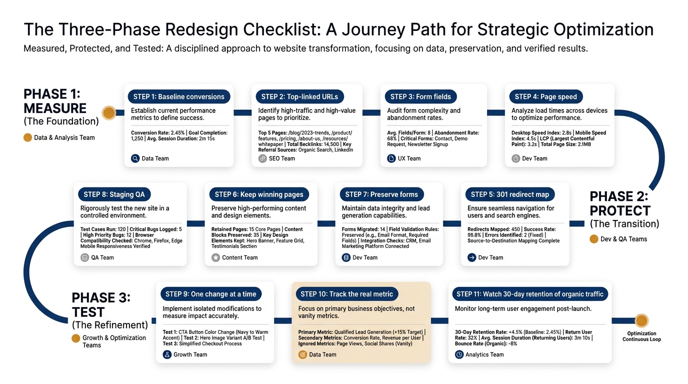
Phase 1: Measure the baseline
Before anyone touches a template, write down what the current site does. The pages that convert, the URLs that have earned links, the forms people actually complete, and the load times buyers experience. This is the record you will compare against, and it is the part teams skip because it is unglamorous and nobody is asking for it in the design review.
Phase 2: Protect what works
Carry the measured assets through the build. Map every old URL to a new one with a permanent redirect. Keep the pages that convert recognizable, even inside a new look. Do not quietly lengthen the forms. Nielsen Norman Group's usability research has shown for years that each added form field and each extra step costs completions, so a redesign that adds fields in the name of richer data usually trades leads for data you will not use.
Phase 3: Test the changes
After launch, change the uncertain things one at a time and watch the metric that matters for each. A redesign is a large bundle of simultaneous changes, which makes it nearly impossible to attribute a lift or a loss. The discipline of running real tests, covered well in Ron Kohavi, Diane Tang and Ya Xu's work on trustworthy online experiments, is what separates a redesign you can defend from one you are guessing about.
3. The template you can copy
Here is the worksheet. Copy it into a spreadsheet, fill the baseline column before the build starts, and do not let the project pass a phase until every gate in that phase reads "done." The owner column forces a name against each row, because "the team" owns nothing.
| Phase | Item | What to record or do | Owner | Gate before next phase |
|---|---|---|---|---|
| Measure | Converting pages | List every URL that produced a form fill, demo request, or sale in the last 6-12 months, with its conversion rate | Marketing lead | List exists and is dated |
| Measure | Linked URLs | Export URLs that have earned external backlinks or steady organic traffic | SEO owner | Export saved |
| Measure | Working forms | Record each live form: its URL, field count, and completion rate | Ops | Field counts logged |
| Measure | Speed and Core Web Vitals | Record current load time and Core Web Vitals per key template | Dev | Numbers recorded |
| Measure | Primary CTAs | Note the exact CTA wording and placement on top pages | Marketing lead | Screenshots kept |
| Protect | Redirect map | Map every old URL to a new URL with a 301; flag any page with no destination | SEO owner | Map covers 100% of old URLs |
| Protect | Keep the winners | Confirm every converting page from Phase 1 survives, renamed is fine, deleted is not | Marketing lead | Zero winners dropped |
| Protect | Form parity | New forms have the same or fewer fields than the old ones you logged | Ops | No field creep |
| Protect | Staging QA | Test redirects, forms, and tracking on staging before launch | Dev | All pass on staging |
| Test | Isolate changes | Pick the uncertain changes; test one at a time, not as a bundle | Marketing lead | Test plan written |
| Test | Hold the metric | Name the metric each test must move | Marketing lead | Metric named per test |
| Test | 30-day traffic watch | Compare organic traffic and conversions to baseline for 30 days post-launch | SEO owner | No unexplained drop |
The Measure column is the one people cut when the timeline slips. Do not. A redesign without a baseline cannot be judged a success or a failure, so you will be left arguing about screenshots and gut feel after launch instead of comparing two numbers.
4. What to measure before you touch anything
Start with the pages that convert. In our homepage index of 118 B2B service firms from November 2026, 80% show case studies and only 3% show a price on the homepage, which tells you where the convincing usually happens: on case study pages and pricing pages, not the hero. If those are the pages carrying your demos, they are the ones a redesign is most likely to damage. You can see the full pattern in our homepage trends for November 2026 and the longer read on homepage design lessons from 118 B2B service firms.
Then record the URLs that have earned links. These are the pages search engines already trust, and a broken redirect on one of them is a direct loss of authority. Baymard Institute's UX research is a useful reference for auditing forms and checkout-style flows at the same time, because the form is where measured intent turns into a lead or leaks away.
Last, record the current CTA wording. Teams rewrite calls to action during a redesign on instinct, and a vaguer button can cost completions on a page that was working. If you are changing CTA copy, change it as a test, not as a quiet edit. Our guide to call to action copy for B2B websites covers what to keep and what to retire.
5. What to protect during the build
The redirect map is the single highest-leverage item in website migration. Every old URL needs a permanent destination, and any page with no sensible new home needs a deliberate decision, not a 404. This is where SEO equity is kept or thrown away, and it is cheap to do and expensive to skip.
Protect the converting pages next. A pricing page that drove demos should still read like a pricing page after the redesign, even inside a new template. Price anchoring and the order of your tiers do real work here, which is why I would not let a designer flatten a structured pricing page into a "contact us" block without testing it first. Our pieces on pricing psychology for B2B services and price anchoring on B2B pricing pages explain what the structure is actually doing.
Protect the trust signals too. In the same index, 80% of these firms show case studies, which means buyers expect that evidence and notice when it disappears. If your redesign hides logos, testimonials, or case studies below a longer scroll, you are weakening the proof at the moment of decision. Our guides to trust signals and social proof on B2B websites cover where that evidence belongs on the page.
6. A worked example (illustrative)
The following is illustrative, built to show the checklist in use rather than to report a specific client result. Numbers here are made up for the example.
Picture a project-delivery firm in a PE portfolio rebuilding its site on a new CMS. In Phase 1, the marketing lead lists converting pages and finds that two case study pages and the pricing page produce most inbound demos. The SEO owner exports 40 URLs with external links. Ops logs the demo form at five fields and a 22% completion rate. Dev records load times per template.
In Phase 2, the designer proposes a cleaner site that drops the two case study pages into a single "Work" gallery and expands the demo form to nine fields to qualify leads earlier. The checklist catches both. The gate on "keep the winners" flags that the two converting case studies cannot be dissolved into a gallery without their own URLs and their own proof. The form-parity gate flags the jump from five fields to nine. The team keeps the case study pages as standalone URLs with 301s from the old paths, and holds the form at five fields with the extra qualifying questions moved to a follow-up email.
In Phase 3, the one genuinely uncertain change, a reworded homepage value proposition, ships as a test rather than an assumption. The firm measures demo requests against the recorded baseline for 30 days. Because only one variable moved on the homepage and the converting pages were protected, the team can actually read the result instead of guessing. If you are rewriting that headline, our guide on how to write a B2B value proposition is the place to start, and Behavly's homepage design research shows where most firms still go vague, with 49% leaning on AI wording in the first screen and 33% asking the visitor to do nothing at all.
7. The behavior behind the costly mistakes
Two patterns explain most redesign losses, and both are well documented. The first is loss aversion. A redesign that removes a familiar, trusted page raises the perceived risk for a buyer who was close to converting, and perceived risk suppresses action more than a slightly better layout improves it. The framing goes back to Daniel Kahneman and Amos Tversky, whose work earned Kahneman the 2002 Nobel Prize in Economic Sciences. We cover the practical version in loss aversion in B2B marketing and sales copy and in risk aversion in B2B purchases.
The second is the temptation to change many things at once and attribute the result to the whole redesign. That is how teams convince themselves a rebuild "worked" or "failed" on no real evidence. Evan Miller's note on how not to run an A/B test is a short, honest read on why bundled changes and early peeking produce confident conclusions that are wrong. The checklist's rule of one change at a time exists to keep you out of that trap.
8. What to change on your page this week
You do not need to start a redesign to use this. Do three things before any rebuild lands on the calendar:
- Write down your three highest-converting pages and their conversion rates today, so you have a baseline that predates any design decision.
- Export the URLs that have earned backlinks, and keep that list where whoever builds the redirect map will find it.
- Count the fields on your main form and decide, in advance, that the redesign will not add to it without a test.
For the keyword and backlink side of that export, we pull Semrush keyword and competitor data for the 60-plus domains we track. That is the same kind of data you will want to protect before a migration. If your pages produce leads, B2B landing page best practices is a useful companion for the templates you keep.
Start with the page most people see first. Run Behavly's free homepage check on your own homepage and see what a redesign would be risking before you touch it.