
Disclosure: some links in this article are affiliate links. If you sign up through one, we may earn a commission at no extra cost to you.
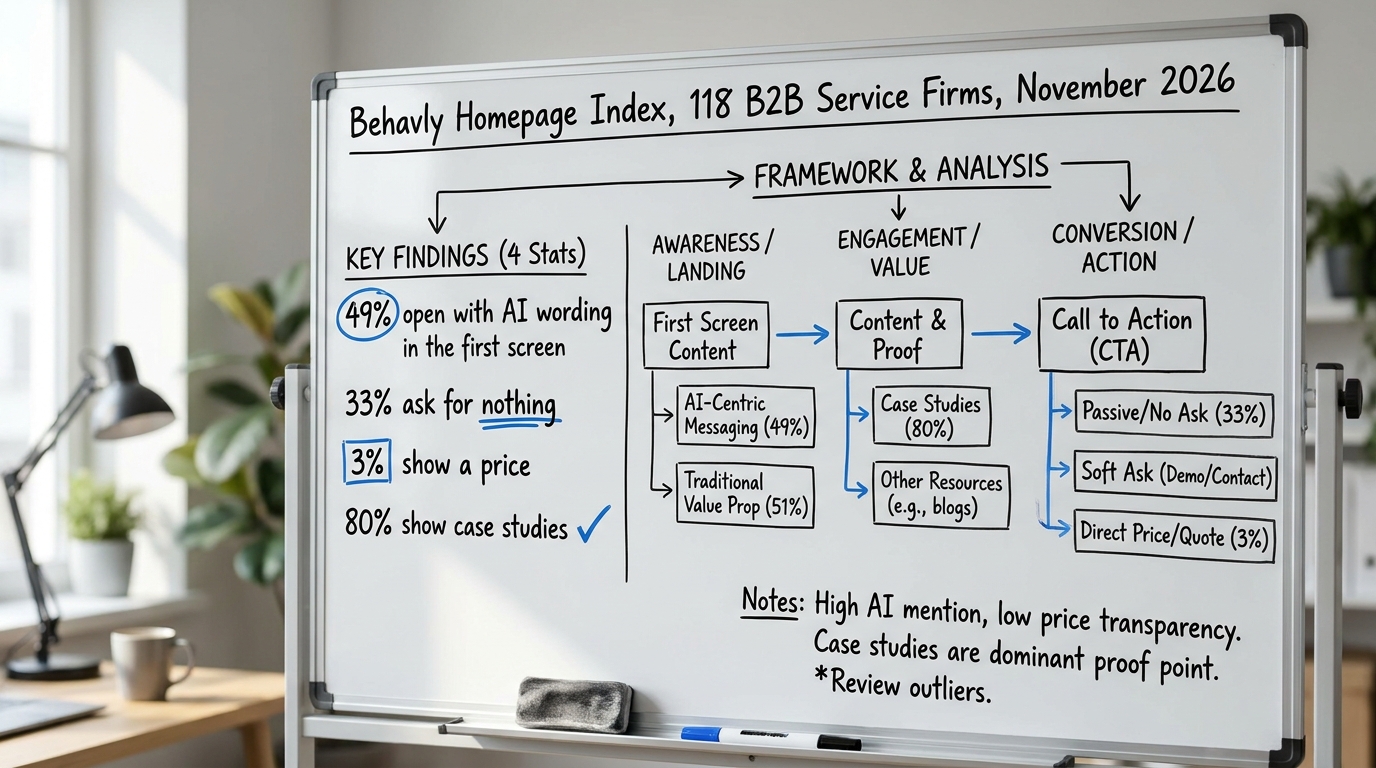
Most of the homepages we index at Behavly do a strange thing. Of 118 B2B service firms we looked at in November 2026, 33% ask the visitor for nothing at all: no form, no clear next step, no reason to raise a hand. The page describes the firm, lists services, and then stops. Website lead generation starts breaking at exactly that point, because a visitor who is ready to talk has nowhere to do it, and a visitor who is not ready is given no smaller step to take.
This guide walks through what the research says about why people hesitate to act online, where that hesitation shows up on a B2B page or in a sale, and what to change this week. The examples are illustrative, drawn from the kinds of pages we review rather than from any one client.
1. What the research says about why visitors do not act
Daniel Kahneman, who shared the 2002 Nobel in Economic Sciences, spent decades documenting that people weigh a potential loss more heavily than an equivalent gain (his work is summarized on the Nobel Prize record for Kahneman). For a visitor on your site, the loss is concrete and immediate: handing over an email, booking time, exposing that they are shopping. The gain is vague and in the future. So the default is to do nothing.
The Nielsen Norman Group's usability research adds the mechanical side of this. People scan rather than read, decide in seconds whether a page is relevant, and abandon anything that makes the next step unclear or expensive in effort. A page that asks for nothing removes the risk, but it also removes the path. A page that asks for too much, too early, raises the perceived cost past what the visitor will pay.
Website lead generation is the work of sitting between those two failures: give the ready visitor an obvious way to start a conversation, and give the unready one a smaller, lower-risk step that keeps them in contact. We cover the first half of that in more depth in our guide to loss aversion in B2B marketing and sales copy.
2. Where it shows up on a B2B website and in the sale
The same hesitation appears at every point where you ask the visitor to commit, and it looks different on each one.
On the homepage, it shows up as the missing or buried call to action. In our index, 49% of firms open the first screen with AI wording, which describes the firm rather than inviting the visitor to do anything. On a pricing page, it shows up as the opposite problem: only 3% of the firms we indexed show a price at all, so a buyer trying to qualify you leaves to compare elsewhere. On a demo or contact form, it shows up as too many fields, each one raising the cost of starting.
In the sale itself, it shows up in the proposal and the first call. A buyer who has to defend the decision internally is weighing the risk of being wrong more than the upside of being right. That is why case studies matter: 80% of the firms we indexed show them, because they lower the perceived risk of hiring you. We go deeper on that in our note on risk aversion in B2B purchases.
3. The table: where it shows up, what the buyer does, what to change
Here is the working version you can take into your own review. Walk your site and sales process against the left column, watch for the middle behavior, and apply the right column.
| Where this shows up | What the buyer does | What to change |
|---|---|---|
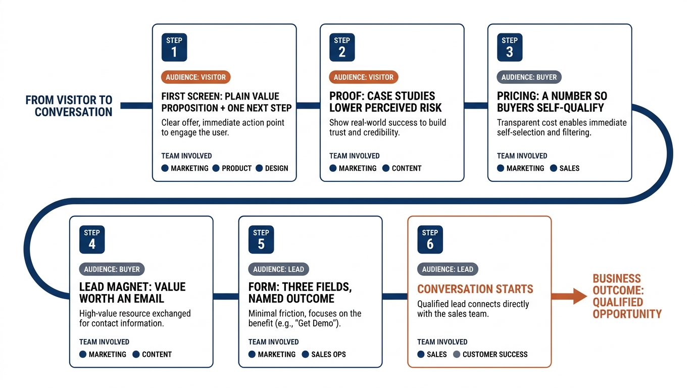
| Homepage first screen | Scans for a few seconds, cannot tell what you do or what to do next, leaves | Replace the AI wording with a plain value proposition and one obvious next step above the fold |
| Pricing page with no price | Cannot self-qualify, assumes you are expensive or not for them, compares elsewhere | Show a starting price, a range, or a worked example so they can place themselves |
| Demo or contact form | Sees ten fields, weighs the effort against a vague payoff, abandons | Cut to three fields, name what happens after they submit, and how fast |
| Lead magnet or resource | Wants the content but resents the gate for a low-value asset | Match the ask to the value: ungate thin content, gate only what earns the email |
| Proposal and first call | Weighs the risk of defending the choice internally more than the upside | Lead with relevant case studies and a small, reversible first engagement |
| Outbound email | Reads one line, sees a big ask, deletes | Ask for one low-cost step, a reply or a short call, not a full meeting |
4. A worked example on one pricing page (illustrative)
Take a mid-size consultancy's pricing page. This example is illustrative, not a real client, but it matches the pattern we see across the firms we index.
The page lists three service tiers by name and ends each with "Contact us for pricing." The buyer, a VP comparing three firms in an afternoon, cannot tell whether the engagement costs $5,000 or $50,000. The missing number reads as risk, and the safest move is to skip this firm and qualify the ones that published a range. The page asked for a contact without giving the buyer enough to decide they want the contact.
The change is small. Add a starting figure to each tier, or a single sentence like "Most engagements run $15,000 to $40,000 depending on scope." Now the buyer can place themselves, and the ones who fit raise their hand already half-qualified. That is anchoring working for you rather than against you, which we cover in price anchoring on B2B pricing pages and more broadly in pricing psychology for B2B services and SaaS.
Baymard Institute's UX research on checkout and form abandonment makes the same point in a different place: every unexplained field and hidden cost pushes people out. A pricing page with no price is the B2B version of a hidden cost.
5. Build the lead magnet around a real question, not a gate
A lead magnet earns the email when it answers a question the buyer already has, in a form they could not easily assemble themselves. The failure mode is gating a thin PDF that reads as filler, which trains the visitor to expect low value and raises the perceived cost of the exchange.
On a lead generation website, the better pattern is to match the size of the ask to the size of the value. An ungated article that genuinely helps builds the familiarity that makes a later form feel safe. A gated asset should be something they would pay for: a benchmark, a calculator, a template tied to their own numbers. The point is that the asset itself lowers the risk of giving you an email, rather than the copy around it promising that it will.
This is where trust signals carry weight. A visitor deciding whether to download is reading the same cues they read before a purchase. The trust signals on your B2B website matter as much on the form as on the pricing page.
6. Fix the first screen so b2b lead generation has somewhere to start
None of the downstream work helps if the homepage first screen fails. Half the firms we index open with wording about their capability stack instead of telling the visitor what they do and inviting one action. That is the single most common reason a B2B page generates no leads: there is no clear value proposition and no clear next step.
Write the first screen so a stranger reads it in five seconds and knows what you do, who it is for, and what to do next. Our guide on how to write a B2B value proposition walks through the wording, and the pattern work across the full index is in homepage design lessons from 118 B2B service firms. If you want the current numbers, they live in the homepage trends, November 2026 share.
The call to action itself deserves more care than most firms give it. "Learn more" asks for nothing and promises nothing; a specific action with a named outcome works better, which we break down in call to action copy for B2B websites. If you run landing pages for campaigns, the same discipline applies there, covered in these B2B landing page best practices.
7. Test the changes instead of trusting the before-and-after
When you change a page, the temptation is to look at this week's numbers against last week's and declare a win. That is the fastest way to fool yourself. Evan Miller's note on how not to run an A/B test explains why calling a result early, before enough visitors have passed through, produces conclusions that reverse later.
For the changes above, decide the metric before you ship, let the test run to a planned sample, and compare like with like. The deeper treatment of running experiments you can trust is in Kohavi, Tang and Xu's work on trustworthy online controlled experiments. Most B2B service sites do not have the traffic to A/B test every change, and that is fine. Where volume is thin, make the change that the research and your own buyers support, then watch the quality and volume of conversations over a quarter rather than a week.
8. What to change on your page this week
Pick the ones that match what you found when you walked the table above.
- Rewrite the homepage first screen to state what you do and give one clear next step, replacing any generic AI wording.
- Put a number on the pricing page: a starting figure, a range, or a worked example, so buyers can place themselves.
- Cut your main form to three fields and name what happens after submission, and how soon.
- Audit your lead magnet: ungate anything thin, and gate only the asset a buyer would value enough to trade an email for.
- Add two or three relevant case studies near your calls to action, since 80% of your competitors already use them to lower perceived risk.
- Decide one metric to watch and give any change at least a few weeks before you judge it.
We pull Semrush keyword and competitor data for the 60+ domains we track. These first-screen patterns repeat far beyond the 118 firms in the index.
If you want a second set of eyes on your first screen before you start, run Behavly's free homepage check on your own page and see what a visitor sees in the first five seconds.