
When a buyer lands on your pricing page, their eye groups the elements before they read a single word. A testimonial sitting two inches below the wrong button gets read as proof for a different plan. A form field floating alone reads as more work than one tucked under a clear label. The gestalt principles explain how people fold separate elements into groups, and on a B2B page that grouping decides whether your proof lands next to the ask or a foot away from it, where it does nothing.
This guide explains the four gestalt principles that matter most on a B2B page, shows each on a real kind of page, and ends with a short list of changes you can make this week.
1. What the research says
The gestalt principles come from German psychologists working in the 1920s, Max Wertheimer, Kurt Koffka and Wolfgang Köhler, who studied how people perceive whole forms rather than loose parts. The short version: your eye organizes a screen into groups automatically, and it uses position, appearance and enclosure to decide what belongs with what.
Nielsen Norman Group's usability research applies this directly to interface design, and the practical finding is consistent. Elements placed close together are read as related, elements that look alike are read as the same kind of thing, and a box or shaded panel around a set of items tells the reader those items are one unit. You do not need the reader to think about any of this. They have already grouped the page before they consciously read it.
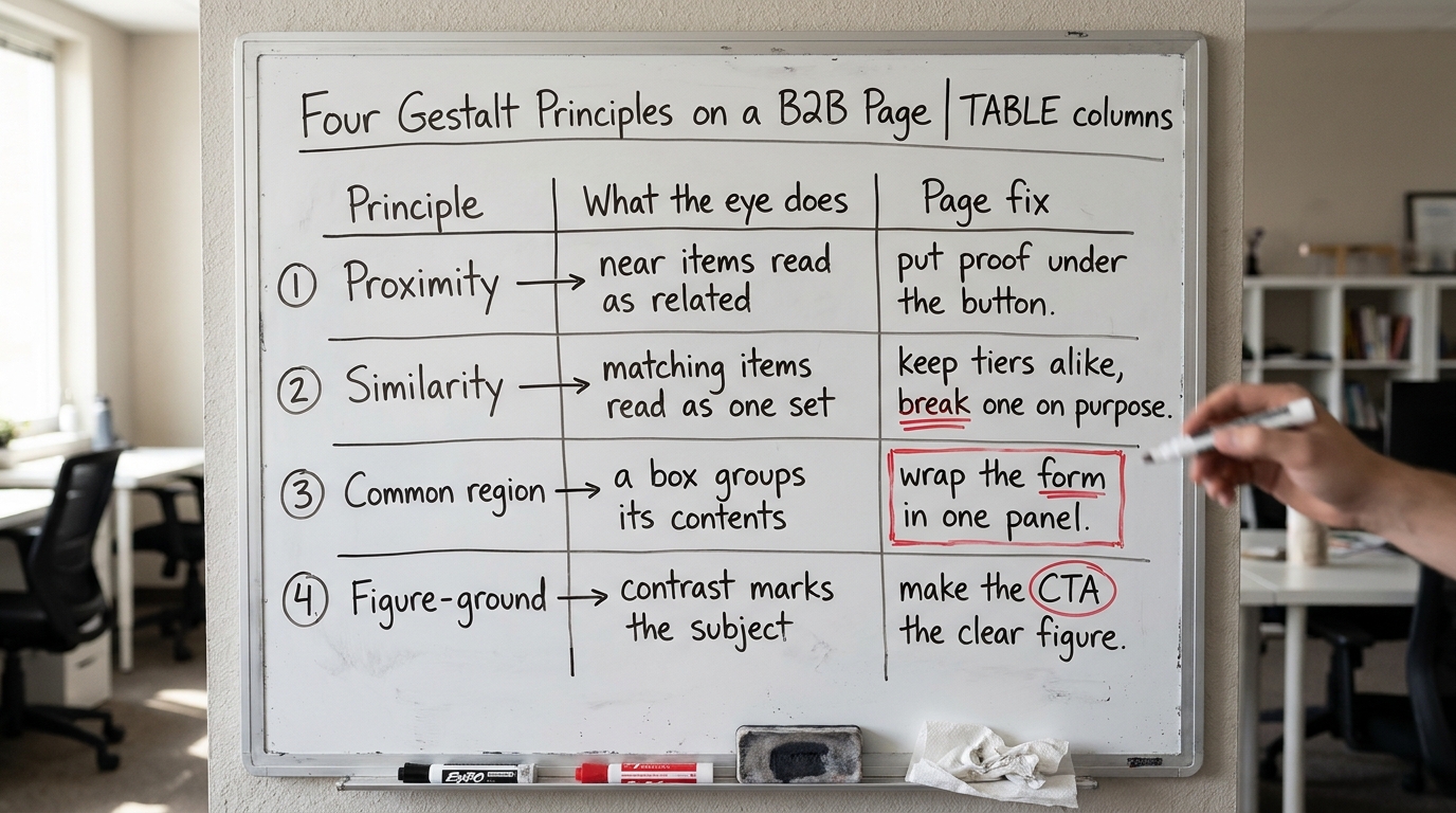
Four of the gestalt principles of design carry most of the weight on a B2B page: proximity, similarity, common region and figure-ground. The rest of this guide takes them one at a time.
2. Proximity puts proof next to the ask or wastes it
The proximity principle says items near each other are read as a group. This is the one that quietly breaks most B2B pages, because the proof and the ask are often in different sections entirely.
Picture a homepage with a hero that says "Book a demo" and a logo strip of named clients three scrolls down. The buyer reaching the button has no proof in view. The logos that would lower their hesitation are grouped far from the ask. Move a client quote or a logo row directly under the button and the eye reads it as evidence for that specific decision.
In Behavly's November 2026 index of 118 B2B service firms, 80% show case studies somewhere on the page, but placement is where most of them lose the effect. Proof that sits far from the action does not get credited to the action. If you want the mechanics of putting proof where it counts, our write-up on social proof on B2B websites covers placement in detail.
What to change: find your primary call to action and put one specific piece of proof within a thumb's width of it.
3. Similarity tells buyers which items are the same kind of thing
Similarity says elements that share a color, shape or size are read as members of one set. On a pricing page this is how the eye tells plans apart from add-ons, and primary buttons apart from secondary links.
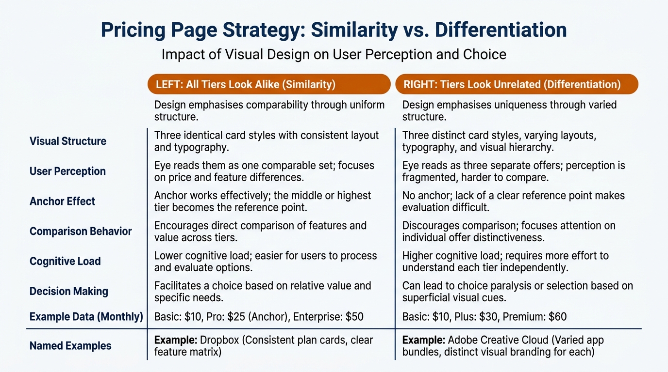
When every button on a page is the same blue, the buyer cannot tell the main action from a "learn more." When your three pricing tiers use three different card styles, the eye reads them as three unrelated offers rather than one ladder to compare. Keep the tiers visually alike so comparison feels natural, then break similarity on purpose for the plan you want chosen, a different border or a highlighted header, so it reads as the exception.
That deliberate break is also how price anchoring on B2B pricing pages works in practice. The anchor plan only anchors if the eye first reads the tiers as one comparable set.
What to change: make your primary button one color that nothing else on the page shares, and give secondary actions a plainer treatment.
4. Common region groups whatever shares a box
Common region says anything enclosed in the same border or shaded panel is read as one unit, even when the items inside the panel sit fairly far apart. A box overrides distance.
On a proposal or a demo form, common region decides what the buyer treats as a single step. Put the headline, the three fields and the submit button inside one light panel and the whole thing reads as one small task. Leave them loose on the page and each field reads as a separate demand. The same move helps on a pricing card: the plan name, the price, the feature list and the button inside one bordered card read as a complete, self-contained choice.
It also works against you. If a disclaimer or an unrelated link falls inside the same panel as your form, the buyer reads it as part of the ask and the task feels heavier. For the broader point about making the next step feel small, see our guide on lowering the perceived risk in B2B purchases.
What to change: draw one panel around each thing you want read as a single step, and remove anything from inside it that is not part of that step.
5. Figure-ground decides what the buyer sees first
Figure-ground is how the eye separates the main subject from the background. Baymard Institute's UX research on form and checkout design keeps returning to this: when the primary action does not stand clear of the surrounding noise, buyers hesitate or miss it.
On a B2B homepage, figure-ground is usually the problem when the first screen is crowded. Behavly's index found 49% of these firms lead with AI wording in the first screen, and much of it competes with the actual offer for attention. If your headline, your button and three badges and a chat bubble all claim equal visual weight, nothing is the figure. The buyer scans and leaves.
Give the main action a clear contrast against a calmer background, and push supporting elements into the background where they belong. The halo effect on B2B websites compounds this, since a clean, confident first screen raises how the buyer judges everything after it.
What to change: pick the single element the first screen must deliver, make it the clear figure, and quiet everything competing with it.
6. The grouping table for a B2B page
Use this table to find where a gestalt principle is working against you and what to do about it. The middle column names what the buyer's eye does on its own, before they read.
| Where it shows up | What the buyer does | What to change |
|---|---|---|
| Homepage hero and CTA | Groups the button with whatever is nearest; proof three scrolls down is credited to nothing | Move one client quote or logo row directly under the primary button (proximity) |
| Pricing tiers | Reads matching cards as one set to compare, mismatched cards as unrelated offers | Keep tiers visually alike, then break similarity only on the plan you want chosen |
| Demo form or proposal | Treats everything inside one panel as a single task; loose fields read as separate demands | Enclose headline, fields and button in one bordered region; remove anything unrelated from it (common region) |
| Crowded first screen | Cannot find the figure when badges, chat and headline share equal weight; scans and leaves | Give the main action clear contrast; push supporting elements into the background (figure-ground) |
| Outbound email | Groups the ask with the signature or disclaimer when the link floats far from the sentence | Put the one action on its own line, close to the sentence that justifies it (proximity) |
7. A worked example on one pricing page
This example is illustrative, built to show the four principles together rather than drawn from a specific client.
Take a pricing page with three plans, Starter, Team and Scale. In the before version, the three cards each use a different accent color, the "Talk to sales" button on Scale is the same blue as the "Start free" buttons on the other two, a tax disclaimer sits inside the Team card, and a busy comparison table above the cards pulls the eye first.
Four changes, one per principle. Give all three cards the same frame and type so similarity reads them as one ladder. Add a single highlighted border to Team, the plan you want chosen, so it breaks similarity on purpose. Move the disclaimer out of the Team card so common region stops bundling it into that choice. Make each card's own button the clear figure against a plain card background, and calm the comparison table so it stops competing. The buyer now reads three comparable plans, sees the recommended one, and finds each button without searching.
None of this changes the price or the features. It changes what the eye groups, which is the part the buyer decides on before they read the words. If you want to confirm the change actually helps, our guide to user testing a B2B website on a small budget shows how to watch five people use the before and after.
8. Where this sits among the other things that move buyers
The gestalt principles describe grouping, so the buyer reads the right things together. Your copy still has to earn the decision. A clear B2B value proposition and well-placed call to action copy do the convincing once the eye has grouped the page correctly.
Think of grouping as the layer underneath the copy. If the layout mis-groups the page, strong copy still lands in the wrong place. Behavly's homepage trends from November 2026 and the fuller write-up on homepage design lessons from 118 B2B service firms show how common the grouping mistakes are, 33% of those firms ask the visitor for nothing at all, which means there is often no clear figure on the page to group proof around in the first place.
For the behavioral background behind why grouping and framing work the way they do, The Decision Lab's reference on behavioral science is a reliable starting point, and the team at Nielsen Norman Group publishes detailed usability findings across interface design questions including the visual grouping cues that make forms, pricing cards and navigation easier to use.
9. What to change on your page this week
Pick the highest-traffic page and work through these in order:
- Find your primary call to action and move one specific piece of proof within a thumb's width of it.
- Make the primary button a color nothing else on the page shares; give secondary links a plainer look.
- Draw one panel around each thing that should read as a single step, and pull anything unrelated out of it.
- Name the one element the first screen must deliver, make it the clear figure, and quiet whatever competes.
- If you have pricing tiers, make them visually alike, then break similarity only on the plan you want chosen.
- Watch five people use the before and after before you trust the change.
Each of these is a layout move, not a rewrite, so most take an afternoon. Grouping is the cheapest conversion work you can do, because you are not changing what you say, only what the buyer reads together.
Want to see how your own first screen groups for a buyer? Run Behavly's free homepage check on your page and see what the eye reads first.