
Someone on your team wants to A/B test the color of your demo button, because they read that green converts better than red. You can run that test, but before you spend two weeks of traffic on it, it helps to separate what color research actually supports from what got turned into a LinkedIn slide. The useful part of color psychology marketing for a B2B site is contrast and visual hierarchy, the plain mechanics of whether a visitor can find the action you want them to take.
This guide works through what the research says, where color decisions show up across your pages and your sales process, a worked example on a pricing page, and a short list of changes you can make this week.
1. What the research actually says about color
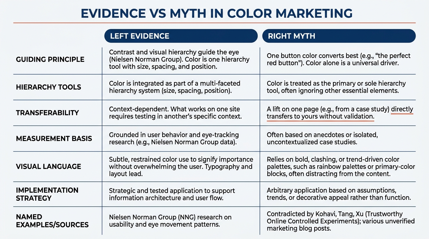
The honest summary is that no single button color converts best across contexts. What matters is whether the important element stands out from everything around it. Nielsen Norman Group's usability research has argued for years that visual hierarchy, the order in which elements pull the eye, drives whether people complete a task. Color is one tool for building that hierarchy, alongside size, spacing, and position.
The "green beats red" claims usually trace back to a single famous experiment on one page with one audience. A result like that tells you something about that page, not a law you can carry to your pricing page. Ron Kohavi, Diane Tang, and Ya Xu, who ran thousands of experiments at Microsoft, make this point in Trustworthy Online Controlled Experiments: a lift on one site does not transfer, and most button-color tests on normal B2B traffic never reach significance anyway.
So treat color as a contrast decision. The question is not "which color persuades" but "does the eye land on the right thing first." That reframes color psychology marketing from a persuasion trick into a legibility problem you can reason about.
2. Where color decisions show up on a B2B website
On most B2B service sites, color matters in a handful of specific places, and almost none of them are "pick a brand color you like." The first screen of your homepage is where visual hierarchy either works or does not. In our index of 118 B2B service firms from November 2026, 49% open with AI wording in the first screen and 33% ask the visitor to do nothing at all. When there is no clear action, button color is irrelevant, because there is no button worth finding.
The pattern repeats on pricing pages, demo forms, and even in the links inside your outbound email. If your primary action does not have more visual weight than the three secondary links near it, you have a contrast problem, not a color-choice problem. You can see how this plays out across real sites in our homepage design lessons from 118 B2B service firms.
3. How buyers actually scan a page
People do not read a landing page top to bottom. They scan to answer whether this does what they need and what to do next. When several elements compete for attention with equal weight, the visitor slows down, and some leave rather than decide. That cost has a name in our related writing on cognitive load on B2B websites, and it compounds on pages that bury the action under equal-weight buttons.
This is why the color question is really a hierarchy question. If your "Book a demo" button, your "Watch video" link, and your "Read the case study" link are all the same blue, the buyer has to parse three equal options. Make one clearly primary, and the choice gets easier. The behavioral tax of too many equal options also shows up in decision fatigue inside buying committees.
4. A worked example on a pricing page (illustrative)
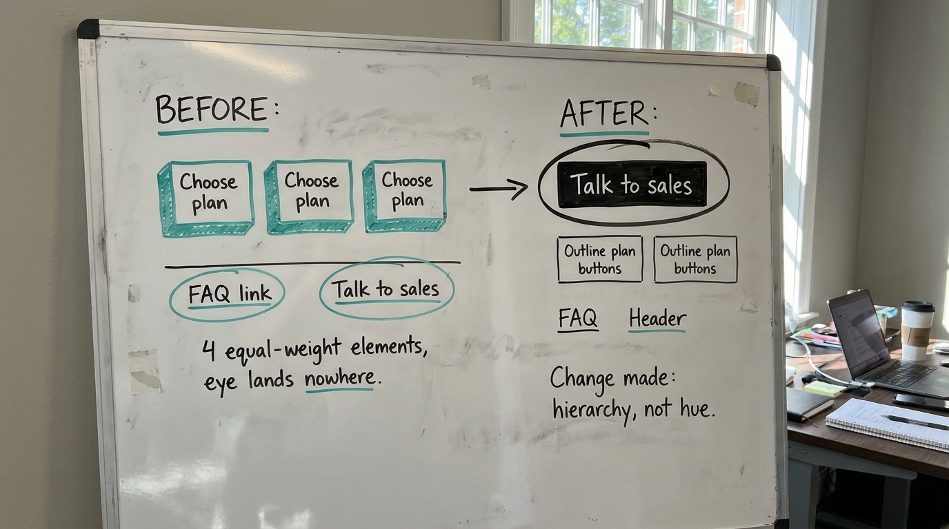
The following is illustrative, not a client result. Picture a B2B pricing page with three plans. The current design shows all three "Choose plan" buttons in the same teal, the FAQ link in the same teal, and a "Talk to sales" link, also teal, in the header. Four equal-weight teal elements, and the eye lands nowhere in particular.
Here the research gives you a clear move. Pick the action you most want, say "Talk to sales" for your highest-value plan, and give it the strongest contrast on the page. Mute the other two plan buttons to an outline style. Change the FAQ and header links to plain text links. Nothing about the hue persuades anyone. The contrast simply tells the buyer where to look first.
Only 3% of the firms in our index show a price at all, so if your pricing page exists, your contrast decisions there are already ahead of most of the field. Spend that attention on hierarchy: a clear visual order that guides the eye to the most important element first.
5. Color across the sales process, not just the page
Color and contrast logic carries past the website. In outbound email, a wall of same-weight text with three competing links behaves like a page with no hierarchy. One clear action reads better than three, which is the same principle we apply in cold email copy based on how B2B buyers read. The hierarchy move in email is link placement and count: one primary link, visually separated, with secondary options below or omitted entirely.
Proposals and follow-ups have the same issue. A proposal where every section header looks equally important gives the reader no path through it. A clear next step in your follow up email after a sales call works for the same reason a single primary button does: you have made the thing to do next obvious.
6. The work product: where color shows up, what the buyer does, what to change
Use this table to audit your own pages and sequence. The middle column is the behavior you are trying to make easier. The right column is a contrast or hierarchy change, never a hue swap on its own.
| Where it shows up | What the buyer does | What to change |
|---|---|---|
| Homepage first screen | Scans for the primary action and an answer to "what is this" | Give the primary CTA the strongest contrast; demote secondary links to plain text |
| Pricing page with multiple plans | Compares plans, looks for the recommended path | Make one plan's button high-contrast; outline the others |
| Demo or contact form | Decides whether the submit action is worth the fields asked | Submit button is the highest-contrast element; no competing colored links beside it |
| Case study section | Checks for proof before committing | Keep links readable, not colored to compete with the primary CTA (80% of firms show case studies, so the proof is common; the hierarchy is what varies) |
| Outbound email | Skims to identify the action to take | One primary link, placed and weighted above the rest; color does not fix three equal links |
| Proposal document | Finds the next step and the price | One visually dominant "next step"; equal-weight headers removed |
7. How to test color without fooling yourself
If you still want to test button color, test it honestly. Most B2B sites do not have the traffic to detect a small color effect, and running a test until it looks significant is how teams convince themselves of lifts that are not real. Evan Miller's guide on how not to run an A/B test walks through why peeking at results and stopping early produces false wins.
A better use of the same effort is to test a hierarchy change, one primary action against three equal ones, because the effect is usually larger and easier to detect. When you do test, pick the sample size before you start and do not stop early. The contrast decision is the one most likely to move the number you care about.
8. What to change on your page this week
You do not need a palette project. You need to make the action you most want unmistakable, and quiet everything that competes with it.
- Open your homepage first screen and name the single action you want. If there is not one, add it before touching any color.
- Find every element on that screen sharing the primary button's color. Demote all but one to plain text or outline style.
- On your pricing page, make one plan's button the highest-contrast element and outline the rest.
- On your demo form, confirm the submit button is the most prominent thing in view, with no colored link beside it.
- In your next outbound email, cut to one primary link and place it above the others.
- If you want to test color, test it against a hierarchy change, set the sample size in advance, and do not stop early.
For the broader context on which elements earn attention, our homepage trends from November 2026 show how most B2B first screens spend their contrast, and our guide on how to write a B2B value proposition covers what the action should actually say. If you are building the page from scratch, the B2B landing page best practices guide on our sister site pairs well with the hierarchy changes above. For how little of consumer color lore survives the move to B2B, see our note on consumer behavior research and what transfers to B2B.
Want to see where your own first screen loses the eye? Run Behavly's free homepage check on your page and start with the contrast ratio between your main call-to-action and the background, then check whether competing elements pull focus from it.