
Most B2B deals are won or lost in the last meeting before the decision, not the first. A buyer who sat through four vendor demos over three weeks does not weigh them evenly. The one they saw on Thursday afternoon, two days before the internal decision call, carries more than it should. That is recency bias at work, and if you are the vendor who presented first, you are fighting it whether you planned to or not.
This guide explains what recency bias is, where it shows up in a real B2B sale and on a real website, and what to change this week so the last impression you leave is the one that moves the decision. The point is not to manipulate anyone. It is to make sure your strongest material lands when it counts instead of fading behind whoever presented after you.
1. What the research says
Recency bias is the tendency to give heavier weight to the most recent information when you make a judgment. It sits next to a well-documented memory effect: in a list of items, people recall the first few and the last few better than the middle. Psychologists call the stronger recall of the final items the recency effect, and it has held up in recall studies since the 1960s.
The larger frame comes from Daniel Kahneman, whose work on judgment under uncertainty won the Nobel Prize in Economic Sciences in 2002. His research showed that people do not evaluate options against a stable internal scorecard. They lean on what is available in memory, and recent experiences are more available. The Decision Lab's reference library on behavioral science catalogs the same pattern across decision contexts.
For a B2B purchase, the practical read is simple. A buying committee that reviews vendors over weeks does not hold all of them in equal focus by decision day. The last demo, the last call and the last document in the inbox get more room in the room.
2. Where it shows up in a B2B sale
Recency bias is strongest where there is a gap between evaluation and decision, and where several options are compared in sequence. B2B buying is built out of exactly those gaps.
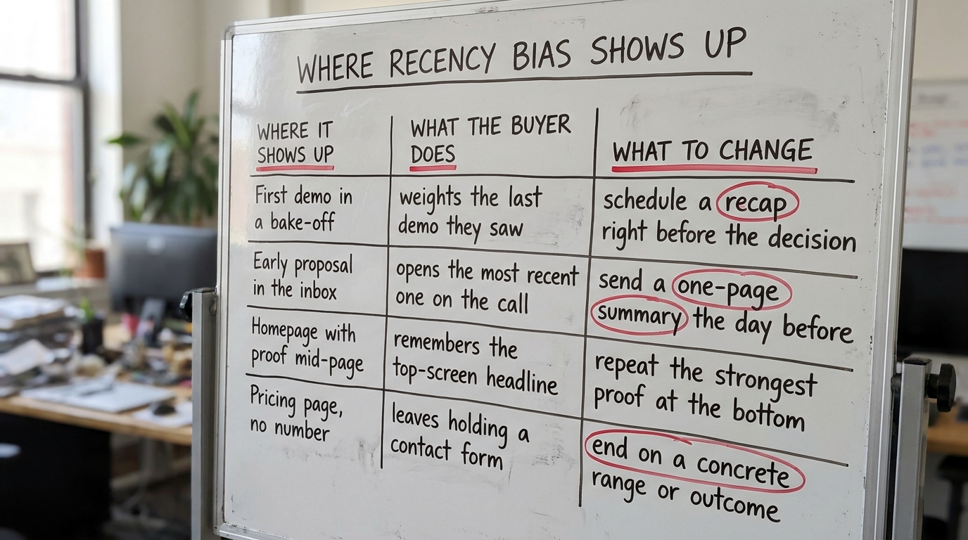
If you present first in a bake-off, your demo competes against the memory of three sharper, more recent demos by the time the committee meets. If your proposal arrives on a Monday and a competitor's lands Thursday, the Thursday document is the one open on screens during the Friday debrief. And when the champion summarizes the shortlist internally, they summarize from recent memory, not from notes they took three weeks ago.
This compounds with other biases rather than replacing any one of them. Recency decides what a buyer recalls, while confirmation bias in B2B buying decides which of those recalled details they trust. Neither one explains a whole purchase on its own, and you should not pitch as if it did.
3. Where it shows up on your website
The sale is not the only place this runs. Your website is often the last thing a buyer touches before a shortlist call, and the last thing they revisit before signing. The order in which they read a page, and what sits at the bottom of it, shapes what they carry away.
On most B2B homepages, the strongest proof is buried in the middle. Behavly's November 2026 index of 118 B2B service firms found that 80% show case studies somewhere on the homepage, but the placement varies widely, and many sit below the fold between a feature grid and a founder bio. By the time a buyer scrolls past, the AI-wording headline up top has already set the first impression, and nothing at the bottom resets it. You can see the full pattern in our homepage trends for November 2026.
Pricing pages have the same problem in reverse. Only 3% of those 118 firms show a price at all, so the last thing a serious buyer remembers from the pricing page is a contact form. That leaves a weak last impression in a head-to-head comparison.
4. A worked example on one page (illustrative)
The figures and company below are illustrative. They show how the behavior plays on a single page.
Picture a data-integration firm's homepage. The first screen leads with AI wording, which half the market now does. The middle holds three strong case studies with named outcomes. The bottom of the page, the last thing a reader sees before leaving, is a generic "Book a call" band with no proof near it.
A buyer who visits the morning of a shortlist call reads the top, skims the middle, and bounces off the empty closing band. Twenty minutes later, on the call, the strongest thing they recall is the AI headline, because that was the first and loudest message and nothing at the end reinforced the outcomes. The case studies, your best material, sat in the low-recall middle of the page.
Move one concrete outcome into the first screen so it anchors early, and repeat a different one in the closing band so it anchors last. Now the first and last impressions both carry proof, and the AI headline stops being the only thing that survives to the call. The homepage design lessons from 118 B2B service firms go deeper on where that proof usually belongs.
5. How to sequence a pitch so the last impression is yours
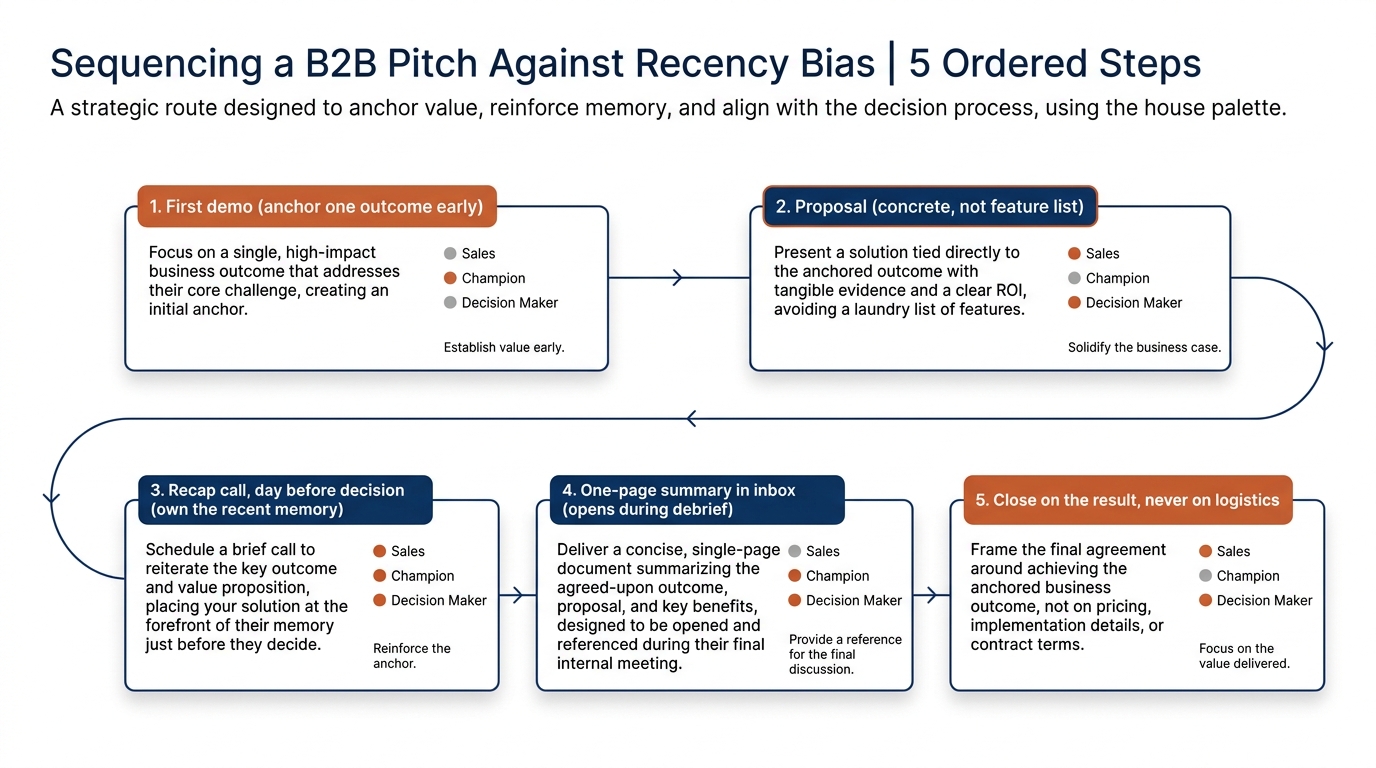
You cannot always choose when you present, but you can control the last thing a buyer holds. Three moves do most of the work.
Get the last slot, or create one
In a bake-off, ask to present last. If the schedule is fixed and you are early, propose a short recap or Q&A session a day or two before the internal decision. That session, not your original demo, becomes the recent memory the committee carries into the room.
Leave the buyer holding something
The document that arrives last and reads best is the one open during the debrief. Send a one-page summary timed for the day before the decision. Lead it with the outcome that matters to them. An early proposal loses ground to a later one even when it is stronger on the merits because recency sets the frame.
End every touch on your strongest point
People remember how a meeting ends. Do not close a demo on pricing logistics or a calendar link. Close on the result the buyer came for. Nielsen Norman Group's usability research shows that what a page or meeting closes on shapes what a user carries away more than anything in the middle.
6. What the buyer is left holding
The phrase worth keeping in mind through a whole sale: what is the buyer left holding on decision day? Not what did you say in week one, but what is in their inbox, on their screen and in recent memory when the committee decides.
If the answer is a contact form, a feature grid or a competitor's Thursday proposal, you have a recency problem no amount of early effort fixes. If the answer is a one-page summary with your outcome on it and a recap call still fresh in their heads, you have turned the bias toward you instead of against you.
This is also why pushing hard for a fast decision after a strong final meeting works, and why letting a deal drift lets a competitor's later touch overwrite yours. The longer the gap between your best moment and the decision, the more the last voice in wins. A related pattern, where buyers stick with a vendor because of what they have already invested, runs through our piece on the sunk cost fallacy in B2B vendor decisions.
7. What to change on your page this week
Three changes you can make without a redesign, in order of effort.
- Put one concrete outcome in the first screen. If your top message is AI wording like half the market, add a named result underneath so the early anchor carries proof.
- Fix the bottom of the page. Replace a bare "Book a call" with your strongest case study or a concrete outcome line directly above the button.
- Build a one-pager before the buyer decides. Draft a single-page summary you can send the day before a decision, leading with their outcome. Reuse it across deals.
Do the first two on your homepage this week and the third over the next two. None of them requires new creative, only moving your best material to where recency makes it count: the first screen and the last.
If you want to see where your own page leaves the buyer, run Behavly's free homepage check and look at what sits in your first screen and your closing band.