
Most B2B service sites do not have the traffic to run a clean A/B test on their homepage. A page with a few hundred visits a month and a handful of demo requests will take you most of a year to reach statistical significance on a single change, and by then you have changed three other things and the test is dead. Conversion optimization still works at that scale, but the method is different: you study what buyers notice, you fix the obvious friction, and you measure the few things that move before you ever reach for an experiment.
This is the part of the job that gets skipped. The textbook version of conversion rate optimization strategy assumes a steady firehose of traffic and clean randomization. Evan Miller's well-known explainer, How Not To Run an A/B Test, walks through how peeking at results early and stopping when you like the number produces false wins. On a low-traffic B2B page you will almost always be tempted to peek, because waiting for a real sample means waiting for quarters. So the honest answer for most sites is to optimize on evidence that does not require a large sample at all.
What buyers notice on a B2B page in the first screen
Before anyone decides anything, they read the first screen and decide whether you are worth the next ten seconds. Nielsen Norman Group's usability research has documented for years that people scan rather than read, and that the top of the page carries most of the attention. On a B2B service homepage, that means your headline and your first proof are doing the work, and almost nothing below the fold gets a fair look until the top earns it.
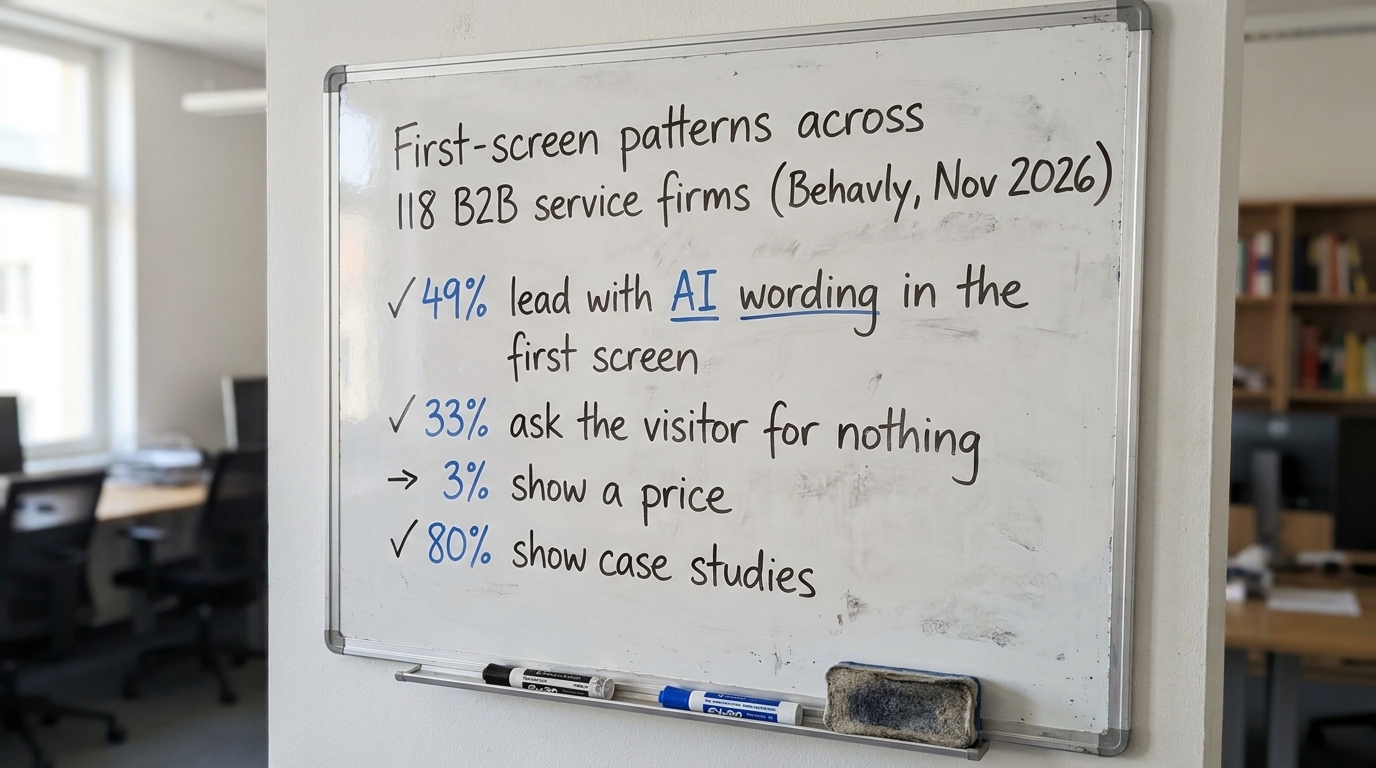
When we indexed 118 B2B service firm homepages in November 2026, the first-screen patterns were consistent and mostly unhelpful. Forty-nine percent led with AI wording in the first screen, which tells a buyer about the technology behind the solution rather than the outcome they will receive. Thirty-three percent asked the visitor for nothing at all, no next step on the page they landed on. Those are not nuances a split test would surface. They are things you can see by reading your own page as a stranger would.
The useful move here is to separate what buyers notice from what you want them to notice. You want them to see your capability. They notice whether the page names their problem in their words and whether anyone like them has bought from you. You can read more of that pattern in our breakdown of homepage design lessons from 118 B2B service firms.
What to change: rewrite the first screen so it names the buyer's problem and the outcome, not your technology. If the words "AI-powered" appear before the words that describe what the client gets, swap the order.
Why the first fix is friction, not the headline
The cheapest conversion gains on a low-traffic page come from removing reasons not to act. Baymard Institute's UX research has catalogued how form length, unclear fields and unexpected steps quietly lose people who were otherwise ready. A demo form that asks for company size, budget and a phone number before a stranger has decided they trust you is a friction problem, and it costs you conversions you will never see in your analytics because the visitor just leaves.
Thirty-three percent of the firms we indexed asked for nothing on the page, one failure. The opposite failure is asking for too much too early. Both are visible without a test. Cut the form to the two fields you actually need to start a conversation, and watch whether completed submissions rise over the next few weeks. That is a far faster signal than a controlled experiment on that traffic.
Long or confusing pages carry their own tax. We covered how to lighten it in reducing cognitive load on B2B websites, and the short version is that every extra choice on the page competes with the one choice you want.
What to change: remove one field, one step, or one competing call to action from your primary conversion path this week. Fewer decisions on the page usually beats a better-worded single decision.
What low traffic lets you measure instead of A/B tests
When you cannot reach significance, you measure things that do not need a 50/50 split. The book that practitioners cite most here, Trustworthy Online Controlled Experiments by Ron Kohavi, Diane Tang and Ya Xu, is honest that controlled experiments require real sample sizes, and that below a threshold you are better served by qualitative and funnel evidence. These methods fit the traffic you have and the decision timeline you work under.
Three measurements work at low volume. Scroll depth and where attention stops, from a session recording tool, show you whether the first screen is holding people. Form abandonment, field by field, shows you exactly where the demo request dies. And a short set of five to eight user tests, where you watch someone from your target role try to understand and act on the page, surfaces problems a million visitors would also hit. Nielsen Norman Group has argued for decades that a small number of test users finds the majority of usability problems. This method fits a page that cannot generate a statistical sample.
What to change: run five moderated page walkthroughs with people who match your buyer. Write down every place they hesitate or seem confused. Fix the top three before you touch anything else.
Bigger changes beat small tweaks when you cannot reach significance
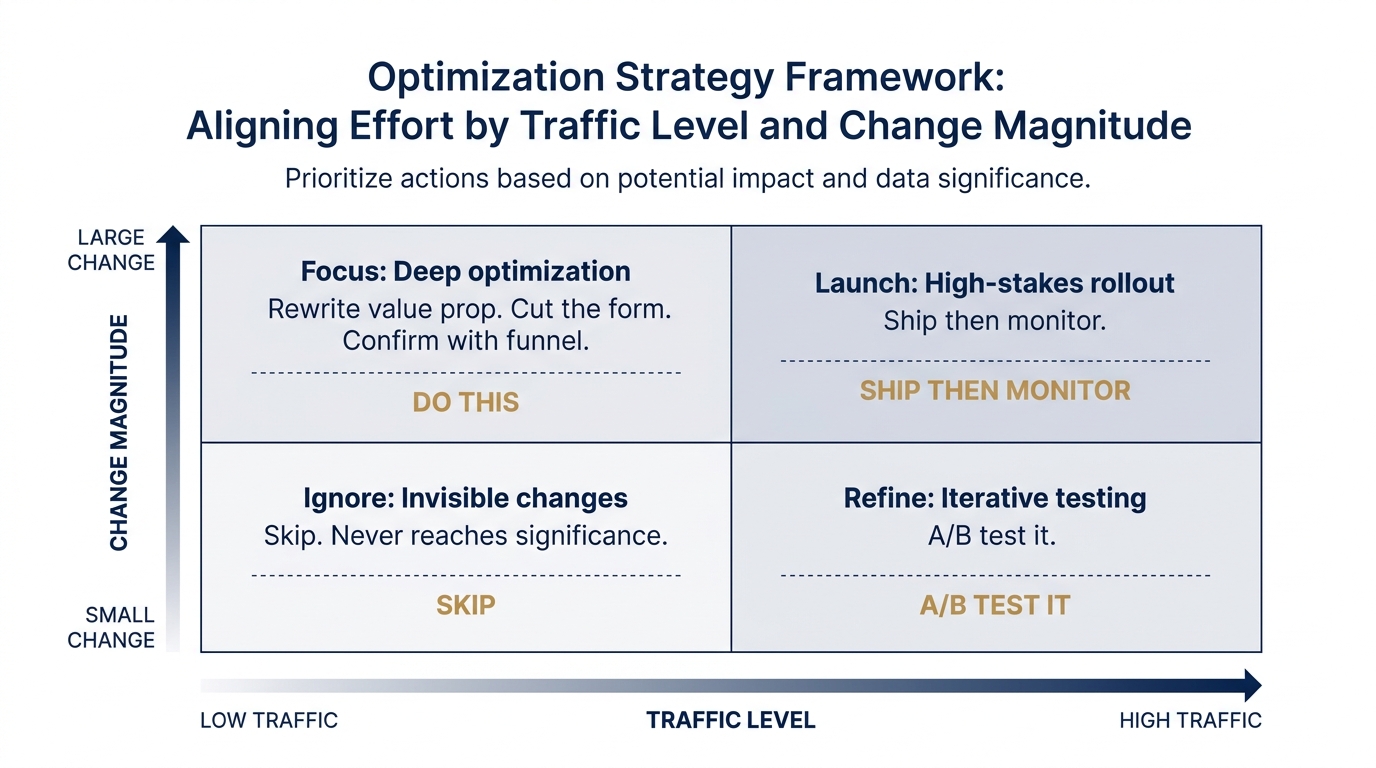
On a high-traffic page you can afford to test a button color, because you have the sample to detect a tiny effect. On a low-traffic page, a tiny effect is invisible to you no matter how long you wait, so a tiny change is not worth making. The logic flips: when traffic is scarce, you should make changes large enough that you do not need a test to see them, and small enough that you can still reason about what caused the result.
A rewritten value proposition is a large change you can defend on first principles. If your first screen does not pass the test of a stranger understanding what you do and for whom in five seconds, rewriting it is justified before any measurement. Our guide on how to write a B2B value proposition covers the structure. The point for low traffic CRO is that you are optimizing by evidence and judgment, then confirming direction with the funnel.
This is also where behavioral research earns its place. Daniel Kahneman's work on how people judge quickly under uncertainty, recognized by the Nobel Prize in Economic Sciences in 2002, explains why a buyer's snap read of your first screen matters more than the careful comparison you imagine them doing. Most buyers never get to the careful comparison. They form an impression and move on.
Where behavioral patterns help and where they mislead
Behavioral science is useful for generating hypotheses about why a page underperforms, not for declaring that one effect explains a whole purchase. A B2B purchase runs through a committee, a budget cycle and a status quo that is hard to displace, so no single bias settles it. The reference libraries at The Decision Lab and BehavioralEconomics.com are good places to read the underlying studies before you borrow a term.
A few patterns transfer cleanly to B2B pages. Social proof matters because buyers look to peers before committing. That is why 80% of the firms we indexed show case studies and why the ones that do it specifically, with named outcomes, do better than the ones with a logo wall; we unpack that in the bandwagon effect in B2B marketing. The pull of the current vendor is real and underrated, covered in status quo bias and why buyers keep their current vendor. And committees stall under too many options, covered in decision fatigue in B2B buying committees. Treat each as a thing to check on your page.
What to change: replace one generic logo row or vague claim with one specific case study that names the client type, the problem and the result. Specific proof reads as true; a logo wall reads as decoration.
What to change on your page this week
You do not need a test suite to start. You need to read your own homepage as a stranger in your buyer's role and work through a short list. Here is the checklist we use on the first pass of any B2B homepage.
- First screen names the buyer's problem in their words, not your technology, within the first sentence a visitor reads.
- Outcome before capability. If "AI" or a tool name appears before what the client gets, reorder it.
- One clear next step above the fold. Not zero (33% of firms ask for nothing), not five competing buttons.
- The form asks for the minimum. Two fields to start a conversation beats seven fields that scare off a stranger.
- At least one specific case study with a client type, a problem and a result.
- A stranger understands who it is for in five seconds. Ask someone outside your company to read it and tell you back what you do and for whom.
- You are measuring scroll depth, form abandonment and five user walkthroughs, not waiting on an A/B test your traffic cannot finish.
Work top to bottom. The first three items fix what buyers notice in the first screen. That is where most of the loss happens on a low-traffic page. The rest fix friction and proof. None of them require a large sample, and all of them show up in your funnel within weeks.
For the broader context on what current B2B homepages are doing and where the common gaps sit, our homepage trends from November 2026 and our write-up on consumer behavior research and what transfers to B2B are the two places to read next. If your buyers reach you through outbound, the same first-screen logic applies to the first lines of an email, which we covered in cold email copy based on how B2B buyers read.
Run the checklist on your own homepage, or let us do the first pass for you with Behavly's free homepage check.