
A visitor forms an opinion of your company in the first screen, long before reading a word about your methodology. If that first screen looks sharp, loads fast, and names a buyer they recognize, they carry that good feeling into everything they read next. If it stutters, shows a stock handshake, and breaks the demo form, they read the rest of the page looking for reasons to leave. That spillover, where one strong signal colors the whole judgment, is the halo effect, and it decides whether your page gets a fair hearing or a skeptical one.
Most B2B pages leak this advantage by accident. In Behavly's November 2026 index of 118 B2B service firms, 49% led with AI wording in the first screen and 33% asked the visitor for nothing at all. Both waste the moment when the halo is forming. This guide explains the behavior, shows where it shows up in a real sale, and ends with what to change this week.
1. What the research says
The term comes from psychologist Edward Thorndike, who in 1920 found that military officers rating their soldiers let one trait pull the others along. A soldier judged physically impressive was also scored higher on intelligence and leadership, though the rater had no evidence for either. One visible quality created a glow around traits the rater could not actually see.
The decision-science reference material from The Decision Lab describes the same mechanism in modern terms: a single salient cue stands in for a judgment the person cannot easily make. Daniel Kahneman, who won the Nobel Prize in Economic Sciences in 2002, folded this into his broader account of fast, intuitive judgment, where the brain answers an easy question (does this look credible?) in place of the hard one (is this firm competent?).
On a B2B website the hard question is whether you can deliver. The buyer cannot assess that from a homepage, so they substitute the questions they can answer in a few seconds: does this look like a serious company, does it load, does it name people like me. Their answer to those easy questions becomes the halo over everything else.
2. Where it shows up on a B2B website and in a sale
The halo effect is not confined to the homepage, though that is where it is strongest. It operates at every point where a buyer forms a quick impression and then reads the rest through it.
- The first screen of the homepage. Design quality, load speed, and a recognizable client logo set the tone for the entire visit.
- The pricing page. A clear, confident price reads as a firm that knows its own value. In Behavly's index only 3% of these firms showed a price at all, so the few that do stand out as more certain.
- The proposal. A tidy, well-structured document makes the buyer trust the numbers inside it more than they should.
- The first reply. A fast, specific response to an inbound message carries a halo into the whole relationship, the same way a slow one casts a shadow.
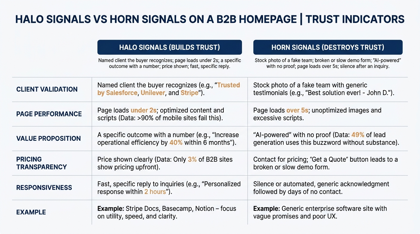
The reverse is the horn effect, where one weak signal drags the rest down. A broken demo form, a stock photo of a fake team, or a page that takes six seconds to load tells the buyer the firm is careless, and they then read your case studies as exaggeration rather than proof.
Nielsen Norman Group's usability research has documented for years how quickly users judge a site and how little text they read before deciding. You can see the pattern in their body of usability research articles: the decision to trust or distrust is made fast, on surface cues, and it sticks.
3. What creates a halo and what creates a horn
The useful distinction is not design taste. It is whether the cue tells the buyer something that correlates, rightly or wrongly, with competence. A named Fortune 500 client is a real signal because landing that account required passing someone else's diligence. A stock photo is a horn because it signals you had nothing real to show and hid it.
The strongest halo cues on a B2B page are concrete and verifiable: a client the buyer recognizes, a specific outcome with a number, a response that arrives within the hour. The strongest horn cues are the ones that suggest neglect, because neglect of the homepage implies neglect of the work.
In Behavly's November 2026 data, 80% of these firms show case studies somewhere, which is good, but most bury them below the fold where they never touch the first impression. The halo forms in the first screen whether or not your best evidence is in it.
4. A worked example on one page (illustrative)
The following is illustrative, not a real client, built to show the mechanism on a single page. Picture a mid-market data-integration firm with a homepage first screen that reads "AI-powered solutions for the modern enterprise," a stock image of four people pointing at a laptop, and a "Request a demo" button that opens a form with nine required fields.
A buyer lands from a Google search. In the first two seconds the generic AI headline tells them nothing, the stock photo signals a firm with no real team to show, and when they click the demo button the nine-field form reads as a company that cares more about its lead-capture than about the visitor. That horn is now set. When they scroll to the case studies, they read "increased efficiency by 40%" as marketing copy, because the page has already told them not to trust it.
Now change only the first screen. The headline names what the firm does and for whom: "We connect ERP, CRM, and spreadsheets for distributors, so finance stops reconciling by hand." Below it sits one recognizable client logo and one sentence of outcome. The stock photo is gone. The demo button asks for an email and nothing else at first. Nothing about the case studies changed, but the buyer now reads the same "40%" as plausible, because the page has earned a halo instead of a horn.
That is the leverage. You rarely need more evidence. You need the first impression to stop undercutting the evidence you already have.
5. The table to work from
Use this to audit your own page and sale. The first column is where the halo forms, the second is what the buyer actually does in that moment, and the third is the change that turns a horn into a halo.
| Where it shows up | What the buyer does | What to change |
|---|---|---|
| Homepage first screen | Decides in ~2 seconds whether the firm is serious, from design, speed, and headline | Replace generic AI wording with what you do and for whom; put one recognized logo in view |
| Hero image | Reads a stock photo as "no real team to show" | Use a real photo, a product screen, or no image rather than a fake one |
| Page load | Treats a slow page as a careless firm and reads the rest skeptically | Get the first screen under two seconds; test on mobile and a cold cache |
| Demo or contact form | Reads a long form as self-serving and abandons | Ask for an email first; move the other fields to a second step |
| Pricing page | Reads "contact us" as uncertainty about value | Show a price or a range; it signals a firm that knows what it is worth |
| Proposal document | Trusts a tidy document and distrusts a sloppy one, regardless of the numbers | Fix formatting and structure before sending; a clean proposal carries the numbers |
| First reply to an inquiry | Carries the speed and specificity of the reply into the whole relationship | Reply within the hour with something specific to their message, not a template |
6. How the halo interacts with other biases on the page
The halo does not act alone. Once a buyer decides your firm looks credible, they start reading the page to confirm that view rather than to test it, which is confirmation bias doing the work the halo set up. We covered that pattern in Confirmation Bias in B2B Buying and What It Means for Your Website, and it is why a strong first impression is worth more than any single later proof point: it tilts how everything after it is read.
The halo also raises the stakes later in the deal. A buyer who formed a strong positive impression and then invested time in calls and a trial becomes reluctant to walk away, a dynamic we wrote about in The Sunk Cost Fallacy in B2B Vendor Decisions. The honest version of using that is to earn the halo with real signals, so the commitment the buyer builds rests on something true.
None of this means one cue decides the purchase. A buyer still runs diligence, checks references, and compares quotes. The halo decides how much benefit of the doubt you get while they do it, which is usually the difference between a shortlist and a pass.
7. What to change on your page this week
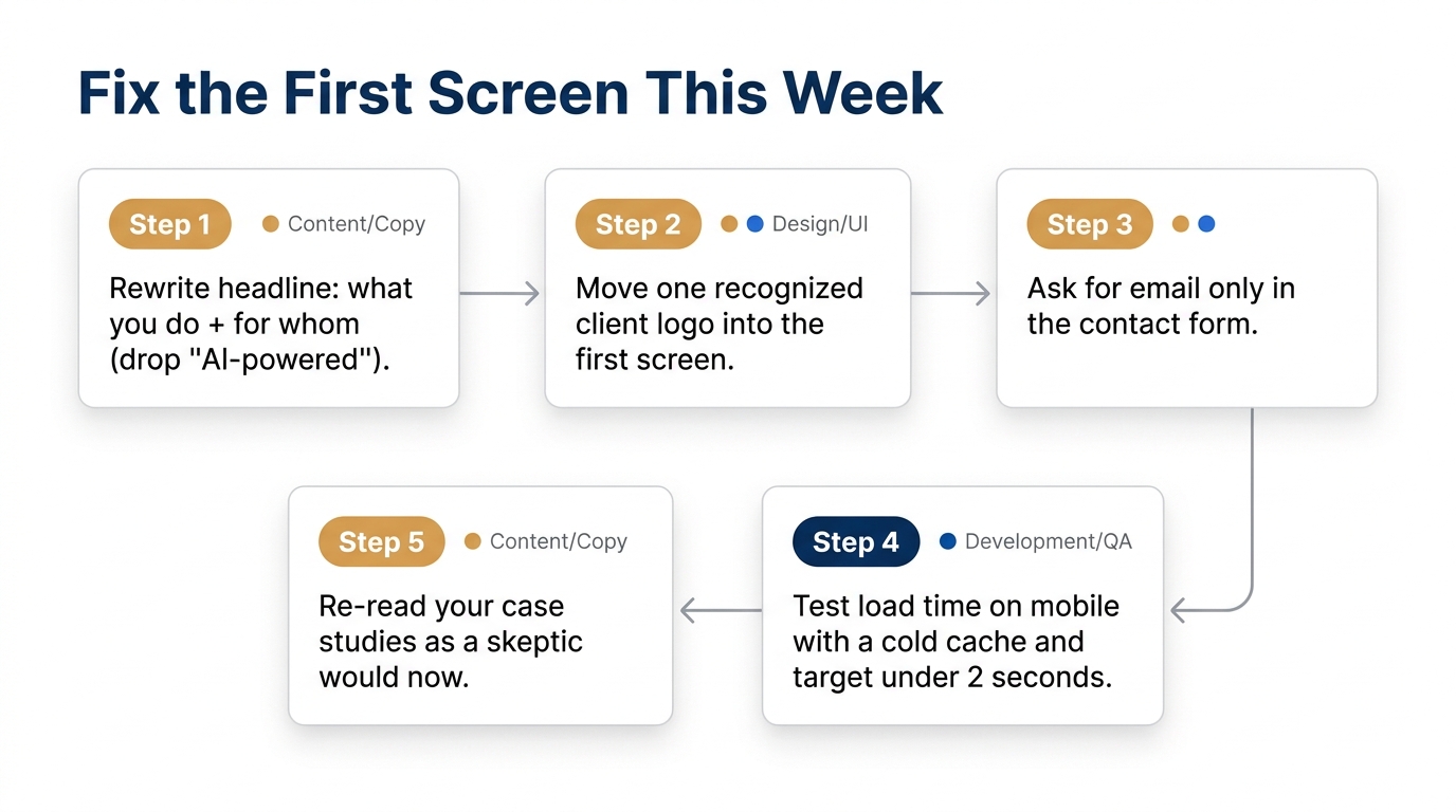
Pick the first screen and nothing else to start, because that is where the halo forms and where most of these firms waste it. Rewrite the headline to say what you do and for whom. If yours leads with "AI-powered," you are in the 49% that said nothing specific. Name the buyer and the outcome instead. Remove any stock photo of a fake team and put one recognized client logo in the first screen. You almost certainly have the logo somewhere below the fold already, since 80% of these firms show case studies, so move one up. Cut the contact or demo form to a single field at first, and measure your page load on mobile. A fast page and a short form stop the horn before it starts.
If you want the broader pattern across the market before you change your own page, the homepage trends from November 2026 show how the 118 firms in the index handle the first screen, and where the easy wins sit.
If you want to see which cue your own first screen is sending before you change anything, run Behavly's free homepage check on your page and read it the way a buyer forms their first impression.