
A procurement lead who sat through a failed ERP migration two years ago will read your homepage through that memory. Before they weigh your case studies, your logos, or your pricing, one vivid scene has already set their sense of risk. That is the availability heuristic at work: people judge how likely something is by how easily an example comes to mind, and a bad example that is easy to recall beats a good outcome they have to reason their way toward. For anyone who owns a B2B page, this is the difference between a prospect who books a call and one who quietly adds you to a mental list of things that might go wrong.
This guide explains the research, shows where availability bias shows up on real B2B pages and in the sales cycle, walks through one illustrative page, and ends with what to change this week. Along the way you get a table you can act on immediately.
1. What the research says
The availability heuristic was described by Amos Tversky and Daniel Kahneman in their 1973 work on judgment under uncertainty. Their finding was straightforward: when people estimate frequency or probability, they substitute an easier question, namely how readily instances come to mind. Kahneman later received the Nobel Prize in Economic Sciences, and the Nobel committee's summary of his work on judgment and decision-making covers this line of research.
The practical consequence for your site is that recency and vividness distort risk. A buyer who recently read about a vendor that missed a launch, or who personally lived through a stalled integration, will overweight that scenario when they look at you. The clear write-up at The Decision Lab's behavioral science reference describes the same mechanism. You are not fighting logic here. You are competing with whatever story is already loaded in the reader's head.
Two things follow. First, one specific, detailed case can carry more weight than a wall of client logos, because a logo is not a story and a story is what the mind retrieves. Second, you can choose which scenario is easiest for the buyer to recall when they picture working with you.
2. Where it shows up on a B2B website and in the sales process
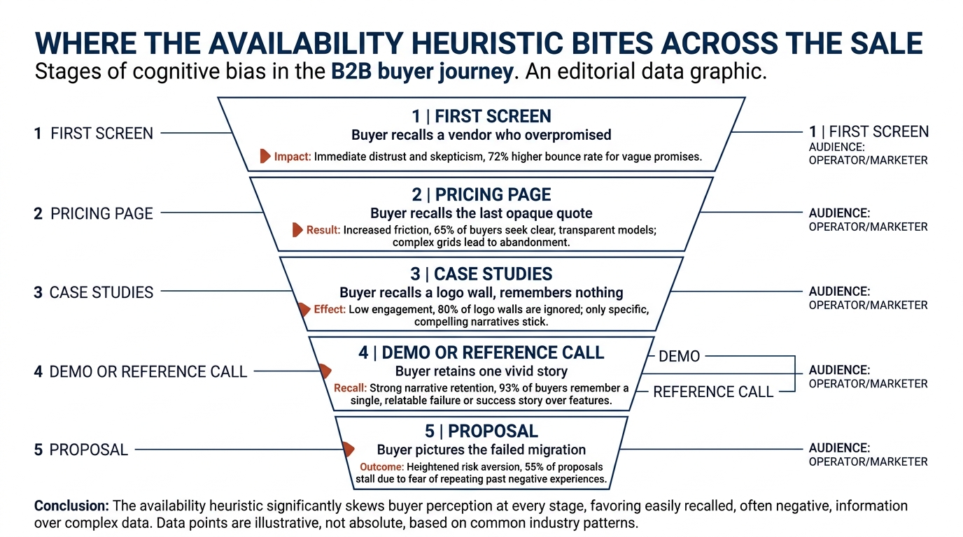
The bias is not confined to one page. It runs through the whole cycle, from the first screen to the signed contract.
On the homepage, the first screen sets the frame. In Behavly's index of 118 B2B service firm homepages (November 2026), 49% lead with AI wording in the first screen, which tells a buyer very little about outcomes and nothing about risk. You can read the full breakdown in the November 2026 homepage trends report. If your first screen is a generic claim, the buyer supplies their own reference point, and that reference point is often a prior vendor who overpromised.
On the pricing page, silence creates its own story. The same index found only 3% of those homepages show a price at all. When a buyer cannot anchor on a number, the available comparison becomes the last opaque quote they received and the budget fight that followed it.
In the sales process, the behavior sharpens. During a demo or a reference call, one detailed account of a problem you solved will stay with the buyer longer than a summary of ten accounts. This interacts with other patterns worth knowing, including confirmation bias in B2B buying and what it means for your website and the sunk cost fallacy in B2B vendor decisions, because a buyer who has already formed a risk picture will seek evidence that confirms it.
3. Why one concrete case beats a wall of logos
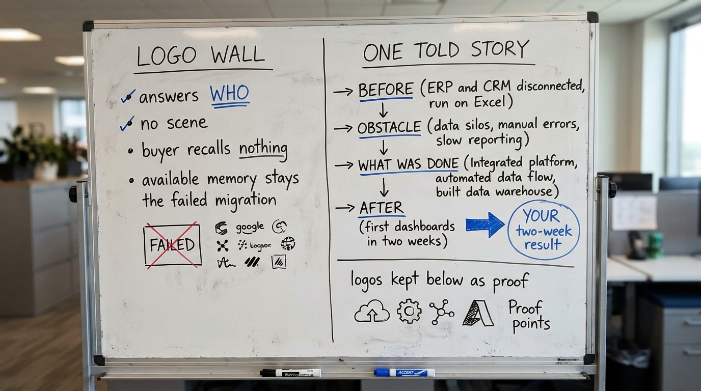
Eighty percent of the homepages in Behavly's index show case studies in some form, yet most present them as a grid of logos or a carousel of one-line quotes. A logo answers "who" but not "what happened," and the mind does not retrieve a logo when it pictures risk. It retrieves a scene.
A scene has a before state, a named obstacle, a sequence of what you did, and a measurable after. When a buyer can replay that sequence, your success becomes the example that comes to mind first, which is the whole point. Nielsen Norman Group's usability research has long shown that specific, scannable content outperforms vague claims, and the availability heuristic explains part of why: specific content is easier to recall later, when the buyer is deciding alone.
Put one fully told story above the logo wall, so the reader has a scene to hold before they skim the proof grid. The logos stay as supporting evidence once the buyer has a memory to anchor on.
4. A worked example on one page (illustrative)
The following is illustrative, not a client result. Picture a mid-market data integration firm with a homepage that opens on "AI-powered data solutions for modern enterprises" and, below it, a row of twelve client logos.
A buyer who once owned a migration that ran six months late reads that first screen and recalls the delay, the finger-pointing, and the budget overrun. Nothing on the page displaces that memory. The logos confirm the firm exists but give the buyer no competing scene, so the available story stays the failed migration.
Now rewrite the first screen as a specific claim tied to an outcome, and place one story directly beneath it: a distributor whose ERP and CRM were disconnected, running the business on spreadsheets, who got read-only connections and a first set of dashboards inside two weeks, with the sequence shown step by step. The before state matches the buyer's own pain, and the after is concrete enough to picture. The twelve logos stay, now as supporting proof under a story the buyer can replay. The available memory the buyer carries into the next meeting shifts from the old disaster to your two-week dashboard.
5. The table: where it shows up, what the buyer does, what to change
Use this as a working checklist against your own site and sales flow. Each row names a place the availability heuristic operates, what the buyer actually does there, and the specific change that gives them a better scene to recall.
| Where it shows up | What the buyer does | What to change |
|---|---|---|
| First screen of the homepage | Fills the vague claim with their own worst prior vendor memory | State a specific outcome for a specific buyer type, so the page supplies the scene instead of the buyer |
| Case study section (logo grid) | Registers that you exist, recalls no scene later | Put one fully told story (before, obstacle, steps, measurable after) above the logo grid |
| Pricing page with no number | Anchors on the last opaque quote and the budget fight it caused | Show a price, a starting range, or a worked example of what a first engagement costs and covers |
| Demo or reference call | Retains one vivid account, forgets the summary of ten | Lead with one detailed, relevant case rather than a broad list of clients |
| Proposal or SOW | Pictures the failed migration when reading the scope | Name the specific risks you prevent and the first low-risk step (read-only access, a staged plan) |
| Outbound email | Deletes a generic pitch, recalls a specific result | Open with one concrete, dated outcome for a company that resembles theirs |
6. How to write a story the mind actually retains
A retrievable story has four parts, and most B2B case studies skip the first two. Write the before state in the buyer's own language, the way they describe the problem to themselves: "it is all in Excel," "we cannot see our own numbers." Name the obstacle that made it hard, because an obstacle is what makes the story feel real rather than a brochure claim.
Then show the sequence of what you did, not a summary of your capabilities. The buyer recalls a sequence; they do not recall a capability list. End on a measurable after with a time frame, because a number attached to a span of weeks is far easier to picture than "improved efficiency."
One caution worth naming: the same vividness that works for you can mislead if you let a single dramatic claim stand in for the whole decision. Your job on the page is narrower: make your best outcome the easiest one to recall, honestly.
7. What to change on your page this week
Start with the first screen, because it frames every memory that follows. Replace a generic or AI-first claim with a specific outcome for a specific buyer type. This is the single highest-leverage edit, given that nearly half the homepages in Behavly's index lead with AI wording that supplies the reader no scene.
Next, promote one case to a full story above your logo grid. Write the before state in the buyer's words, name the obstacle, show the steps, and close on a measurable after with a time frame. Keep the logos; move them under the story.
Then address the pricing silence. You do not have to publish a full rate card, but a starting range or a worked example of a first engagement gives the buyer a number to anchor on instead of their last bad quote. Finally, rewrite the opening line of your standard outbound email and your proposal cover so each leads with one concrete, relevant result rather than a list of services. These four edits all do the same thing: they decide which scene comes to the buyer's mind first.
If you want an outside read on which of these your own page is missing, run Behavly's free homepage check on your site and see what a first-time visitor is most likely to remember.