
Most buyers decide whether to keep reading your page in the first few seconds, and they do it while skimming, half-distracted, with three other tabs open. If your homepage makes them work to figure out what you do, who you do it for, and what to do next, they leave before the sales conversation ever starts. The cause is rarely a bad offer. It is cognitive load: you are asking the reader's working memory to hold more than it can.
In our homepage index of 118 B2B service firms (November 2026), 49% lead the first screen with AI wording and 33% ask the visitor to do nothing at all. Both are symptoms of the same problem. A page that describes everything forces the reader to sort it, and a page that asks for nothing gives them no place to put the attention they have left. This guide explains the behavior, shows where it hits a B2B site and a sales process, and gives you specific reductions to make this week.
1. What the research says about working memory
The term comes from John Sweller's cognitive load theory, developed in the late 1980s to explain why learners fail when instruction overwhelms their working memory. The core finding is simple and well replicated: working memory holds only a few items at once, so when a task forces the reader to track too many things simultaneously, comprehension collapses and they disengage.
Your homepage is a learning task whether you intended it or not. The visitor is trying to learn what you sell, whether it fits, and whether to trust you, all from a page they did not ask to read. Nielsen Norman Group's usability research on interaction cost and scanning behavior shows the same pattern in practice: people scan in an F-shape, skip dense blocks, and abandon pages that make the next step unclear. The reader is rationing a limited resource, because working memory capacity is finite.
Daniel Kahneman's work on fast and slow thinking, recognized with the 2002 Nobel Prize in Economic Sciences, adds the reason it matters commercially. Buyers default to the low-effort mode, and anything that forces effort gets avoided. A page that reads as hard work reads as the vendor being hard work.
2. Where cognitive load shows up on a B2B website
The load is rarely in one place. It accumulates across the page, and each small demand on working memory is survivable until they stack.
Dense hero sections
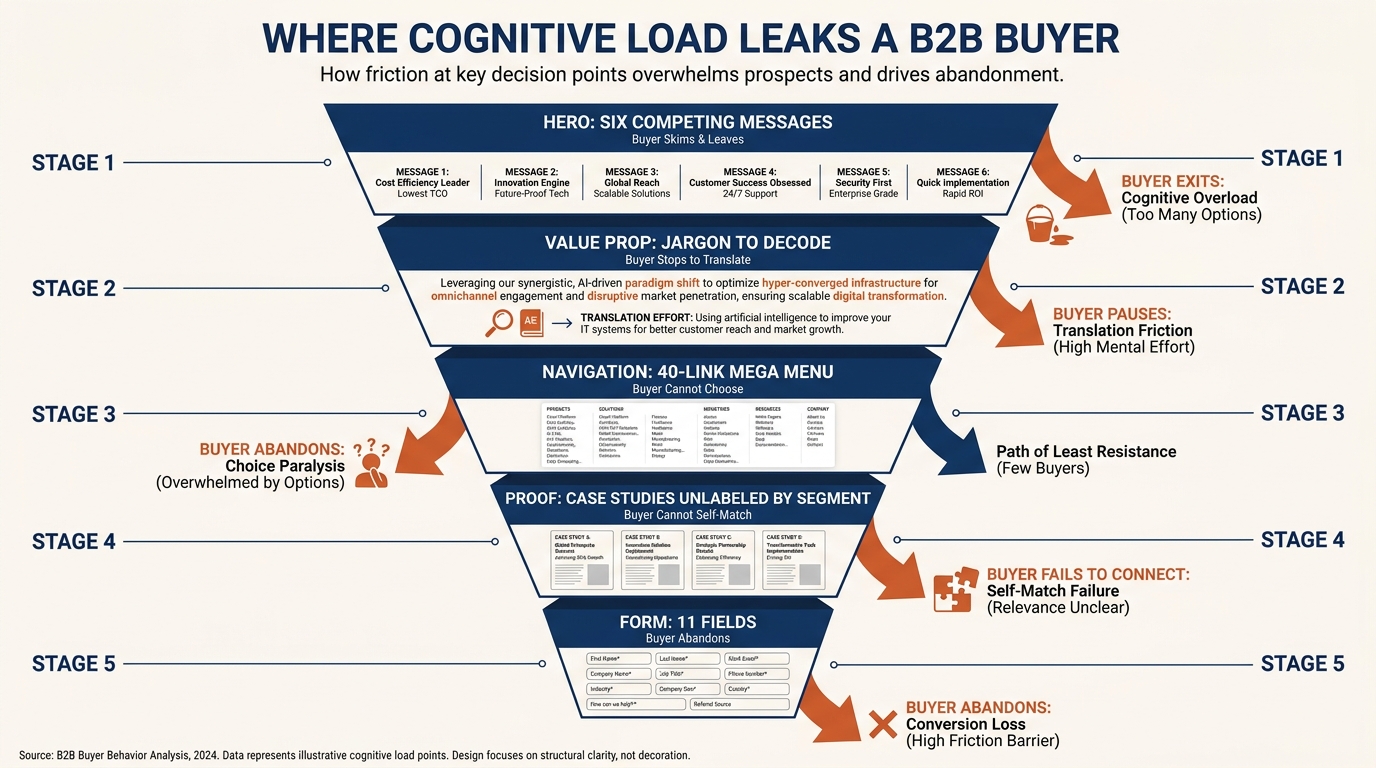
A hero that stacks a vague headline, a sub-headline, three feature bullets, two badges and a carousel asks the reader to parse six competing messages before they know what you do. The first screen should answer one question: what do you do and for whom. If your first screen leads with AI wording like 49% of the firms we indexed, you are describing a method before the reader knows the problem it solves.
Jargon and abstraction
Every term the reader has to translate is an item held in working memory. "End-to-end orchestration for revenue teams" makes them stop and decode. "We fix the CRM your sales team stopped trusting" does not. Plain words are not a style preference. They lower the processing cost of the sentence.
Mega menus and long forms
A navigation menu with 40 links is 40 decisions. Baymard Institute's UX research on forms and navigation documents how every extra field and every extra option raises abandonment, because the cost of choosing is itself a cost. A demo form with 11 fields tells the buyer the conversation will be as heavy as the form.
These same patterns feed other biases too. When a page is hard to read, buyers fall back on whatever they already believed, which is one way confirmation bias shows up in B2B buying: load pushes them toward the easy, pre-formed judgment instead of your argument.
3. The three-column table to find your load
Use this to audit your own page and sales process. The point is to connect each place load builds to what the buyer actually does when it builds, so you are fixing a behavior and not just tidying a layout.
| Where it shows up | What the buyer does | What to change |
|---|---|---|
| Hero with headline, sub-headline, bullets, badges and a carousel | Skims for one second, cannot find the point, scrolls past or leaves | Cut to one headline that names the outcome and one line of who it is for; remove the carousel |
| First screen leads with AI or method wording | Reads a feature before the problem, cannot tell if it fits them | Lead with the problem you solve; move the method lower |
| Jargon and abstract phrasing | Stops to translate, loses the thread, re-reads or gives up | Replace each term with the plain words a client would use on a call |
| Mega menu with 30+ links | Scans options, cannot decide, uses nothing | Reduce to 5 to 7 primary items; group the rest or remove |
| Case studies with no segment labels | Cannot tell which proof is about a company like theirs | Label each case by industry and company size so they self-match |
| Demo form with 10+ fields | Weighs the effort against unknown value, abandons | Ask for name, work email and one qualifying field; collect the rest on the call |
| Proposal that opens with your firm history | Reads three pages before reaching their problem, skims | Open with their problem and the outcome; move credentials to an appendix |
| Outbound email with three asks | Defers the decision because none is obvious | One ask, one sentence of why, one link |
4. A worked example on one pricing page
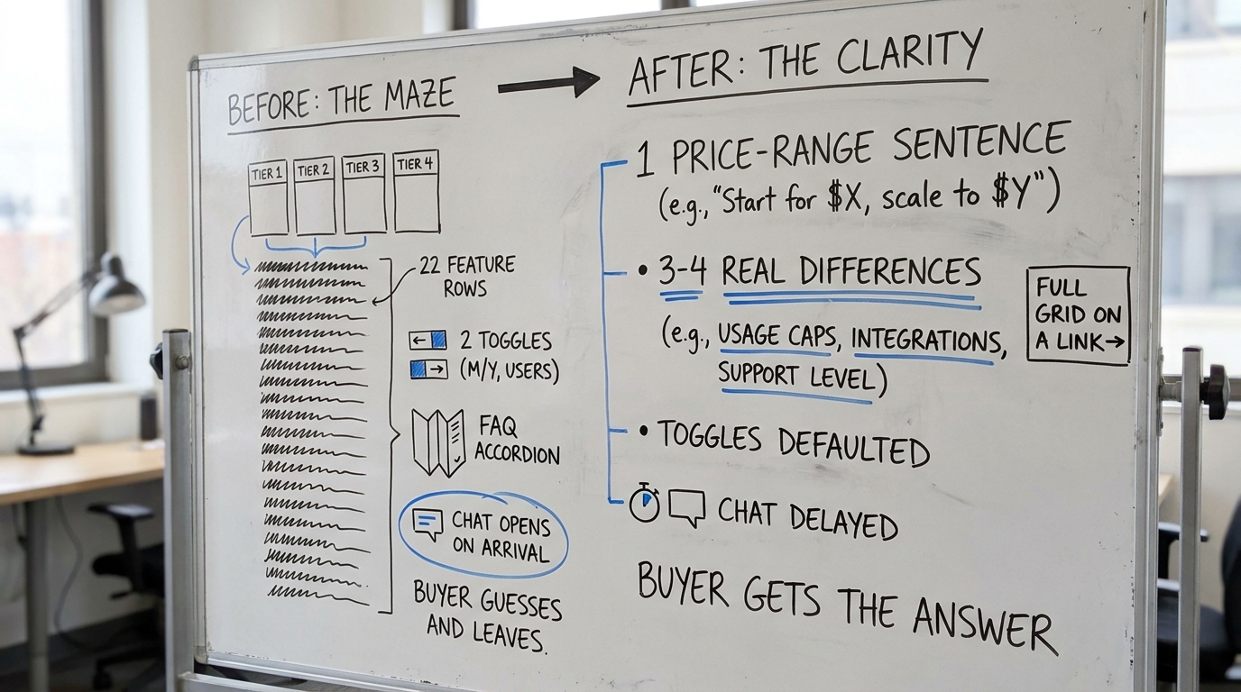
Picture a mid-market B2B services firm whose pricing page carries four plan tiers, a comparison grid with 22 feature rows, two toggles for billing frequency and currency, an FAQ accordion, and a chat widget that opens on arrival. Only 3% of the firms we indexed show a price at all, so this page is already ahead for even trying. But it is asking too much at once.
Walk the load. The buyer lands wanting one answer: roughly what will this cost a company like mine. Instead they meet four columns, 22 rows and two toggles, which is dozens of comparisons to hold in working memory before any judgment is possible. The chat widget adds a social demand on top of a reading task. Most readers do not finish the comparison. They guess, assume it is expensive or complicated, and leave.
The reduction keeps every fact and changes the order it arrives in. Lead with a single sentence that anchors the range ("most engagements run between X and Y per month"). Collapse 22 rows into the three or four differences that actually move a buyer between tiers, and link the full grid for the few who want it. Default the toggles to the common case. Delay the chat widget until the reader has scrolled. Nothing was removed from the offer; the page simply stopped delivering it all in the first glance.
5. How this plays out in the sales process
Cognitive load does not stop at the website. The same working-memory limit governs your proposal, your demo and your outbound.
A proposal that opens with your founding year and a company timeline spends the reader's attention before it reaches their problem. By the time they reach the part that matters, they are skimming. Reorder it: their situation, the outcome, the plan, then your credentials as an appendix for the people who check. A demo that shows every feature leaves the buyer unable to recall which one solved their problem. Show the two or three that map to what they told you, and stop.
Outbound email is the sharpest test, because it is the shortest. An email with three questions and two links forces the reader to decide which to answer, so they decide to answer later, which means never. One ask, one reason, one link. The clearer the next step, the lower the load, and the more likely they act.
6. Why clearer pages convert and not just read better
It is tempting to treat this as a tidiness exercise. The commercial case is stronger than that. A page the buyer can process in one pass builds trust, because ease of reading is read as ease of working with you. Richard Thaler's work on choice architecture, recognized with the 2017 Nobel Prize in Economic Sciences, shows that how options are presented changes which ones get chosen, independent of the options themselves. Lowering cognitive load is choice architecture applied to your own funnel.
Page clarity also compounds. In our index, 80% of firms show case studies, but proof the reader cannot quickly match to their own situation adds load instead of removing it. Labeling a case by industry and size turns a dense block into a fast judgment. The fix for information overload is almost never more content. It is the same content, sequenced so working memory can hold it. If you want the longer pattern across all 118 firms, the homepage design lessons from 118 B2B service firms and the full homepage trends for November 2026 show where the load concentrates.
7. What to change on your page this week
You do not need a redesign. You need to remove demands on working memory in the order a buyer meets them. Work down this list.
- Rewrite the first screen to answer one question: what you do and for whom. Cut the carousel and the badges.
- Find every phrase a client would not say out loud on a call and replace it with the plain version. Writing a clear B2B value proposition is the single highest-leverage reduction here.
- Cut your navigation to 5 to 7 primary items. Group or remove the rest.
- Label each case study by industry and company size so the reader can self-match in a glance.
- Reduce your demo or contact form to three fields. Move the rest to the call.
- Reorder your proposal template to open with the client's problem, not your history.
- Cut every outbound email to one ask, one reason, one link.
Pick two of these and ship them this week. Each one removes items the reader would otherwise have to hold, and the effect stacks the same way the load did.
If you want a fast read on where your own homepage is overloading buyers, run Behavly's free homepage check on your page and see what the first screen is actually asking people to do.