
When a B2B buyer leaves your pricing page without acting, you rarely lose to another vendor. You lose to the buyer keeping the spreadsheet, the manual process, or the tool they already pay for. Status quo bias is the pull toward staying put, and on most B2B pages it wins by default because the page never names what staying costs or shows how small the switch really is.
This guide explains the behavior, shows where it shows up on real pages and in a real sales process, and ends with a short list of changes you can make this week. The goal is narrow: make staying the same look like the risk, and make switching look smaller than the buyer fears.
1. What the research says
The term comes from a 1988 paper by William Samuelson and Richard Zeckhauser, who ran experiments where people stuck with an existing option far more often than a neutral comparison would predict, even when a better alternative was on the table. The effect gets stronger as the number of options grows, because more choice makes doing nothing feel safer.
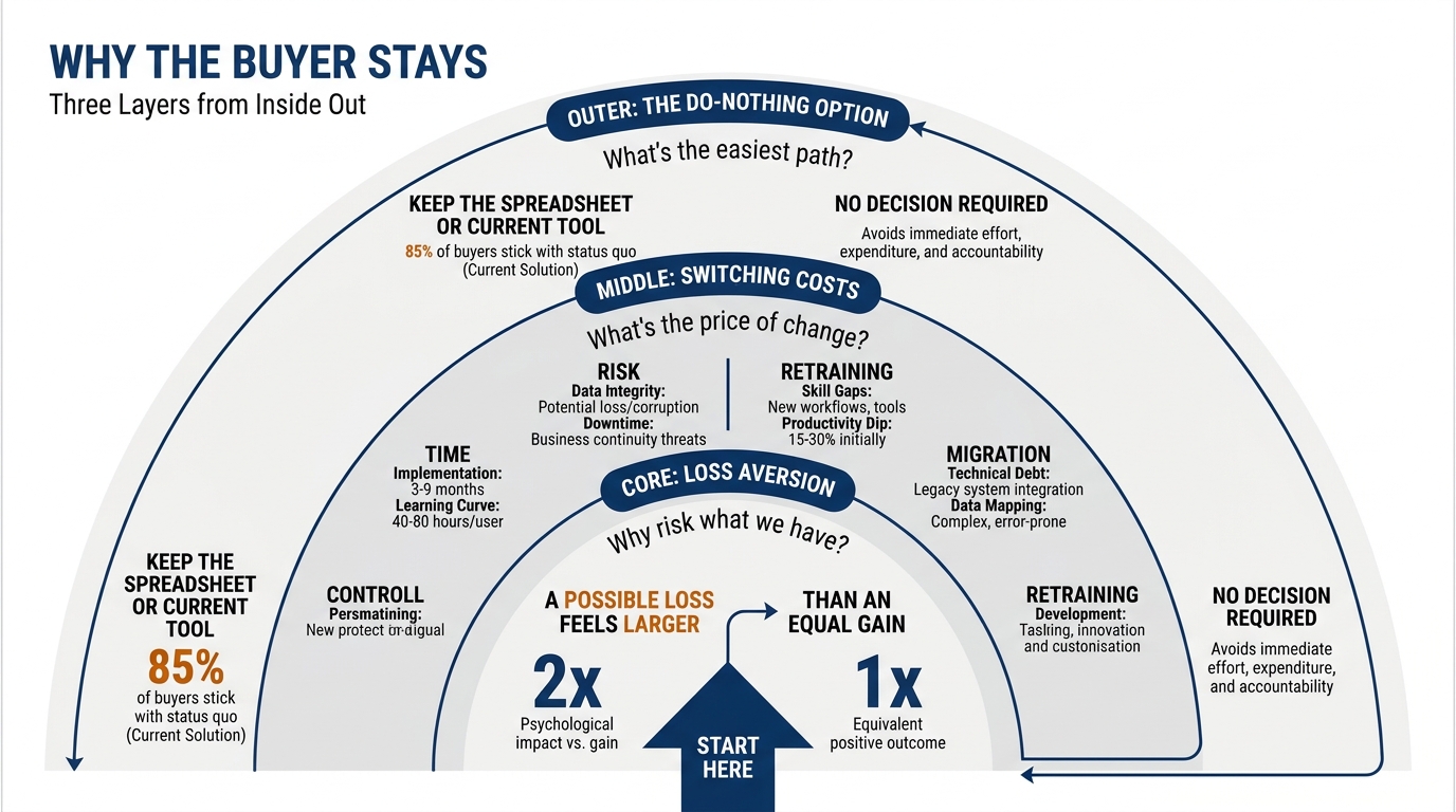
Two forces behind it are worth naming. One is loss aversion, documented by Daniel Kahneman and Amos Tversky, where a potential loss weighs heavier than an equivalent gain; Kahneman's work on this was recognized with the 2002 Nobel Prize in Economic Sciences. The other is the default effect, which Richard Thaler, awarded the 2017 Nobel Prize, showed can move real decisions simply by changing what happens if a person does nothing. The Decision Lab has a plain reference on status quo bias if you want the academic summary.
For a B2B page the practical reading is this: the buyer's current setup is the default, and your page is asking them to abandon a default. That is the hardest thing to ask, and most pages do not acknowledge it at all.
2. Where it shows up on a B2B website or in a sales process
The do-nothing option is invisible on most pages because nobody draws it. The buyer is silently comparing you not to a rival, but to their own current state, which they already understand and have already paid for. Your copy competes with a known quantity, and known beats unknown.
You can see the symptoms. A homepage that lists features but never describes the cost of the buyer's present situation. A pricing page that shows a number with no sense of what the buyer loses each month by waiting. A demo form that asks for a lot of information before giving any value, which raises the perceived switching cost before the buyer has seen a reason to switch. In Behavly's November 2026 index of 118 B2B service firms, 33% ask for nothing on the first screen and only 3% show a price, so the buyer often cannot even size the decision, let alone the alternative.
Inertia also lives in the sales process itself. A proposal that quotes your fee without quantifying the status quo invites the buyer to compare your price to zero, because today they pay you nothing. An outbound email that opens with your capabilities instead of their current pain gives the reader no reason to move off a setup that already works well enough.
The three-column map
Use this table to locate the status quo bias on your own funnel. The middle column is what the buyer is actually doing while looking at that surface; the right column is the single change that reduces inertia there.
| Where it shows up | What the buyer does | What to change |
|---|---|---|
| Homepage hero | Scans for whether this is worth a decision at all, then leaves to keep the current setup | Name the status quo in the first screen ("still running this in spreadsheets?") so the buyer sees their default described |
| Pricing page | Compares your price to the zero they pay today for doing nothing | Put the cost of staying next to the price, in the buyer's own units (hours, errors, missed renewals) |
| Demo or contact form | Weighs effort of signing up against an uncertain payoff, and the effort wins | Cut fields to the minimum and show the payoff before the ask, so the perceived switching cost drops |
| Proposal or quote | Reads the fee as a new expense added to a working situation | Open with the quantified cost of the current state, then present the fee as the smaller number |
| Outbound email | Deletes it because nothing in it beats the familiar setup | Lead with a specific symptom of their status quo, not your capabilities |
| Onboarding or migration page | Imagines a painful switch and stalls | Show the migration path as concrete, dated steps so the switch looks finite |
3. Name the status quo before you sell against it
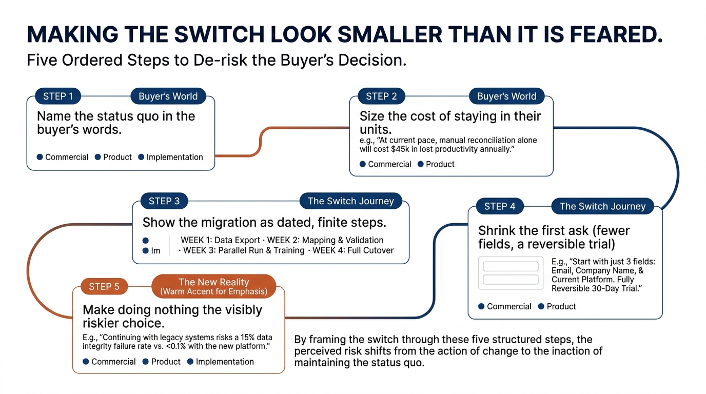
You cannot argue with a default the buyer has not consciously noticed. The first move is to describe their current state back to them, specifically enough that they recognize it. A hero line like "most teams still track renewals in a shared sheet and find out too late" does more work than any feature list, because it makes the invisible default visible and slightly uncomfortable.
This is the opposite of the common pattern. Behavly's November 2026 index found 49% of B2B service firms open with AI wording in the first screen, which describes the vendor rather than the buyer's situation. If your first screen is about you, the buyer has no reason to reconsider their own setup. Our homepage trends from November 2026 show how common that mirror-facing copy is.
Name the status quo in the buyer's words, on the homepage and at the top of any proposal. That single sentence reframes the whole page from "here is a new thing to buy" to "here is a problem you already have."
4. Size the cost of staying
Once the default is named, give it a number. Loss aversion means the buyer feels the cost of staying more sharply than the benefit of switching, so your job is to make the cost of staying concrete. "Teams your size lose roughly a day a week reconciling this manually" is harder to ignore than "we save you time."
Keep the number honest and sourced. If it comes from a published study, cite it. If it comes from your own experience with similar buyers, say so and state the range. On a pricing page, the cost of staying belongs right next to the price, because that is where the buyer is doing the comparison. Nielsen Norman Group's usability research is clear that buyers decide fast and skim, so the cost of staying has to be visible without scrolling or math.
This is also where confirmation bias works for you. A buyer who already suspects their current setup is failing will seize on evidence that confirms it, which is why naming a symptom they recognize is so effective. Our piece on confirmation bias in B2B buying and what it means for your website covers how to feed that existing suspicion without overclaiming.
5. Show the migration path so the switch looks finite
Switching costs are usually imagined larger than they are. The buyer pictures a messy, open-ended project and stalls. You counter that by making the switch look finite and mapped. A short, dated migration outline ("week one: read-only connection, week two: first dashboards, week three: your team on the new view") turns a vague fear into a schedule.
Baymard Institute's UX research on checkout and form flows shows that perceived effort, not actual effort, is what stops people. Spelling out the steps matters more than the steps being few. Even a complex migration feels smaller when it is broken into named stages with a clear end.
Reduce the first commitment too. A reversible trial, a read-only pilot, or a two-field demo form all lower the perceived switching cost because the buyer can back out. The default is powerful partly because it feels safe; a reversible first step borrows some of that safety.
6. A worked example on one pricing page (teaching example)
The following is a teaching example. Picture a B2B scheduling tool whose pricing page shows three tiers and a "Start free trial" button, and nothing else. The buyer looks, decides their current spreadsheet is free and familiar, and leaves. The page never competed with the real alternative.
Now rework the same page against the status quo bias. Above the tiers, add one line: "Most teams book this manually and lose about three hours a week to double-bookings and back-and-forth." That names the default and sizes the cost of staying. Next to each tier, add a short note: "Replaces the shared sheet in under a week." That shrinks the switching cost. Change the button from "Start free trial" to "Import your current schedule in 10 minutes," which makes the first step concrete and reversible.
Nothing about the product changed. What changed is that the page now argues against the do-nothing option instead of ignoring it. The buyer is comparing the tier price to the three hours a week, not to zero.
The same logic applies to a proposal. If you quote a retainer without quantifying the current state, the buyer compares your fee to nothing. If you open with "handling this in-house is costing roughly this much in overtime and rework," the fee reads as the smaller, safer number. This is the inverse of the trap we describe in the sunk cost fallacy in B2B vendor decisions, where buyers overvalue what they have already poured into the current setup.
7. What to change on your page this week
You do not need a redesign. You need to make the default visible and the switch finite. Here is a short checklist you can run against your own homepage, pricing page, and next proposal.
- Add one sentence to your first screen that names the buyer's current setup, using the terms they would use to describe their situation to a colleague.
- Put the cost of staying next to your price, sourced or stated as a range from your own data, in units the buyer feels (hours, errors, missed revenue).
- Cut your demo or contact form to the fewest fields that let you follow up, and show the payoff above the ask.
- Replace a vague call to action ("Start free trial") with a concrete, reversible first step ("Import your current data in 10 minutes").
- Add a short, dated migration outline anywhere the buyer might imagine a painful switch.
- Open your next proposal with the quantified cost of the current state, then the fee.
Work top to bottom. Naming the status quo is the one change that makes every other change land, because until the buyer sees their default described, the rest of the page is competing with something invisible. The Decision Lab and behavioral science references are useful if you want to read the mechanism in more depth, but the page work is the part that moves the number.
If you want a quick read on how your own first screen handles this, run Behavly's free homepage check and see whether your page names the status quo or only describes what you sell.