
Readers remember the first and last items in any list you show them, and they forget most of what sits in the middle. That pattern, the serial position effect, decides which of your service lines a buyer recalls after they close the tab, which pricing feature they repeat to a colleague, and which menu label they click first. If you ordered your top navigation, your service grid, or your proposal sections by accident, you have left that recall to chance.
This guide explains the behavior, names where it shows up on a real B2B page, and gives you an order you can change this week. No psychology lecture, no invented numbers.
1. What the research says
The serial position effect comes from Hermann Ebbinghaus in the 1880s and was tested in detail by Bennet Murdock in a 1962 study on free recall. People shown a list remember the earliest items better than the middle (the primacy effect) and the most recent items better still (the recency effect). The items in the middle take the biggest hit.
The two halves have different causes, which matters when you decide what to put where. Primacy works because the first items get more attention and more rehearsal before the next ones arrive. Recency works because the last items are still fresh when the person stops reading. On a web page, where a visitor scans fast and leaves, you are usually fighting for both ends at once.
Nielsen Norman Group's usability research has shown for years that people scan pages rather than read them, and that the first and last elements in a sequence carry weight the middle does not. You can read their usability research articles for the eye-tracking work behind that. The underlying memory effect is catalogued at The Decision Lab if you want the academic lineage in one place.
One caution before you apply it. The serial position effect shapes what a buyer recalls, and recall is not conversion. Other patterns, like confirmation bias in B2B buying and what it means for your website, act at the same time, and no single bias explains a whole purchase. This is an ordering rule.
2. Where it shows up on a B2B website and in a sale
Most B2B pages contain at least four ordered lists the buyer scans in sequence, and in each one the order is doing work whether you planned it or not.
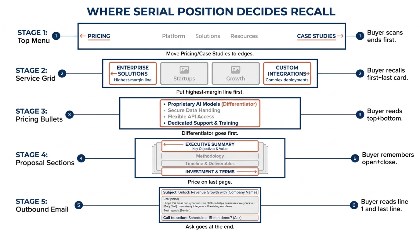
- Top menu labels. The first and last items in your navigation are the ones a visitor registers. Burying "Pricing" or "Case Studies" in the fourth slot of six hands that attention to whatever sits on the ends.
- Service or capability lists. A grid of nine services reads as a wall. The buyer leaves recalling the first card and the last, and your highest-margin line may be sitting in slot five.
- Pricing feature lists. Inside a plan, the first and last bullets get read; the middle ten blur. If your differentiator is bullet seven, it is effectively invisible.
- Proposal and deck sections. A buyer who reviews a proposal remembers the opening and the close. Price in the middle gets skimmed; price on the last page gets anchored.
- Outbound email. The first line and the last line carry the ask. A buried call to action in paragraph two is the middle of the list.
3. Order the top menu so the ends do their job
Start with the navigation, because it is the first ordered list every visitor meets and the cheapest to change. List the labels you actually have, then decide which two matter most for a buyer deciding whether to stay. Put one at the front and one at the back.
In our homepage index of 118 B2B service firms in November 2026, 33% of sites asked the visitor for nothing at all, no clear next step anywhere on the first screen. If that is you, the menu is where you fix it: a label like "Book a call" belongs in the last slot, the recency position, where it is the final thing a scanner registers. You can see the full breakdown in the homepage trends from November 2026.
Keep the middle for the labels that exist for completeness but rarely win a click, such as "About" or "Careers". You are not hiding them; you are accepting that the middle is where recall drops and putting low-stakes items there on purpose.
4. Reorder service and pricing lists around the first and last slot
For a service grid, decide what a first-time buyer should remember you for, and put that card first. Put the service you most want associated with your name, or the one with the clearest proof behind it, in the last visible slot. Everything in between is middle, so group the commodity lines there.
Pricing feature lists follow the same rule at a smaller scale. Lead each plan's bullet list with the feature that separates you from the obvious alternative, and close with the one that removes the last objection, usually support, onboarding, or a guarantee. Do not open with "email support" and close with "SSO" unless those are genuinely your strongest and your closer.
One honest note on price itself. In the same index, only 3% of these firms showed a price on the homepage at all, so for most readers this is about feature order inside a plan page rather than a number on the home screen. Baymard Institute's UX research on how people read pricing and list content is a useful cross-check before you finalize any reorder.
5. Put the close where the buyer stops reading in a proposal
A proposal is a long ordered list the buyer reads once, often in a hurry. The opening section and the final section are what the champion repeats to the people who were not on the call. Use the first section to state the outcome they are buying, in their own words, and use the last section for the recommendation and the next step.
Avoid ending on terms, legal boilerplate, or a long appendix, because that is the recency slot and it will be the freshest thing in their mind. If scope and price have to appear, place price where you want it anchored, not where the template left it. The middle sections, methodology and team bios, are where recall drops anyway, so that is the right home for detail nobody quotes back to you.
This is also where a related pattern bites. Once a buyer has invested time reviewing a long proposal, the sunk cost fallacy in B2B vendor decisions can keep them moving forward, which is one more reason the opening and closing framing deserve your attention rather than the filler in between.
6. A worked example on one page, illustrative only
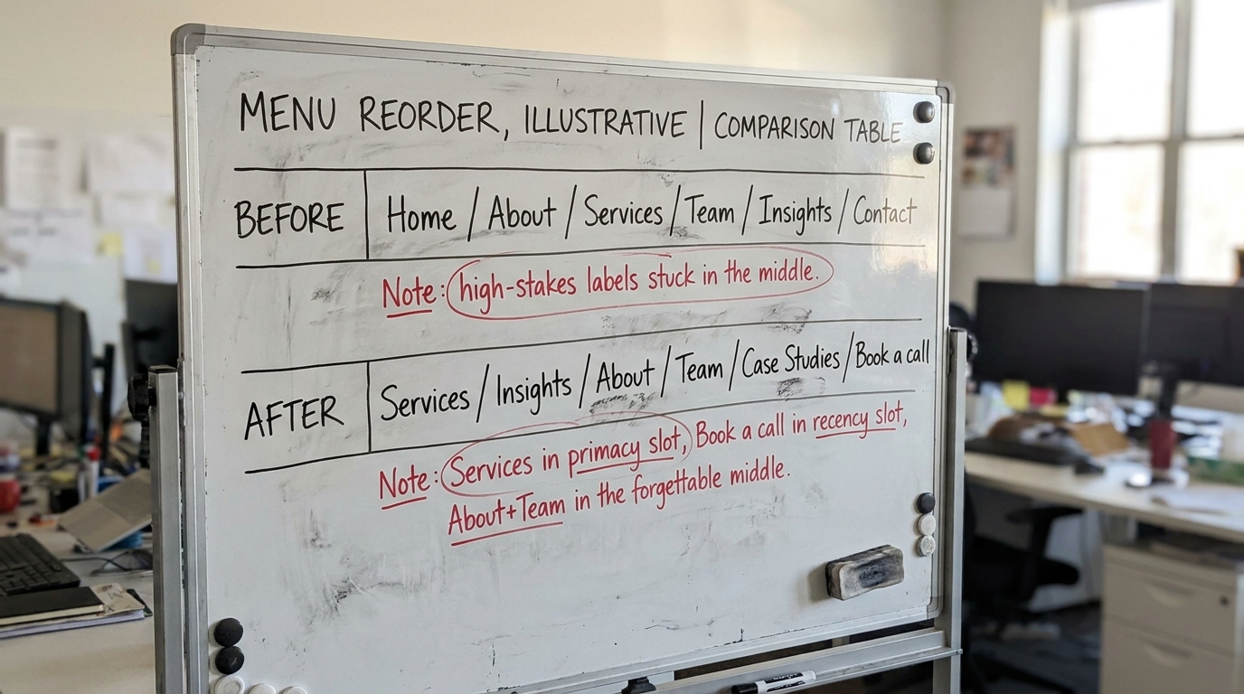
Here is a before and after for the top menu of one service firm. The firm, labels, and reasoning are illustrative, built to show the reorder, not drawn from a client.
Before. Home, About, Services, Team, Insights, Contact. The two end slots are "Home" (which the logo already links to) and "Contact" (vague). The buyer's two highest-stakes questions, what you do and what it costs to engage, sit in the forgettable middle.
After. Services, Insights, About, Team, Case Studies, Book a call. Now "Services" takes the primacy slot, so the scanner's first registered label answers what you do. "Book a call" takes the recency slot, so the last thing they read is the next step. "About" and "Team" drop into the middle on purpose, because they rarely win the first click and the middle is where recall falls.
In our index, 80% of these firms already show case studies somewhere. Moving that proof to an end slot is usually a reorder.
7. The ordering table to work from
Use this to audit your own page. For each place the serial position effect applies, it names what the buyer does with the list and what to change about the order.
| Where it shows up | What the buyer does | What to change |
|---|---|---|
| Top menu labels | Scans left to right, registers the first and last labels, skips the middle | First slot = what you do; last slot = the next step (book, demo, contact) |
| Service or capability grid | Recalls the first card and the last card after leaving | Lead with the line you want to be known for; close with your strongest proof; group commodity lines in the middle |
| Pricing feature bullets | Reads the top two and bottom two bullets, blurs the rest | Open with the differentiator; close with the objection remover (support, onboarding, guarantee) |
| Proposal sections | Remembers the opening and the final section; skims the body | Open with the outcome in their words; close with the recommendation and next step, not terms or appendix |
| Outbound email | Reads the first line and the last line, skips paragraph two | State relevance in line one; put the single ask in the last line |
| Demo or contact form fields | Starts the first field, abandons in the middle of a long list | Ask the easiest field first; keep the list short so there is barely a middle to lose people in |
8. What to change on your page this week
You can do all of this in an afternoon without a redesign, because every item is a reorder of content you already have.
- Open your navigation and move your strongest "what we do" label to the first slot and your clearest next-step label to the last. Push "About" and "Careers" into the middle.
- Reorder your service grid so the line you most want recalled is first and your best proof is last.
- In each pricing plan, move your differentiator to the top bullet and your objection remover to the bottom bullet.
- Open your current proposal template and check that it opens on the buyer's outcome and closes on the recommendation.
- Rewrite one outbound email so the ask is the last line, then compare reply rates against your old order.
None of these guarantee a sale on their own, and that is the point. The serial position effect changes what a buyer carries away and repeats internally. That is a precondition for the slower work of getting chosen. Order the ends well and you stop donating your best message to the forgettable middle.
If you want a second read on your own homepage before you start reordering, run Behavly's free homepage check and see which of your first-screen elements are landing in the middle.