
Most B2B buyers form a view of your price before anyone from your team speaks to them. They read the number against a budget line they already have, against whatever competitor they looked at last, and against the unit you chose to quote in. By the time a sales call happens, the price has already been judged once. Pricing psychology is the study of how that first judgment forms, and on a B2B website it decides whether a buyer keeps reading or quietly drops you from the shortlist.
This guide explains what the research actually says, shows where it lands on a homepage, a pricing page, and a proposal, and ends with a short list of changes you can make this week. In Behavly's November 2026 index of 118 B2B service firms, only 3% show a price anywhere on the first screen. That silence is itself a pricing decision, and usually not a good one.
1. What the research says about how a price is read
The clearest finding comes from Daniel Kahneman and Amos Tversky's work on judgment under uncertainty, which earned Kahneman the Nobel Prize in Economic Sciences in 2002. People do not evaluate a number in isolation. They evaluate it against a reference point, and the reference point is whatever is handy: the last quote they saw, the budget they were given, or the first figure on your page.
Richard Thaler, who won the Nobel Prize in Economic Sciences in 2017, added the idea of mental accounting: buyers file a cost into a category before they weigh it. A number filed under "software subscription" is judged against other subscriptions. The same number filed under "consulting project" is judged against day rates and headcount. You do not get to pick which account a buyer uses, but the unit you quote in, per seat, per month, per project, pushes them toward one.
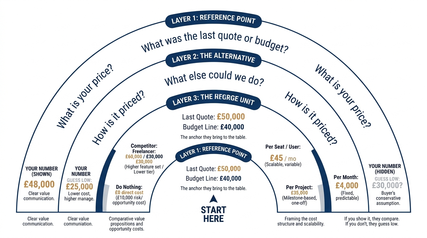
So three things shape price perception before a conversation starts: the reference point you set, the alternative the buyer compares you with, and the unit you express the price in. The rest of this guide works through each on a real page.
2. The reference point you set, or the one the buyer brings
If your page shows no number, the buyer supplies the reference point, and they tend to supply a low one. The alternative they have in mind is often a cheaper tool, a freelancer, or doing nothing. When you stay silent, you compete against that mental figure without knowing it exists.
Anchoring is the lever here. The first relevant number a buyer sees pulls their estimate toward it. On a B2B pricing page, that means the order and prominence of your tiers matters more than the tiers themselves. We cover the mechanics in detail in Price Anchoring on B2B Pricing Pages, but the short version is that a visible high tier makes the middle tier read as reasonable, while an empty page makes everything read as expensive relative to free.
Nielsen Norman Group's usability research has long found that hidden pricing drives users to assume the worst and leave, because the effort of asking is itself a cost. On a B2B homepage, the practical move is to put a starting number or a range above the fold, so the buyer anchors on your figure instead of their own.
What to change: show at least one real number before the contact form. A range ("engagements start at $X") sets a floor you control.
3. The alternative you compete against
Every price is compared with something. The question is whether you choose the comparison or let the buyer choose it. For a software company, the obvious alternative is a competitor's plan, so a feature-to-feature table that includes price makes the comparison on your terms. For a service firm, the real alternative is often an internal hire. A $90,000 annual engagement looks expensive next to a tool and cheap next to a $140,000 salaried role plus overhead.
This is where confirmation bias works against a vague page. Buyers who have half-decided you are the premium option will read an unexplained high number as proof. We walk through how that plays out in confirmation bias in B2B buying. The fix is to name the comparison explicitly: state what the buyer would otherwise spend, so the number lands against the alternative you prefer rather than the cheapest one they can imagine.
What to change: on the pricing or services page, write one sentence that names the realistic alternative and its cost, so your price is read against it.
4. The unit you quote in
The unit is a quiet but strong lever. The same annual value reads differently as $7,500 a month, $90,000 a year, or $375 per user per month. None of these is dishonest. Each files the cost into a different mental account and invites a different comparison.
Per-seat pricing is read against other per-seat tools, which is useful if you are cheaper per seat and dangerous if you are not. Per-project pricing is read against agency quotes and internal effort. Per-month pricing lowers the apparent commitment because the buyer multiplies less readily than they should, a gap Thaler's mental accounting predicts. Choose the unit that lands you in the account where you win the comparison, and be consistent about it across the site.
What to change: decide the one unit that puts you in the most favorable mental account, and quote in it everywhere, including the proposal.
5. Where this shows up across a B2B sale
Pricing psychology is not confined to the pricing page. The reference point, the alternative, and the unit all get set or missed at several points in a real sale. The table below maps the common ones.
| Where it shows up | What the buyer does | What to change |
|---|---|---|
| Homepage first screen | Supplies their own price guess when you show none, usually low | Show a starting number or range above the fold |
| Pricing page tiers | Anchors on the first or most prominent tier, then judges the rest against it | Order tiers so the one you want chosen reads as reasonable |
| Demo or contact form | Treats "contact us for pricing" as a cost and often leaves | Give a range before the form, not after |
| Proposal document | Files the number into a mental account and compares against that category's norms | State the unit and the alternative cost on the same page as the number |
| Outbound email | Reads a bare number with no reference point and discounts it | Pair the number with the comparison you want ("versus one hire") |
6. A worked example on one pricing page
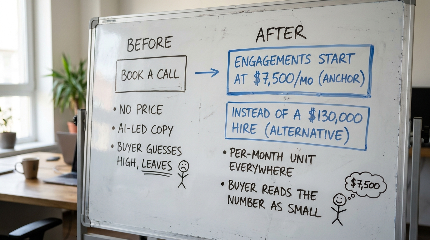
The following is illustrative. Picture a RevOps service firm with a homepage that says "book a call" and no number anywhere. In the November 2026 index, this is the common case: homepage trends for November 2026 show 33% of these firms ask for nothing specific and 49% lead with AI wording before a buyer knows what anything costs.
A buyer lands, sees no price, and mentally files the firm as "probably enterprise, probably more than we have." They leave to check a cheaper tool. Nothing on the page corrected the reference point, named an alternative, or set a unit.
Now change three things. Add a line on the first screen: "RevOps engagements start at $7,500 a month." That sets the anchor. Add a sentence below it: "Most clients run this instead of a $130,000 internal hire." That names the alternative and files the cost into the "versus a hire" account, where the monthly number reads small. Keep the unit per month across the site and the proposal, so the comparison never resets.
The number did not change. The reference point, the alternative, and the unit did, and all three were set before any call. That is the whole of what pricing psychology does on a page.
7. What loses on a B2B page
A few patterns reliably work against you. Hiding the price entirely hands the reference point to the buyer. Quoting in a unit that invites the wrong comparison, per seat when you are expensive per seat, puts you in a losing account. Showing three tiers with no visible high anchor makes the top one read as the ceiling rather than the reference. And stacking an unexplained number next to vague AI claims gives a skeptical buyer exactly the confirmation they need to discount you.
Baymard Institute's UX research on checkout and pricing clarity points the same way: ambiguity about cost is one of the most common reasons buyers abandon, because they assume the unseen number is bad. The remedy on a B2B page is to show a clear number set in the right account against the right alternative.
8. What to change on your page this week
You do not need a repricing exercise to improve how your price is read. You need the number, the comparison, and the unit to do their work before the call. Here is the short list, in order of effort.
- Put one real number or range on the first screen, so you set the anchor instead of the buyer.
- Write one sentence naming the realistic alternative and its cost, so your price is judged against it.
- Pick the single unit (per seat, per month, per project) that files you into the most favorable account, and use it everywhere.
- Check that your pricing page has a visible high tier, so the tier you want chosen reads as reasonable.
- Remove "contact us for pricing" as the only signal; give a range before the form, not after.
- Make sure the proposal uses the same unit and names the same alternative as the website, so the comparison never resets.
If you want the broader behavioral patterns that sit alongside pricing, The Decision Lab keeps a readable reference on judgment and decision-making that covers anchoring and mental accounting. For how we think about quoting service work specifically, there is a longer write-up on pricing strategy for WordPress services.
Start by seeing what your own first screen tells a buyer about price before they ask. Run Behavly's free homepage check on your page and see which of these three levers you are already using and which you are leaving to the buyer.