
Most B2B buyers do not decide alone. The person who lands on your homepage has to describe what you do to a colleague who never saw the page, usually in one sentence, usually in a Slack message or a hallway. If your value proposition cannot survive that retelling, you lose the deal in a room you were never in. Our November 2026 index of 118 B2B service firm homepages found that 49% lead the first screen with AI wording and 33% ask the visitor to do nothing at all, which tells you how many first screens never give a buyer a sentence worth repeating.
This guide explains what the research actually says about how buyers read a claim, shows where a value proposition shows up across a real B2B site and sales process, walks through one worked example, and ends with what to change on your page this week.
1. What the research says about how buyers read a claim
Daniel Kahneman, who won the 2002 Nobel Prize in Economic Sciences, described two systems of thinking: a fast, automatic one that reads a headline in a second, and a slow, effortful one that most visitors never switch on while scanning. You can read the summary of his work at the Nobel Prize record for Daniel Kahneman. The fast system decides whether to keep reading, and it rewards a claim that is concrete and penalizes one it has to decode.
Nielsen Norman Group's usability research backs this up on the page itself. In eye-tracking and scanning studies published across Nielsen Norman Group's research articles, people read web pages in short bursts, skipping anything that reads as filler and settling on text that names a specific result. A value proposition written for the slow, careful reader is a value proposition most of your traffic never finishes.
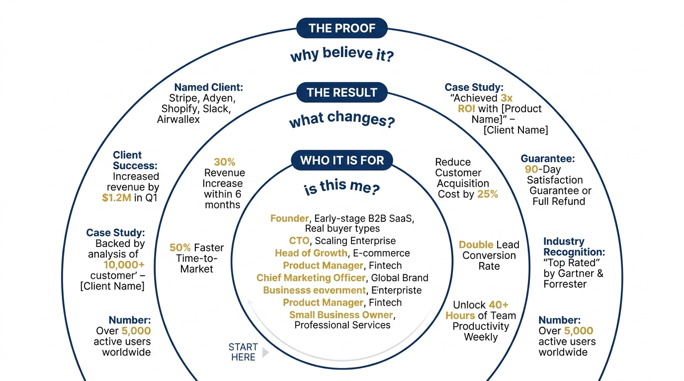
So the test is not whether your statement is clever. The test is whether the fast reader can extract three things in one pass: who it is for, the result they get, and why they should believe it.
2. The three parts a value proposition statement has to carry
A value proposition statement that a buyer can repeat has three parts, and dropping any one of them is what makes most homepage lines forgettable.
- Who it is for. A named buyer or company type, not "teams" or "organizations." A buyer repeats the line only if they recognize themselves in it.
- The result. What changes for that buyer, stated as an outcome they can measure, not the activity you perform to get there.
- The proof. One reason to believe the result, visible near the claim: a named client, a number, a case study, a guarantee.
Think of these as a customer value proposition rather than a company description. The difference is the subject of the sentence. A company description makes you the subject ("We build..."). A customer value proposition makes the buyer and their outcome the subject.
Our index found that 80% of these homepages show case studies somewhere on the site, which is the proof part, but far fewer place that proof next to the claim where the fast reader is deciding. Proof two scrolls down is proof the deciding reader never reaches.
3. Where it shows up on a B2B website and in the sale
The value proposition is not one line on one page. The same promise has to hold in every place a buyer or their colleague encounters you, and it breaks most often when each page is written by a different person on a different day.
On the homepage first screen, it is the headline and subhead. On the pricing page, it is the sentence above the tiers that justifies the number, and our index found only 3% of these firms show a price at all, which means most buyers reach a sales call still unsure what they are buying. In an outbound email, it is the first line that earns the second. In a proposal, it is the summary a champion forwards to a CFO who will never read page nine. On a demo form, it is the reassurance next to the submit button that the meeting is worth the time.
Use the table below to find each spot, name what the buyer is actually doing there, and decide what to change.
Where the value proposition does its work
| Where it shows up | What the buyer does | What to change |
|---|---|---|
| Homepage first screen | Scans in one pass to decide whether this is for them | Put the named buyer and the result in the headline; move AI wording out of the first line unless it is the result the buyer buys |
| Pricing page | Looks for the number and a reason it is fair | Add one sentence above the tiers tying the price to the outcome; show a starting price so the buyer can qualify themselves |
| Outbound email | Reads the first line, then deletes or replies | Lead with the buyer's result, not your service category; cut the company intro |
| Proposal summary | Forwards one page to a colleague who never met you | Write the summary so the colleague understands the offer without the rest of the document |
| Demo or contact form | Weighs the time cost against the payoff | Put the specific result they get from the meeting next to the submit button |
4. A worked example on one homepage line
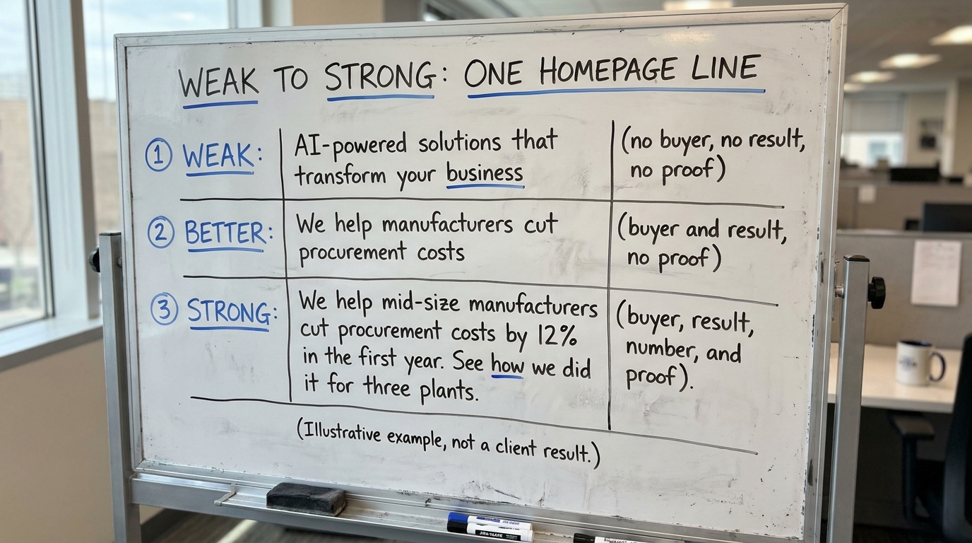
Here is one homepage headline for a fictional firm, rewritten from weak to strong. The firm and the numbers are illustrative, not a client result.
The weak version names no buyer, no result, and no proof. It could belong to any of the 49% of firms in our index leading with AI wording, and a buyer cannot repeat it because there is nothing specific to repeat. The better version names a buyer and a result, which already beats most first screens, but it still has no proof and no size, so it reads as a claim rather than a fact. The strong version lets a buyer at a mid-size manufacturer recognize themselves, see a result with a number, and find proof one click away. The colleague they forward it to understands the offer without ever seeing the page.
Notice the strong version is longer, not shorter. The instinct to trim a headline to five words usually removes the exact detail that let the buyer repeat it. Specificity is what travels; vagueness does not.
5. A test you can run on your own page
You do not need software to check whether your value proposition carries. Run this test on your current homepage headline and subhead.
- The colleague test. Read your first screen once, close the tab, and write the sentence you would send a colleague to describe what the firm does. If your sentence is more specific than the page, the page is underwritten.
- The three-part check. Underline who it is for, the result, and the proof. If you cannot underline all three in the first screen, you know which part to add.
- The swap test. Paste a competitor's name over yours. If the line still reads as true, it describes a category rather than a specific offer.
- The number test. Count the concrete nouns and numbers in your headline. Zero is the common result, and zero is why the fast reader keeps scrolling.
For a sense of how your first screen compares to the field, our homepage trends from November 2026 show the full distribution across the 118 firms, and the breakdown in Homepage Design Lessons From 118 B2B Service Firms walks through the patterns behind those numbers.
6. Match the statement to the segment you are selling to
One value proposition rarely fits every buyer you serve. A mid-size manufacturer and an enterprise logistics group care about different results, and a single headline written to cover both usually ends up describing neither. Decide which segment the homepage leads with and let the rest live on dedicated pages.
Mario Peshev's write-up on aligning value propositions with segments lays out how to split the promise by who is actually buying, so each page names its own buyer and result.
A value proposition template is only useful if it forces a choice. "For [named buyer], we deliver [measurable result], proven by [specific evidence]" works because every bracket rejects a vague answer. If you cannot fill a bracket, that is the work, not the template's failure.
7. What to change on your page this week
You do not need a rebrand to fix this. Pick the three changes that take the least time and move the most, and do them in order.
- Rewrite the first-screen headline to name one buyer and one measurable result. If AI is genuinely the result your buyer buys, keep it; if it is a method, move it below the fold.
- Move one piece of proof up next to the claim: a client name, a number, or a short case study link. If you are in the 80%, you already have case studies; place them next to the claims they support.
- Run the colleague test on the new line and, if the sentence you would forward is clearer than the page, use your sentence as the page.
- Add one qualifying detail to your pricing or demo page so a buyer can tell whether they fit before they spend a call finding out.
These four changes take an afternoon and they attack the exact gap the research points to: a fast reader deciding in one pass whether your claim is for them, with a result and a reason to believe it.
When you are ready to see how your first screen reads to that fast, deciding visitor, run Behavly's free homepage check on your own page.