
On Behavly's November 2026 index of 118 B2B service firms, 80% show case studies somewhere on the homepage, but most bury them below three screens of product copy. The proof is on the page. It is in the wrong place, aimed at the wrong reader, and it rarely says what a buyer needs to hear before a demo request. Social proof is one of the few levers that reliably moves a B2B purchase, and it is also one of the most wasted. This guide explains what the research supports, which formats a buyer reads and which they skip, and what to change on specific pages this week.
1. What the research says about social proof
The term comes from Robert Cialdini, whose work on influence and persuasion described how people look to the behavior of others to decide what to do when they are uncertain. A B2B buyer evaluating a six-figure engagement is exactly that: uncertain, accountable to a committee, and looking for evidence that someone like them already made this call and did not regret it.
That last part matters more than the volume of proof. Nielsen Norman Group's usability research has repeatedly found that testimonials and credibility signals only help when they are specific, attributed, and relevant to the reader. A vague quote from an unnamed "CEO" does less than nothing, because buyers have learned to discount anything that could have been written in-house. The behavior you are relying on is comparison to a credible peer, so the proof has to make the peer legible.
2. Which formats move a buyer and which they skip
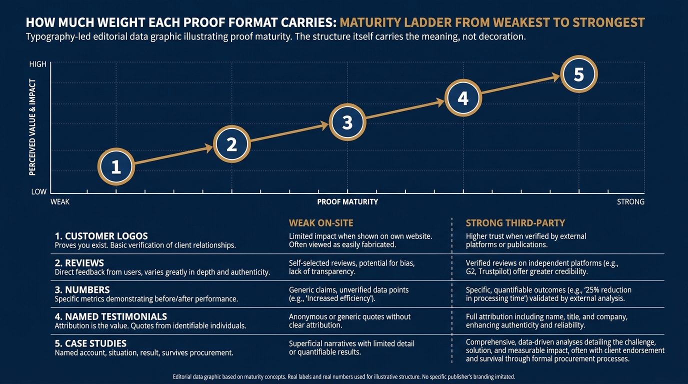
Not all social proof carries the same weight. The order below reflects how a B2B committee tends to read a vendor, based on what makes a signal verifiable and relevant rather than decorative.
Case studies do the most work
A named account, a starting situation, what you did, and a measured result is the one format that survives a procurement review. It answers the question the buyer cannot ask you directly: did this work for a company shaped like mine.
Named testimonials, if the name is real
A quote tied to a full name, title, and company reads as a reference you could theoretically call. The attribution is the entire value. Strip the name and it becomes copy.
Numbers, when they are yours and specific
"Cut onboarding from 40 days to 12" beats "faster onboarding." A number with a before and after implies a measurement method, which implies the result is real.
Customer logos, as a glance test
A logo wall confirms you serve companies of a certain size and sector. It passes a five-second scan and nothing more. Logos cannot carry a page on their own. They confirm you have clients of a given size and sector, which matters in the first five seconds, and that is all they do.
Third-party reviews
Reviews on a platform the buyer already trusts add weight because you did not write them. On your own page, a screenshotted star rating reads as marketing.
3. Where social proof shows up on a B2B website
The format matters less than the placement. The same case study does nothing in a footer carousel and a great deal three lines under a pricing tier. Here is where each kind of proof earns its spot, mapped to what the buyer is doing when they reach it.
| Where it shows up | What the buyer does there | What to change |
|---|---|---|
| Homepage first screen | Decides in seconds whether you serve companies like theirs | Put one logo row or one named result in the first screen, not a generic value headline |
| Pricing page | Weighs cost against proof the spend pays back | Place a named outcome beside the tier it applies to, not a shared testimonial block at the bottom |
| Demo or contact form | Hesitates at the commitment of talking to sales | Add one short named quote about the sales experience right beside the submit button |
| Case studies index | Hunts for the one account that looks like them | Label each study by industry and company size so the buyer can self-select in one scan |
| Proposal or sales deck | Builds the internal case to a committee | Lead with the single most comparable account |
| Outbound email | Decides in one line whether you are credible enough to reply to | Name one comparable client and one number, drop the adjectives |
The failure mode across all six rows is the same: proof placed where it is convenient to design rather than where the buyer's doubt actually sits. On Behavly's November 2026 homepage trends, 49% of firms open with AI wording in the first screen and only a fraction open with a client result, which means most are spending their most-read real estate on a claim instead of evidence.
4. A worked example on one pricing page
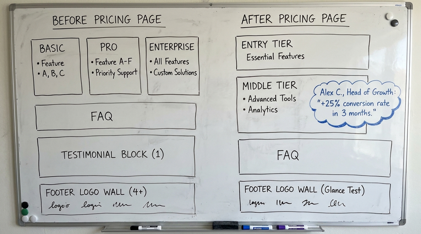
Picture a managed-services firm with three pricing tiers and a single testimonial block at the bottom of the page, under the FAQ, where almost no one scrolls.
The buyer lands on the pricing page already knowing roughly what they will pay. What they do not know is whether the middle tier is worth the step up from the entry tier. That is the exact moment doubt peaks, and that is where the page offers nothing but feature bullets. The testimonial sitting 900 pixels below is answering a question the buyer stopped asking two screens ago.
The fix is to move one piece of proof to the point of doubt. Beside the middle tier, add a one-line named result from a company that bought that tier: a real name, a real title, and a measured outcome. The logo wall can stay at the bottom as a glance test. The committee's question, "is the step up worth it," now has an answer sitting next to the price it is being asked about.
5. Match the proof to the reader, not to the layout
A B2B purchase rarely has one reader. The deal owner wants to know the outcome and the risk. The practitioner who will use the thing wants to know it will not break their week. The finance signer wants the number to hold up. One generic testimonial cannot serve all three. A single proof block under the fold underperforms because it tries to answer questions three different people are asking.
Behavioral work on decision-making, including Daniel Kahneman's research recognized by the 2002 Nobel in Economic Sciences, shows that people lean on whatever evidence is easiest to recall and most concrete when they judge an uncertain choice. A specific, attributed story is easy to recall and easy to repeat to a colleague who was not in the room. That repeatability is what gets you through a committee you never meet.
So place proof by audience. Put the outcome number where the deal owner reads, the "it was easy to work with them" quote near the form where the practitioner hesitates, and the measured before-and-after near the price where finance pushes back.
6. The mistakes that quietly cancel your proof
Baymard Institute's UX research on how users evaluate sites points to a pattern worth watching: credibility signals that cannot be verified are often ignored or actively distrusted. Three habits do most of the damage in B2B.
- Unnamed testimonials. "A happy client" tells the buyer you either could not get permission or made it up. Both are worse than silence.
- Logos without relevance. A wall of enterprise logos on a page selling to 20-person teams signals the opposite of fit. Show logos that look like the reader.
- Proof far from the doubt. The strongest case study in the world does nothing if it sits three screens below the decision it should inform.
Social proof marketing fails most often not because the proof is weak but because it is anonymous, mismatched, or misplaced. All three are fixable this week without producing a single new asset.
7. A short audit of your own pages
Run this against your homepage, pricing page, and one sales email. It takes under an hour and uses only what you already have.
- Is there a named, attributed result in the first screen of the homepage, or just a claim?
- Does the pricing page put proof beside the tier it applies to, or in a block nobody scrolls to?
- Is there one short named quote beside your demo or contact form?
- Can a buyer filter your case studies by industry and company size in one scan?
- Does your proposal lead with the single most comparable account?
- Does your outbound email name a comparable client and one number in the first line?
- Have you removed every testimonial that lacks a real name and title?
When case studies are the format that survives scrutiny, it is worth treating them as a real asset. The same holds on your pricing page.
8. What to change on your page this week
You do not need new testimonials to improve this week. You need to move the ones you have to where doubt sits and strip the anonymous ones that are costing you trust. Pick the single page that gets the most qualified traffic, usually the homepage or the pricing page, and do three things: put one named result in the first screen, move one proof point beside the price or the form, and delete every unattributed quote on the page. Those three edits touch the exact moments where a B2B buyer decides whether to keep reading.
If you want an outside read on where your homepage spends its first screen and whether your proof is placed where buyers actually look, run Behavly's free homepage check on your own page.